
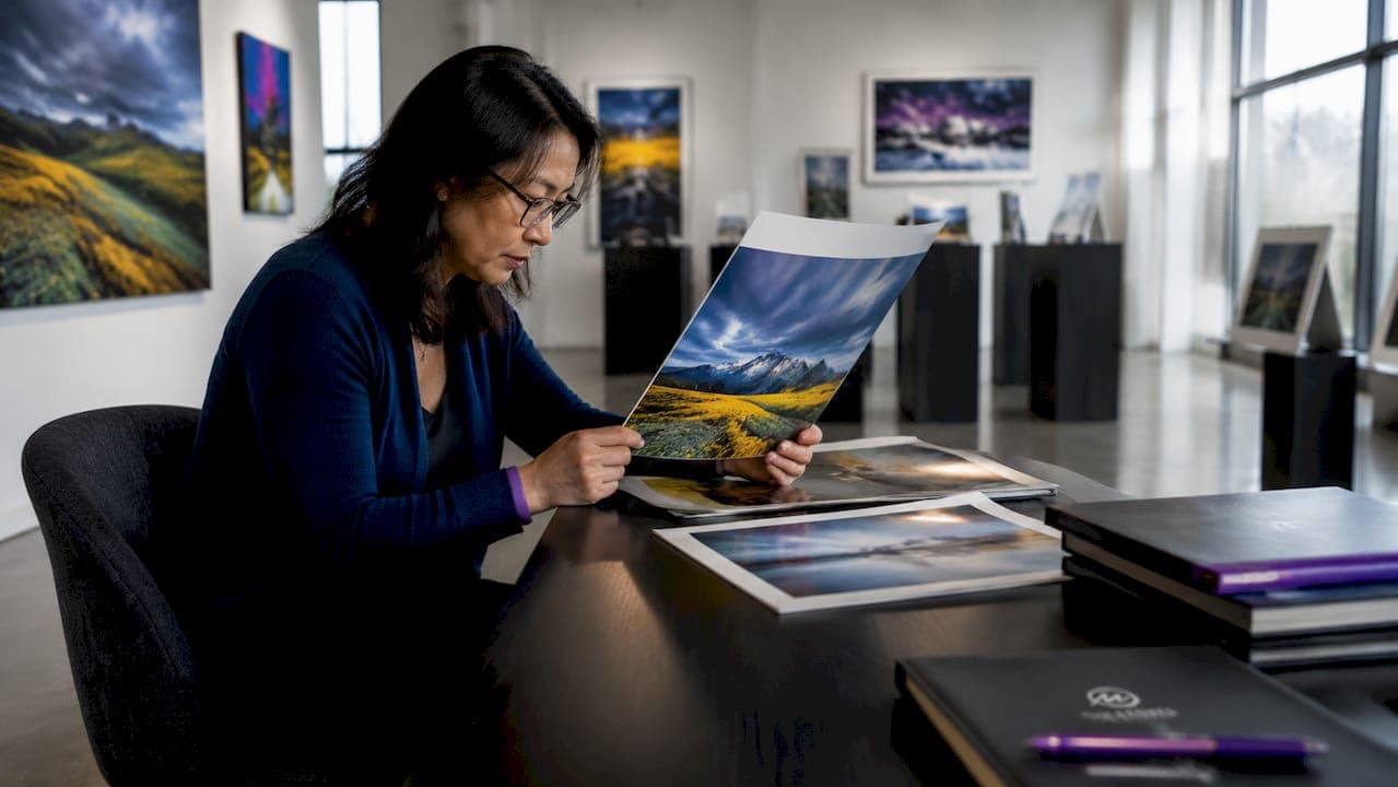
Photography print quality is defined as the combined result of image resolution, color accuracy, sharpness, and substrate choice. Each factor shapes what you see on the wall. Knowing how to assess photography print quality separates a lasting fine art investment from a disappointing purchase. Whether you are an art collector, a photographer preparing a new series, or a buyer choosing a piece for your home, the same core standards apply. This guide covers the technical benchmarks, visual inspection methods, and material considerations that define a truly excellent print.
How do you determine if an image file has sufficient resolution?
Resolution is the foundation of print quality assessment. A file that looks sharp on screen can fall apart completely when printed large. The key metric is PPI, which stands for pixels per inch, and it measures how much image detail fits into each inch of the printed surface.
The accepted industry standard for photographic prints is 300 PPI for arm's length viewing and 150 PPI for large-format wall art. At 300 PPI, fine details like texture and edge sharpness remain crisp. At 150 PPI, the human eye compensates for the lower density when standing several feet back from a large piece.
Calculating your file's print limit is straightforward:
- Find the pixel dimensions of your image file (for example, 6,000 x 4,000 pixels).
- Divide the pixel width by your target PPI. At 300 PPI, 6,000 pixels yields a 20-inch wide print.
- Divide the pixel height the same way. At 300 PPI, 4,000 pixels yields a 13.3-inch tall print.
- For a large wall print viewed from across the room, divide by 150 PPI instead. The same 6,000-pixel file now supports a 40-inch wide print.
Viewing distance directly affects the required resolution. A 60-inch gallery print hung at eye level and viewed from six feet away needs far less PPI than a 12-inch print held in hand. Matching your file's resolution to the intended display distance is the single most important step in photography print evaluation.
Tools like DPI checker applications and image editing software such as Adobe Photoshop and Lightroom display pixel dimensions and calculated print sizes instantly. Use them before sending any file to a lab.
Pro Tip: Always check your file's native resolution at 100% zoom in Photoshop or Lightroom before ordering. If the image looks soft at that zoom level, it will look soft in print.
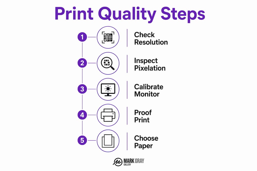
What visual signs indicate pixelation, noise, or compression problems?
Visual defects in prints fall into three main categories: pixelation, digital noise, and compression artifacts. Each has a distinct appearance and a distinct cause.
- Pixelation appears as blocky, stair-stepped edges on curved lines or diagonal shapes. It signals that the file's resolution was too low for the print size chosen.
- Digital noise shows up as a grainy or speckled texture, especially in shadow areas and smooth gradients like skies. High ISO camera settings are the primary cause.
- Compression artifacts look like blocky patches, halos around edges, or muddy color transitions. They result from saving a JPEG at too low a quality setting.
JPEG compression quality should be 85 or higher for professional print output. Below 70, visible artifacts appear. Below 50, the file is unusable for any quality print work. This is why photographers working toward fine art prints save master files as TIFF or PSD rather than JPEG.
Banding is another defect worth watching for. It appears as visible stripes across gradients, often caused by insufficient bit depth in the original file or a printer calibration issue. Halos around sharp edges usually point to over-sharpening applied in post-processing.
The most reliable way to spot these flaws before printing is to zoom into your image at 100% on screen. At that zoom level, what you see closely approximates what a print will show at arm's length. Scan the shadow areas, the sky, and any fine detail like foliage or fabric.
Physical proofing remains the gold standard for final quality verification. Professionals order test prints on the actual substrate before committing to a full print run. A proof reveals shadow detail, color rendering, and texture fidelity in ways no screen preview can replicate.
Pro Tip: Digital previews are approximations. Order a small proof print on your chosen paper before approving any large format piece. The proof is the only honest answer.
How does color accuracy and monitor calibration affect print results?
Color accuracy is where most print quality problems originate. Print quality issues are rarely due to printers but mostly due to improper screen brightness and color management. Understanding why prints look different from screens is the key to fixing the problem.
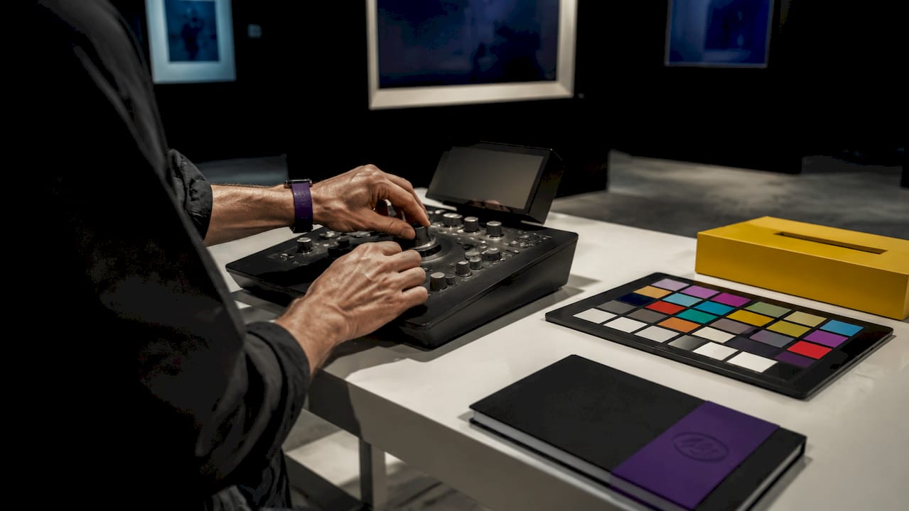
The core issue is the gap between RGB and CMYK color gamuts. Monitors display color using red, green, and blue light, which produces a wide, vivid range of colors. Printers reproduce color using cyan, magenta, yellow, and black inks, which cover a smaller range. Colors that glow on screen, particularly saturated blues and greens, often appear more muted in print.
Monitor brightness compounds the problem. Most monitors ship from the factory set far too bright for print work. Calibrating your monitor to 80–120 cd/m2 matches the luminance of a print viewed under standard gallery lighting. When your screen is too bright, prints look darker by comparison, even when the print itself is perfectly exposed.
Key practices for accurate color assessment include:
- Calibrate your monitor using a hardware colorimeter such as the X-Rite i1Display or Datacolor Spyder. Software-only calibration is not reliable enough for print work.
- Use soft proofing in Photoshop or Lightroom to simulate how your image will look when converted to the printer's color profile.
- Embed the correct color profile in your file before sending it to a lab. Print labs typically require sRGB color profiles to maintain color accuracy, as they convert most inputs to this standard.
- Evaluate prints under consistent lighting. Daylight-balanced bulbs at 5,000K are the standard for color-critical print review.
Soft proofing is a feature in Photoshop that simulates the printer's output on your calibrated screen. It shows you which colors will shift or compress during conversion. Adjusting your image with soft proofing active gives you far more control over the final result than correcting after the fact.
How do substrate and paper finish contribute to perceived print quality?
The paper you print on changes everything about how a photograph looks and feels. Two prints from the same file on different substrates can appear to be entirely different images. Substrate choice is a critical part of any honest print quality assessment.
| Paper type | Surface quality | Best use case |
|---|---|---|
| Matte | Low glare, soft texture | Gallery display, fine art |
| Gloss | High sheen, vivid color | Commercial, product photography |
| Luster | Semi-gloss, reduced glare | Portraits, general photography |
| Textured | Tactile surface, painterly feel | Fine art, limited editions |
| Baryta | Deep blacks, fiber-based feel | Museum-quality fine art prints |
Matte papers reduce glare and are preferred in galleries. Gloss and luster papers enhance saturation and contrast, making them the standard choice for commercial photography. The right choice depends on where the print will be displayed and how it will be lit.
Two technical properties define a paper's performance beyond its surface finish. The white point describes how bright and neutral the paper base appears. A warm white base shifts all colors slightly toward yellow. A cool white base keeps colors neutral and clean. Dmax refers to the maximum density of black a paper can achieve. Higher Dmax produces deeper shadows and stronger contrast, which is especially visible in landscape and fine art photography.
For gallery-quality landscape prints, baryta and fine art matte papers consistently deliver the depth and tonal range that collectors expect. Gloss papers, while vivid, can create distracting reflections under gallery lighting.
Key Takeaways
Accurate photography print evaluation requires combining technical file checks, calibrated color management, and physical proofing before any final print decision.
| Point | Details |
|---|---|
| Resolution determines print size | Use 300 PPI for close viewing and 150 PPI for large wall art viewed from a distance. |
| JPEG quality matters | Save files at quality 85 or above to avoid compression artifacts in the final print. |
| Monitor calibration is non-negotiable | Calibrate to 80–120 cd/m2 to match print viewing conditions and avoid dark prints. |
| sRGB is the standard for print labs | Embed sRGB profiles in your files before submitting to any professional print lab. |
| Paper choice shapes the final impression | Matte suits gallery display; gloss and luster maximize saturation for commercial use. |
What I've learned from years of evaluating my own prints
The single most common mistake I see, and one I made myself early on, is trusting the screen too much. A beautifully bright monitor is a terrible judge of print quality. When I first started printing my landscape work at large format, I was consistently disappointed by how dark the prints looked. The problem was not the printer. My monitor was set to over 200 cd/m2, which made every image look luminous on screen and flat on paper. Calibrating to 100 cd/m2 changed everything.
The second lesson took longer to absorb: physical proofing is not optional. Ordering a proof on the final substrate is the only way to honestly evaluate color, shadow detail, and texture fidelity. I now proof every new image before approving a print run, regardless of how confident I feel about the file. The proof has saved me from costly mistakes more times than I can count.
For collectors and buyers, the same principle applies. Ask the gallery or printer whether the piece you are considering was proofed on the actual paper it was printed on. If the answer is no, that is a meaningful gap in the quality process. Understanding the basics of photography print investment helps you ask the right questions and recognize when a print truly meets the standard it claims.
Technical standards matter, but they serve artistic intent. A 300 PPI file on baryta paper means nothing if the image itself lacks the tonal range and composition to reward close inspection. The best prints I have made are the ones where every technical decision served the image, not the other way around.
— Mark
Award-winning prints built on exacting quality standards
Mark Gray's landscape photography prints represent years of field work across Australia, Iceland, Norway, French Polynesia, and beyond, combined with a disciplined approach to file preparation, color management, and substrate selection.
Every limited edition print available through Mark Gray's gallery is produced to the photographic print standards described in this guide. From resolution and color profiling to paper selection and proofing, each piece reflects the same commitment to quality that collectors and photographers expect from award-winning fine art. If you are ready to see what those standards look like in a finished print, the gallery is the place to start.
FAQ
What PPI is required for a high-quality photo print?
The industry standard is 300 PPI for prints viewed at arm's length and 150 PPI for large-format prints viewed from a distance. Lower resolution produces visible softness or pixelation.
Why do my prints look darker than on screen?
Prints appear darker when your monitor is set too bright. Calibrating your monitor to 80–120 cd/m2 aligns screen brightness with standard print viewing conditions.
What color profile should I use when sending files to a print lab?
Most print labs require sRGB as the standard color profile. Embedding sRGB in your file before submission prevents unexpected color shifts during the lab's conversion process.
How do I check if my image has compression artifacts before printing?
Zoom into your image at 100% in Photoshop or Lightroom and look for blocky patches, halos around edges, or muddy color transitions. JPEG files saved below quality 70 are the most common source of these defects.
What paper finish is best for gallery photography prints?
Matte and baryta papers are the preferred choice for gallery display because they reduce glare and deliver deep blacks. Gloss and luster papers suit commercial photography where vivid color and contrast take priority.