

Choose image resolution based on final viewing distance and final output size, not a flat 300 DPI rule. Close-range signs need roughly 150 to 300 DPI, mid-range banners and shopfronts run 100 to 150 DPI, and billboards can look sharp at just 10 to 50 DPI. Digital signage skips DPI altogether: screens need native pixel dimensions, not a print resolution number.
TL;DR:
- Most signs require resolution based on viewing distance, ranging from 150-300 DPI for close signs to 10-50 DPI for billboards, which are viewed from far away.
- Digital signage relies solely on native pixel dimensions, with 1080p being standard for most displays, while 4K is mainly beneficial for large or close-up screens.
- Upscaling images beyond 150% or using files with mismatched resolutions can cause pixelation, softness, or artifacts, making file recalculation essential before printing.
- Substrate texture and lighting conditions significantly influence perceived sharpness, requiring adjustments in resolution, contrast, and surface finish for optimal results.
- Color profile mismatches and improper file formats can reduce perceived sharpness; converting RGB to CMYK correctly and using vector graphics help maintain image clarity.
Table of Contents
- Image Resolution for Signage: A Quick DPI Cheat Sheet
- How to Calculate the Pixel Dimensions You Actually Need
- Digital Signage vs Print: Why DPI Stops Mattering on Screens
- Picking File Formats That Stay Sharp Without Crashing the Player
- Artwork Prep Checklist Before Sending Files to Print
- Diagnosing Blurry Prints, Pixelated Screens, and Bloated Files
- Practitioner Notes From Mark Gray on Large-Format Photography
- How Lighting Changes What "Sharp Enough" Actually Means
- Why Substrate Texture Changes Your Resolution Needs
- Matching Resolution Rules to Your Printing Technology
- Large-Format Printing Problems Tied Directly to Resolution
- Why Color Profiles Affect Perceived Sharpness Too
- Balancing Quality, Budget, and Playback Reliability
- An Alternative Worth Considering: Licensed, Print-Ready Photography
- Sources
Image Resolution for Signage: A Quick DPI Cheat Sheet
The DPI a sign needs depends entirely on how close people stand to read it. A poster mounted at eye level in a lobby demands far more detail per inch than a billboard read from a moving car, because the eye simply can't resolve fine pixels at 300 feet.
| Sign type | Recommended DPI | Typical viewing distance |
|---|---|---|
| Poster / point-of-sale | 150–300 DPI | 1–3 feet |
| Pull-up banner | 100–150 DPI | 3–6 feet |
| Wall graphic / interior panel | 100–150 DPI | 5–10 feet |
| ACM panel (storefront) | 100 to 150 DPI | 10 to 20 feet |
| Building banner | 150 to 300 DPI | 10 to 50 feet |
| Billboard | 10 to 50 DPI | 50 feet or more |
These bands come from viewing-distance-based DPI standards used across the large-format print industry. Anything carrying a logo or type deserves vector artwork instead of raster files, since vectors stay crisp at any output size. Once you know the sign type, the next step is converting that DPI target into actual pixel dimensions, which is where a lot of files go wrong.
How to Calculate the Pixel Dimensions You Actually Need
Resolution gets measured at final print size, not at whatever size the source file happens to be. A photo that looks razor sharp at 4×6 inches can turn to mush blown up to 4×6 feet, even though the pixel count never changed.
- Find your final output size in inches. A wall graphic printing at 48×96 inches is your baseline.
- Multiply by your target DPI. At 100 DPI, that's 4,800 by 9,600 pixels.
- Check your source file against that number. If your image is smaller, you're upscaling.
- Use a reduced-scale workflow for oversized jobs. Many print shops design at 10% scale, building a 4.8×9.6 inch file at 1,000 DPI, which is easier to handle than a multi-gigabyte full-size file and produces an identical result.
- Cap upscaling at around 150%. Beyond that, software has to invent pixel data, and photographs start showing soft edges and mushy detail, especially in skin tones, foliage, and skies.
Digital Signage vs Print: Why DPI Stops Mattering on Screens
Screens don't have DPI at all. They have a fixed grid of pixels, and clarity depends entirely on whether your file matches that native pixel dimension.
Fast fact: Export digital signage assets at the screen's exact native resolution, such as 1,920×1,080 for Full HD or 3,840×2,160 for 4K. That's the entire spec.
- 1080p is the practical default for most signage networks, balancing file weight against visible sharpness at normal viewing distances.
- 4K only pays off on very large screens, close-viewing kiosks, or displays showing dense data and fine text, according to screen resolution guidance for digital signage.
- LED and EMC displays run on pixel pitch, not DPI. A P10 or P16 panel has a hardware-fixed pixel grid that content must match exactly.
- Oversized files hurt performance more than they help quality. A media player choking on an unnecessarily large still can stutter or drop frames during playback.
Picking File Formats That Stay Sharp Without Crashing the Player
Format choice affects both how an image looks and how reliably it plays back on a media player queue.
- JPEG for photographs, exported at native pixel size with quality set between 80 and 90 percent.
- PNG for logos, icons, or any graphic needing transparency.
- WebP where your player supports it, since it can shrink file size by roughly 25 to 34 percent with no visible quality loss.
- SVG for vector logos and text, which stay sharp at any screen size because they aren't pixel-based at all.
Pro Tip: Strip metadata before uploading to a signage player. EXIF data, color profiles, and embedded thumbnails add unnecessary weight to a file that never gets displayed, and trimming it can shave meaningful kilobytes off every asset in a playlist.
Test every export on the actual target player before a full rollout. Compression that looks fine on a laptop monitor can behave differently once a cheap media player decodes it.
Artwork Prep Checklist Before Sending Files to Print
A print-ready file and a design-ready file are two different things, and the gap between them causes most last-minute production delays.
- Outline or vectorize logos. Never hand a printer a raster logo that's been scaled up from a small web asset.
- Set color mode to CMYK for print, and note any Pantone spot colors the vendor needs to match. Keep RGB reserved strictly for screen-based assets.
- Build in bleed and respect the safe area. Standard practice is 0.125 to 0.25 inches of bleed, with critical text kept well inside trim lines.
- Embed or outline fonts so nothing reflows on the print shop's system.
- Supply the file at (or scaled to) final size, along with substrate and finish notes, so the vendor can flag resolution problems before the job runs.
Diagnosing Blurry Prints, Pixelated Screens, and Bloated Files
Not every "resolution problem" has the same cause, so the fix depends on what's actually happening.
- Pixelation (visible blocky squares) usually means the source image was scaled beyond its native pixel count.
- Soft, blurry printing often points to a DPI mismatch at final size rather than a bad file, especially on ACM or banner jobs.
- Scaling artifacts like haloing around edges show up when software stretches a raster file past safe limits.
- Fix pixelation by requesting a vector logo, cropping tighter to the usable image area, or accepting the sign's viewing distance allows a lower DPI.
- Fix softness by re-checking your math against the pixel dimension formula before reprinting.
- When distance genuinely excuses low DPI, don't force a reshoot. A billboard at 10 DPI viewed from a highway is not a failed file.
Practitioner Notes From Mark Gray on Large-Format Photography
Shooting for signage is different from shooting for a gallery wall, and it changes how I frame every image that might end up printed 20 feet wide.
I always shoot with headroom, leaving margin around the subject so a client or designer can crop for a banner, a billboard, or a square panel without losing the composition. RAW capture at the camera's largest native sensor dimension gives the most flexibility later, since you're working from maximum data rather than trying to stretch a compressed file.
On the file-handling side, I keep a TIFF or PSD master of every image and only export optimized JPEG or WebP copies for delivery, preserving the original for anything that needs reprocessing. For licensed work destined for signage, supplying an already high-resolution, color-managed file up front avoids the reshoot delays and legal gray areas that come from a client trying to stretch a low-res web image to storefront size.
How Lighting Changes What "Sharp Enough" Actually Means
A sign's perceived clarity shifts dramatically depending on the light hitting it, sometimes more than the file's actual resolution does. An interior panel lit evenly by diffuse ceiling light will show fine detail cleanly, while the same file printed for an outdoor ACM panel facing direct afternoon sun can look washed out and soft regardless of how carefully it was prepared.
Glare and reflection are the biggest culprits. Glossy laminates and direct sun create hot spots that erase midtone detail, meaning viewers physically cannot resolve pixels they'd otherwise see clearly. Matte or anti-glare finishes soften that problem but slightly reduce color saturation and micro-contrast, which is why signage printed for bright storefronts often benefits from bumping contrast and saturation slightly during file prep to compensate.

Low-light and backlit signage introduce a different issue. Backlit panels need images built with enough tonal range to survive light passing through the substrate, since dark shadow areas can crush to black and lose all texture. Designers working on backlit or dusk-to-dawn signage should proof files under conditions close to the sign's actual installation, not just on a calibrated studio monitor.
The practical takeaway: resolution and lighting aren't separate problems. A technically perfect 150 DPI file can look worse under harsh glare than a lower-resolution file designed with contrast and finish in mind. Factor the installation environment into your resolution decisions as heavily as viewing distance, because legibility research on sign placement consistently flags lighting and contrast as decisive as size.
Why Substrate Texture Changes Your Resolution Needs
Surface finish absorbs or scatters ink in ways that either sharpen or soften an image regardless of the file's actual pixel count. A smooth, gloss-coated ACM panel reproduces fine detail almost photographically, letting a well-prepared 100 DPI file look crisp at close range. Switch that same file to a heavily textured canvas or a matte vinyl banner, and edges soften because the substrate's texture physically breaks up sharp lines.

Fabric substrates used for tension-fabric displays and backlit frames are especially forgiving of lower resolution, since the woven texture masks minor softness the eye would catch on a smooth surface. That's part of why fabric signage often gets away with DPI at the low end of its recommended range without looking soft.
Textured wall wraps and dimensional signage behave differently again. Raised lettering, embossed panels, or heavily grained vinyl can hide fine photographic detail entirely, so investing in ultra-high resolution for a heavily textured application often wastes file weight the substrate will never render. Designers should match resolution effort to the smoothest part of the sign, since that's where any softness will actually show.
The practical rule: treat substrate as a resolution modifier, not an afterthought. A rough-textured print can tolerate resolution at the bottom of its recommended band, while a glossy, close-viewed panel deserves the top of that same band, even if both signs are technically the same "type."
Matching Resolution Rules to Your Printing Technology
UV, solvent, and latex printing each interact with image files slightly differently, and knowing which one your vendor runs changes how you should prepare artwork. UV-cured inks sit on top of the substrate rather than absorbing into it, which tends to preserve fine detail and sharp edges well, making UV printing forgiving of files at the lower end of the recommended DPI band for a given viewing distance.
Solvent printing, common for vehicle wraps and outdoor banners, pushes ink slightly into the substrate and can soften very fine detail at close range, so files intended for solvent output benefit from staying toward the middle or top of the recommended DPI range rather than the minimum.
Latex printing sits between the two, offering strong color accuracy and reasonably crisp detail on a wide range of substrates, including textured and fabric materials. Because latex inks cure without heat damage to more delicate media, it's become a common choice for indoor retail graphics where color fidelity matters as much as sharpness.
None of these technologies change the underlying viewing-distance math. What changes is your margin for error: a UV print at exactly 100 DPI will likely look sharper than a solvent print at the same DPI viewed from the same distance. When a vendor quotes a printing technology you haven't used before, ask directly what DPI they recommend for that specific press and substrate combination rather than assuming your usual number applies.

Large-Format Printing Problems Tied Directly to Resolution
The most common large-format signage failure is a file that was resolution-appropriate at its original size but got upscaled without anyone recalculating the math. A product photo shot for a web banner, stretched to cover a 10-foot storefront panel, will show soft edges and blotchy color no matter how good the original photography was.
A second recurring issue is inconsistent resolution across a multi-panel installation, which can be prevented by following brand strategy context on how signage fits into broader brand systems. When a wall graphic gets split across several ACM panels, and only some panels were re-exported at the correct final-size resolution, the seams between panels show an obvious sharpness mismatch that's far more noticeable than uniform softness would have been.
Text and fine logo work cause a third category of problems. Raster logos scaled up from a small source file often print with jagged, stair-stepped edges even when the photographic elements of the same file look acceptable, because type and line art reveal upscaling artifacts far more readily than photographs do.
The fix for all three is the same discipline: recalculate pixel dimensions at true final size before export, keep resolution consistent across every panel in a multi-piece installation, and swap raster logos for vector versions before they ever reach a print queue. Catching these issues in file review costs minutes; catching them after a panel ships costs a reprint.
Why Color Profiles Affect Perceived Sharpness Too
Color profile mismatches don't just shift hues, they can make a technically sharp file look muddy or flat once it hits the press. RGB files, built for the wide gamut of a screen, contain colors that CMYK printing simply cannot reproduce. When a printer's software has to force an out-of-gamut RGB file into CMYK without proper conversion, the result often loses contrast and saturation, which reads to the eye as reduced sharpness even though pixel resolution never changed.
Converting to CMYK deliberately, inside your design software, before handing off the file, gives you control over how that color compression happens. Soft-proofing against your printer's specific ICC profile catches problems like flattened greens or muddy skin tones before they show up on a finished panel rather than after.
Digital signage assets stay in RGB throughout, since screens display color additively and never touch CMYK ink at all. Keeping that distinction clear across a mixed print-and-digital signage project avoids one of the most common handoff mistakes: sending a CMYK-converted file to a digital display, where it will look washed out and dull compared to its RGB counterpart.
Getting color profile management right is as much a part of "resolution" as pixel count, because a poorly converted file will look less detailed even when every pixel is exactly where it should be.
Balancing Quality, Budget, and Playback Reliability
Chasing a bigger DPI number or a heavier file rarely fixes a sign that looks wrong. Brightness, viewing distance, and the actual hardware playing your content usually matter more than the resolution figure on your export dialog. Test every final file on the real screen or the real substrate before a full rollout. The honest takeaway: native pixels and smart optimization beat an inflated DPI number every time.
— Mark
An Alternative Worth Considering: Licensed, Print-Ready Photography
If sourcing or prepping imagery is the bottleneck, licensing already high-resolution photography solves the problem before it starts. Com offers landscape and travel photography available for commercial licensing in applications including splashbacks, signage, websites, and print collateral, shot and delivered at resolutions built for large-format output from the outset.
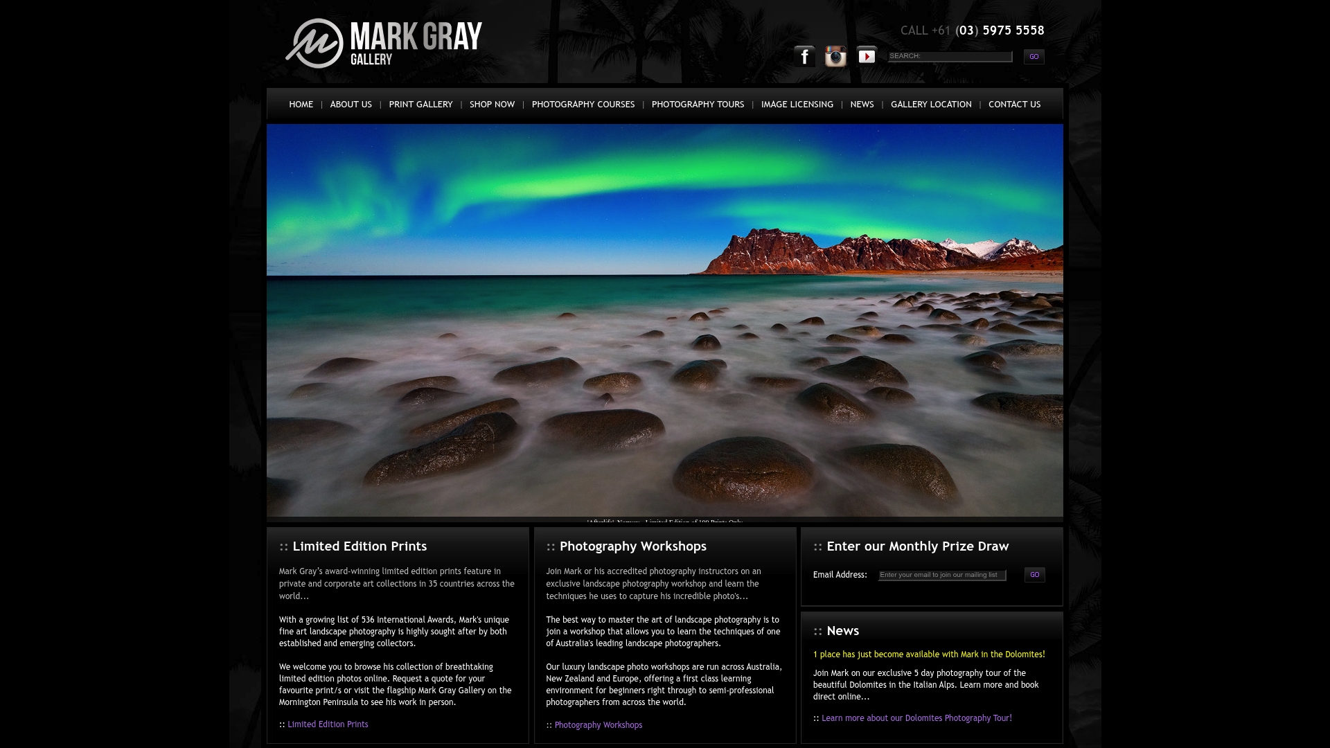
That matters because licensed, gallery-grade files arrive already color-managed and cleared for commercial use, removing the guesswork around whether a stock photo will hold up at storefront or billboard size. Instead of stretching a marginal source image and hoping it survives the print run, a designer working with a suitable catalog starts from files captured specifically for large-scale reproduction. If your next signage project needs imagery that won't buckle under a 20-foot panel, get in touch through the licensing inquiries page to discuss availability for your project.
Sources
- Best Practice: Image Resolution, DPI, And File Size For Digital Signage
- Digital signage: screen resolution — when to choose 1080p vs 4K
- Optimizing Your EMC Sign Resolution for Clear and Sharp Displays