
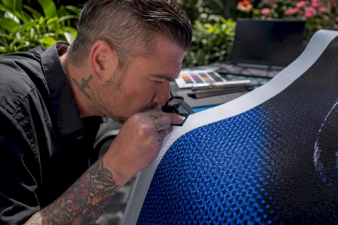
You rarely need 300 DPI at full size for a large print. Choose the image's PPI (pixels per inch) by viewing distance instead: close inspection (150 to 300 PPI), normal room distance (100 to 150 PPI), medium distance across a hall or lobby (50 to 100 PPI), and distant viewing on banners or billboards (10 to 50 PPI). Perceived sharpness depends on how far a viewer stands from the print, not on hitting a fixed resolution number.
One clarification matters before you export anything: an image's PPI at its final printed size is what determines sharpness to the human eye. The printer's own DPI, the density of ink dots it lays down, is a separate mechanical spec. Confusing the two leads photographers to demand file resolutions their printer doesn't need and their hard drive doesn't want to hold.
A few situations still call for pushing PPI higher regardless of distance:
- Fine art prints meant for close gallery inspection
- Any surface where a viewer might walk right up to the piece
- Small text, fine typography, or QR codes that must scan or read cleanly at arm's length
Key Takeaways
Matching image PPI to actual viewing distance, rather than defaulting to 300 DPI, produces sharp large-format prints at a fraction of the file size.
| Point | Details |
|---|---|
| Match PPI to distance | Use 150 to 300 PPI up close, 100 to 150 PPI at room distance, and 10 to 50 PPI for billboards. |
| PPI and DPI differ | Image PPI drives perceived sharpness; printer DPI (360 to 1200) is a separate mechanical output spec. |
| Calculate pixels directly | Multiply width in inches by target PPI to get required pixel width before exporting. |
| Scale working files smartly | Double DPI at 50% working scale, or multiply by 10 at 10% scale, to keep files manageable. |
| Proof before full production | Request test strips and soft-proof with ICC profiles to catch problems while they're cheap to fix. |
| Choose proofed, gallery-grade printing | Com applies ICC-managed proofing to every limited edition print, matching this article's viewing-distance approach. |
Table of Contents
- Setting DPI for Large Prints: Why Viewing Distance Rules Everything
- Optimal DPI for Banners, Posters, and Billboards
- How to Calculate the Pixels You Need for Any Print Size
- PPI, DPI, and the Prepress Details That Prevent Print-Day Surprises
- Practical Steps to Keep Large-Format Files Manageable
- A Proofing Checklist for Large-Format Photographic Prints
- When to Accept Lower PPI and When to Insist on More
- Get Gallery-Grade Proofing for Your Large-Format Prints
- Sources
Setting DPI for Large Prints: Why Viewing Distance Rules Everything
Your eye has a limited angular resolution. Past a certain distance, it physically cannot distinguish individual pixels, no matter how many you cram into the file. That's the entire basis for viewing-distance-based printing, and it's why a billboard looks razor sharp from the highway at 20 DPI while the same file would look like mush held twelve inches from your face.
The 300 DPI figure most photographers grew up with comes from close-reading distances, roughly the arm's length you'd hold a magazine or a photo print. It was never meant to apply to a print viewed from across a room, let alone from a moving car. Kwik Kopy's large-format guidance puts standard viewing at one to three meters comfortably in the 100 to 150 PPI range, and long-distance viewing beyond three meters can drop to 10 to 100 PPI without any visible loss.
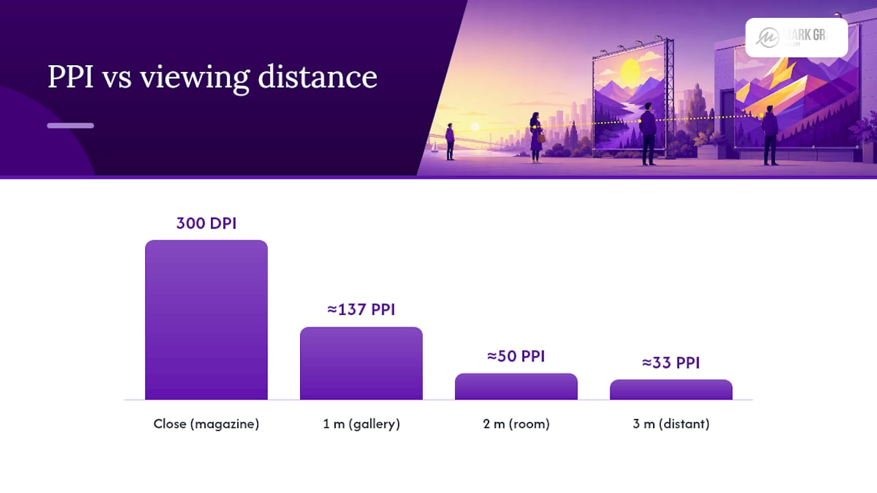
Run the numbers and the logic holds up. At one meter, roughly 137 PPI delivers comparable sharpness to what 300 DPI gives you at normal reading distance. Push back to two meters and that requirement falls to around 50 PPI. At three meters, you're down near 33 PPI, according to Gigapixel GmbH's analysis of the 300 DPI convention. A 5 meter wall print rendered at a blanket 300 PPI would demand a 1.77 gigapixel file. That's not extra quality. That's just a bigger, slower, more expensive file for no visible benefit.
Optimal DPI for Banners, Posters, and Billboards
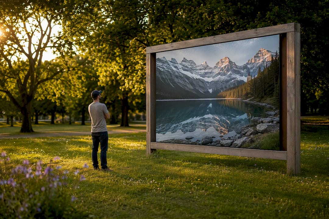
Print size and viewing distance travel together, and once you accept that, choosing a target PPI becomes a lookup rather than a guess. Convention signage viewed from 15 to 25 feet performs well around a 100 DPI baseline, according to Kwik Kopy, and that number balances sharpness against file size better than chasing a higher figure ever would.
| Viewing distance category | Typical viewing range | Recommended PPI |
|---|---|---|
| Close inspection | Under 1 meter | 150 to 300 |
| Standard room distance | 1 to 3 meters | 100 to 150 |
| Medium hall or lobby distance | 3 to 5 meters | 100 to 150 |
| Long distance / roadside billboard | 5 meters or more | 10 to 50 |
These bands match what EmojiFaces' large-format printing guide and Kwik Kopy both document across posters, banners, and billboards.
A few worked examples make this concrete:
- A 24×36 inch poster meant for close viewing at 150 PPI needs roughly 3,600 by 5,400 pixels.
- A 3×8 foot banner at 100 DPI needs approximately 3,600 by 9,600 pixels, per Kwik Kopy's example math.
- A 14×48 foot billboard viewed from a highway can function at 10 to 30 DPI, since no one is close enough to resolve individual dots.
Exceptions still apply. Small body text, QR codes, and fine-line illustration work all need to sit at the higher end of their band, even on a large banner, because legibility fails well before general sharpness would.
How to Calculate the Pixels You Need for Any Print Size
The formula is simple and worth memorizing: width in inches × target PPI = required pixel width. Do the same for height. That single calculation replaces most of the guesswork photographers bring to large-format exports.
Here's how it plays out on two real jobs:
- A 5 meter wall mural at 137 PPI (roughly 197 inches wide): multiply 197 by 137 and you land near 27,000 pixels wide, matching the close viewing distance target from Gigapixel GmbH's 1 meter calculation.
- A 24×36 inch poster at 150 PPI: 24 × 150 = 3,600 pixels wide, 36 × 150 = 5,400 pixels tall. That's a file you can actually open without your computer stalling.
Scaling rules matter just as much as the base formula, especially when you're designing in a program at less than full size. Drop to 10% scale, and you multiply the working DPI by 10, a rule Kwik Kopy uses to keep giant billboard files editable on ordinary hardware.
That extra reserve gives you cropping and composition flexibility without ballooning the file into something unmanageable, an approach Gigapixel GmbH recommends as a sensible upper working limit.*
One warning belongs here permanently: upscaling software can smooth and interpolate pixels, but it cannot invent detail that was never captured. If you know a print is heading to large format, shoot and export at the largest native resolution your camera allows from the start. No amount of clever scaling substitutes for real pixel data.
PPI, DPI, and the Prepress Details That Prevent Print-Day Surprises
PPI describes your file. DPI describes what the printer physically does with that file, laying down ink dots to render each pixel. Commercial Print Services UK notes that large-format printers commonly output at 360, 720, or 1200 DPI, and each image pixel gets rendered using multiple ink dots regardless of your file's PPI. A 150 PPI file printed at 720 DPI still looks sharp, because the printer's dot density and your image's pixel density solve different problems.
That distinction has a direct practical payoff: reducing your file's PPI to match viewing distance shrinks pixel count and eases the load on the printer's RIP (raster image processor) without touching perceived quality at the intended distance. A large-format inkjet like the HP DesignJet XL 3600dr handles high-DPI output natively, but that only matters if your source file gives it clean, correctly sized pixel data to work with.
A short prepress checklist saves real headaches on large jobs:
- Confirm bleed allowance, typically 0.25 to 0.5 inches beyond the trim line for most formats.
- Push safe margins for critical text and logos to at least 0.5 inches on prints 36×48 inches and larger, since large-format equipment has wider cutting tolerances.
- Export as TIFF or high-quality PDF, embed your ICC profile, and flatten or embed linked images and fonts before handoff.
- Confirm your print house's preferred color profile before final export, not after.
Practical Steps to Keep Large-Format Files Manageable
Big prints don't have to mean unworkable files. Design at a fraction of final size, then scale your working DPI proportionally, exactly as covered above, and you'll keep your working files light enough to actually edit.
A few habits make the difference between a smooth job and a frustrating one:
- Work in 16-bit while editing for tonal range, then flatten and convert to 8-bit for final delivery once color and contrast are locked.
- Apply selective sharpening to faces, text, and key focal areas rather than sharpening the entire canvas uniformly.
- Use lossless or high-quality compression on your final export; avoid aggressive JPEG compression on anything headed to large format.
- For oversized files, export test sections at full resolution rather than the entire canvas, so you can check detail without opening a multi-gigabyte file every time.
Pro Tip: Always ask your print house for their preflight specs before you build the file, not after. Requesting a physical test strip on unfamiliar paper stock or a new printer catches color and sharpness surprises while they're still cheap to fix, a habit Rasterbator's poster DPI guide rightly treats as essential rather than optional.
A Proofing Checklist for Large-Format Photographic Prints
Sharpness problems hide at screen resolution and show up at wall size. A short, repeatable check catches them first.
- Zoom to 100% and inspect faces, fine text, and tonal transitions, the three areas where softness shows fastest.
- Print a small contact proof or test strip on your actual paper stock before committing to full size.
- Soft-proof on screen using your printer's ICC profile so color shifts don't surprise you at delivery.
- When in doubt, request a printer test strip. It's cheap insurance against a very expensive mistake.
Com's own print quality assessment guide and color profile walkthrough cover these steps in more depth for readers building out a full prepress workflow.
When to Accept Lower PPI and When to Insist on More
Gallery fine art, close-inspection pieces, and anything with small typography earn the higher end of the PPI range, no exceptions. A collector standing eighteen inches from a limited edition print will notice softness a highway driver never would.
Large murals, trade show backdrops, and roadside billboards are the opposite case. Insisting on 300 PPI there wastes storage and money without adding anything a viewer could perceive. The honest move with clients is naming the actual viewing distance up front, then setting PPI to match it rather than defaulting to whatever number feels safest.
— Mark
Get Gallery-Grade Proofing for Your Large-Format Prints
Com built its printing workflow around exactly the principle this article covers: match resolution and proofing rigor to how a piece will actually be viewed. Every limited edition print goes through ICC-managed color proofing and careful output checks before it ever reaches a collector's wall, whether that's a close-viewed fine art piece or a large statement print meant to anchor a room from across the space.
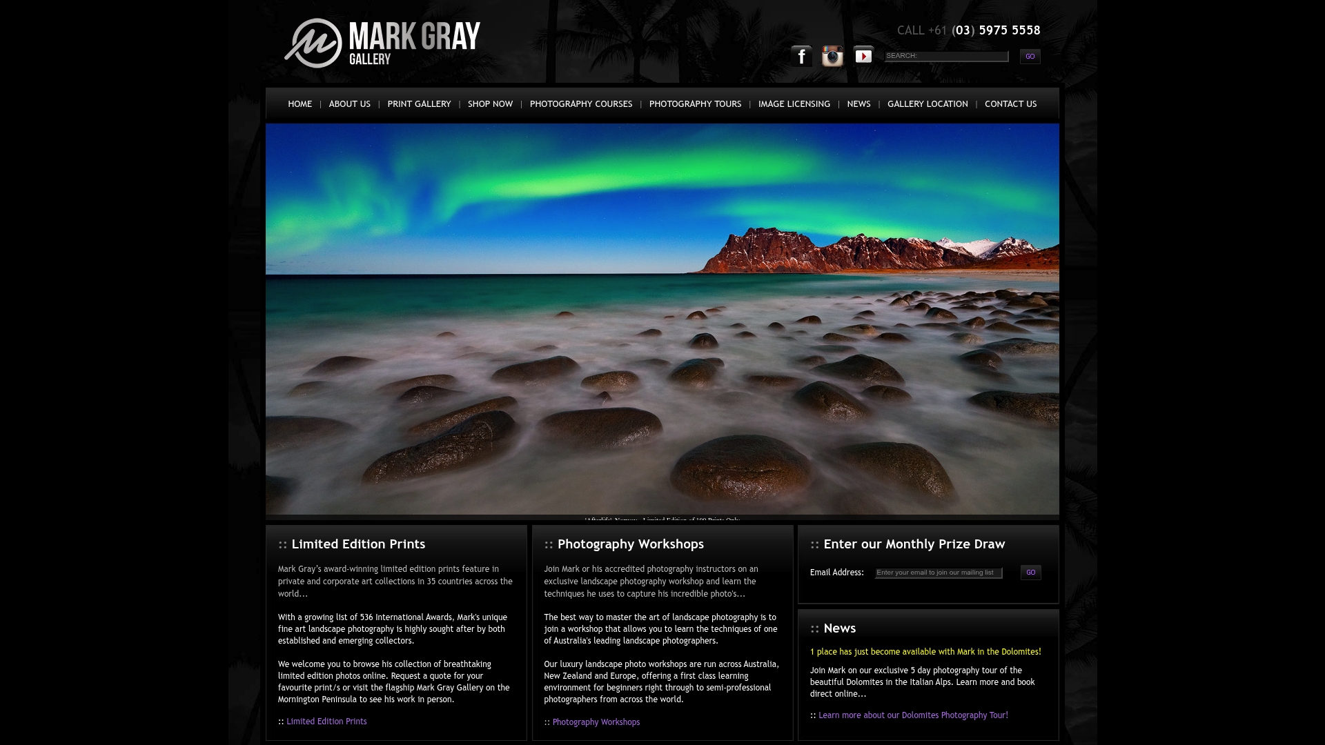
That workflow exists because getting DPI and proofing right the first time protects both the image and the investment behind it. If you're planning a large-format piece and want it handled with the same fine art printing process used for Mark Gray's own limited editions, browse available prints or Markgray to discuss sizing and viewing distance for your space before you order.
Sources
- Top 3 large format printing requirements | Kwik Kopy
- The DPI myth — why 300 DPI is not always necessary | Gigapixel GmbH
- Large-format printing DPI guide — EmojiFaces Blog
- Print resolution for large format: what DPI do you actually need? - Commercial Print Services UK