
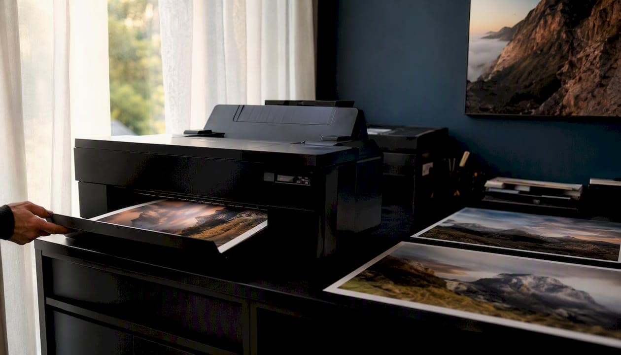
Accurate printed color starts with one decision: use the printer's recommended ICC output profile as your output intent, edit from a calibrated and profiled monitor, soft-proof against that same printer profile, and request a hard proof before any significant run. That single workflow eliminates the most common source of print surprises.
Three immediate actions will get you there:
- Ask your lab for their PDF/X output intent or printer ICC profile before you finalize any file. If they cannot supply one, request which standard profile they prefer (GRACoL 2013, SWOP 2006, or a PSO variant).
- Calibrate and profile your monitor with a colorimeter or spectrophotometer. Without this step, soft-proofing is unreliable regardless of which profile you load.
- Soft-proof and order a hard proof for any color-critical or limited-edition work before committing to a full print run.
Prepare your files with embedded profiles, set the correct PDF/X output intent, and confirm your lab's proofing spec in writing before you send anything.
Key Takeaways
The most reliable path to accurate printed color is a correctly matched ICC output profile, a calibrated display, a verified soft proof, and a signed-off hard proof before any edition goes to press.
| Point | Details |
|---|---|
| Get the printer's ICC profile | Ask your lab for their specific output profile or PDF/X output intent before finalizing any file. |
| Calibrate your monitor first | A colorimeter or spectrophotometer is required; soft proofs are unreliable without a profiled display. |
| Soft-proof with the correct rendering intent | Use Relative Colorimetric with Black Point Compensation for most images; switch to Perceptual for highly saturated scenes. |
| Request a hard proof for critical work | A signed-off proof protects limited-edition integrity and prevents costly reprints. |
| Document profiles and approvals | Record the profile name, rendering intent, and proof sign-off for every edition to ensure consistent reorders. |
Table of Contents
- What are ICC color profiles and why do they matter for printing?
- Which working space should you use: sRGB, Adobe RGB, ProPhoto, or CMYK?
- What are the standard printer profiles and PDF/X output intents?
- How do you use ICC profiles in Photoshop, Lightroom, and InDesign?
- Does monitor calibration really affect your soft proofs?
- Preflight checklist before sending files to the printer
- When is a custom printer profile worth the cost?
- Common printing problems and how to fix them
- Pro tips from professional fine-art print workflows
- An honest perspective on when color management pays off
- Professional color management for your most important prints
- Sources
What are ICC color profiles and why do they matter for printing?
An ICC profile is a standardized translation file that describes the exact color behavior of a specific device or printing condition. It maps that device's color range into a common reference space, the Profile Connection Space, so that color stays consistent as a file moves from camera to monitor to printer. The ICC white paper describes profiles as translators: without them, each device interprets color independently, and results become unpredictable across the pipeline.
In a color-managed workflow, profiles sit at every handoff point: capture, editing, proofing, and output. Your camera embeds a source profile. Your editing application uses a working-space profile. Your monitor has its own display profile. And your printer or print lab uses an output profile tied to a specific ink set, paper, and press condition. When all four are correctly assigned and consistent, the color management system (CMS) can translate accurately between them. Adobe's color management guidance notes that a CMS becomes especially valuable when files move across multiple devices or workstations, since each device introduces its own interpretation of color without a shared reference.
The gamut gap between a monitor and a printer is real and significant. Most inkjet and offset printers cannot reproduce the full range of colors a calibrated display can show, particularly in saturated blues and greens. Soft-proofing simulates that narrower gamut on screen, but only when the display itself is accurately profiled. An uncalibrated monitor produces a soft proof that reflects the monitor's drift, not the printer's actual output.
Which working space should you use: sRGB, Adobe RGB, ProPhoto, or CMYK?
Choosing the right working space is one of the most consequential decisions in printing color management. The table below summarizes the four main options and when each fits best.
| Working Space | Gamut Coverage | Best For | When to Use |
|---|---|---|---|
| sRGB | Narrowest | Web, consumer labs, basic home printing | Files destined for online use or labs that specify sRGB input |
| Adobe RGB (1998) | Medium-wide | Professional photo printing, wide-gamut inkjet | Editing images for high-quality inkjet or offset when your monitor covers most of Adobe RGB |
| ProPhoto RGB | Widest | Raw processing, archival editing | Only when your full pipeline (monitor, software, output) supports wide-gamut; convert at final step |
| CMYK (e.g., GRACoL 2013) | Press-specific | Commercial offset, final delivery to press | Final conversion step for offset or digital press; never edit in CMYK from the start |
The practical decision rule: edit in Adobe RGB if your monitor covers most of that space and your print target is a professional inkjet or offset press. Stick to sRGB for consumer labs and any workflow where the downstream handling is uncertain. ProPhoto RGB is worth using only when you are processing raw files and your entire pipeline, including your display and output profile, can handle the wider gamut without clipping. Converting to ProPhoto and then viewing on an uncalibrated sRGB monitor defeats the purpose entirely.
CMYK is a destination, not a working space. Convert to the target CMYK profile as the final step, after all editing and retouching are complete. Editing in CMYK from the start limits your options and can introduce rounding errors across repeated adjustments. The Adobe color management guidance supports device-specific CMYK tailoring only when production is tightly controlled to a single press condition, which is rarely the case for photographers working across multiple labs or substrates.
Pro Tip: If you are working from raw files, edit in a wide-gamut RGB space and only convert to the print target profile at the final step. This avoids premature clipping of out-of-gamut colors. Then soft-proof the converted result using that same target profile to verify what the press will actually reproduce.
What are the standard printer profiles and PDF/X output intents?
Standard reference profiles define known printing conditions so that files can be prepared consistently, even before a custom press profile exists. The PDFlib PDF/X output intent documentation maps common printing processes to specific starting profiles, which makes these profiles the correct choice when your print provider cannot supply a custom ICC.
| Standard Profile | Process / Region | Paper Type | Primary Use Case |
|---|---|---|---|
| GRACoL 2013 | Sheet-fed offset, U.S. | Coated #1 | High-quality U.S. commercial offset; preferred U.S. PDF/X output intent |
| SWOP 2006 (CRPC5) | Web offset, U.S. | Coated #3 / #5 | U.S. magazine and publication printing |
| PSOcoated_v3 | Sheet-fed offset, Europe | Coated | ISO 12647-2 coated; European commercial offset |
| PSOuncoated_v3 | Sheet-fed offset, Europe | Uncoated | ISO 12647-2 uncoated; European uncoated stock |
| PSO LWC Improved | Web offset, Europe | LWC / lightweight coated | European magazine and catalog printing |
GRACoL and its related CRPC datasets, maintained by Idealliance and PRINTING United Alliance, serve as the primary reference conditions for sheet-fed offset in the United States. For European or ISO-aligned workflows, the PSO profiles from ECI (European Color Initiative) cover the equivalent conditions under ISO 12647-2.
PDF/X requires a printer profile as the output intent. Unlike PDF/A, which uses a different intent structure, PDF/X output intents must reference a valid CMYK printer profile tied to the target printing condition and paper. Your print provider should specify which output intent they require. If they do not, GRACoL 2013 is the correct starting point for coated sheet-fed offset in the U.S., and SWOP 2006 covers web-offset publication work.
Download registered profiles from the ICC Profile Registry, which links each profile to its characterized dataset and metadata. Profiles from the registry are tied to verified printing conditions, which makes them a far safer choice than profiles sourced from random internet searches.
How do you use ICC profiles in Photoshop, Lightroom, and InDesign?
Photoshop workflow
- Set your working space. Go to Edit > Color Settings. Set the RGB working space to Adobe RGB (1998) for professional print work, or sRGB if your lab specifies it. Set the CMYK working space to your target output profile (e.g., GRACoL 2013).
- Assign vs. convert. Use Edit > Assign Profile only to correct a wrongly tagged file without changing the numbers. Use Edit > Convert to Profile to actually translate pixel values into the target space. For final press delivery, convert to the target CMYK profile here.
- Set up soft proofing. Open View > Proof Setup > Custom. Select your printer's ICC profile from the Device to Simulate menu. Choose Relative Colorimetric with Black Point Compensation (BPC) for most photographic images. Enable Simulate Paper Color to see the full simulation, including paper white.
- Check gamut warnings. Enable View > Gamut Warning (Shift+Ctrl+Y / Shift+Cmd+Y). Out-of-gamut areas appear in gray. If large portions of the image are flagged, consider switching to Perceptual rendering intent, which compresses the entire gamut rather than clipping.
- Export. For press delivery, use File > Export > Export As or Save As with the target profile embedded. For PDF/X, use File > Save As > Photoshop PDF, select a PDF/X preset, and confirm the output intent matches your target profile.
Lightroom workflow
Lightroom's develop module works in a fixed ProPhoto RGB internal space. For soft-proofing, open the Soft Proofing panel in the Develop module, select your printer's ICC profile, and choose your rendering intent. Lightroom creates a proof copy automatically when you make proof-specific adjustments. On export, select the target color space (sRGB, Adobe RGB, or a custom profile if your lab accepts it) and confirm the "Include Color Profile" checkbox is active.
InDesign and PDF/X export
In InDesign, go to Edit > Color Settings and match the working spaces to your Photoshop setup. When placing images, InDesign reads embedded profiles and manages color through the document's color settings. For PDF/X export, use File > Export > Adobe PDF (Print), select a PDF/X-4 or PDF/X-1a preset, and in the Output panel set the Color Conversion to "Convert to Destination" with the destination set to your target printer profile. Set the Profile Inclusion Policy to "Include Destination Profile." This embeds the output intent correctly and ensures the RIP at the print provider reads the file consistently.
Pro Tip: Untagged or DeviceRGB content in an InDesign document is a common source of color surprises. Before export, use the Preflight panel to flag any placed images that lack embedded profiles. Fix them at the source, not at the RIP.
The Cambridge in Colour soft-proofing tutorial covers rendering intent effects and the simulate-paper toggle in detail, which is worth reviewing before your first press-ready export.
Does monitor calibration really affect your soft proofs?
Yes, and the effect is significant. X-Rite's soft-proofing guidance is direct on this point: calibration and profiling are prerequisites for a reliable soft proof. An uncalibrated display introduces its own color cast, brightness drift, and white-point error into every on-screen simulation, making the soft proof reflect the monitor's condition rather than the printer's output.
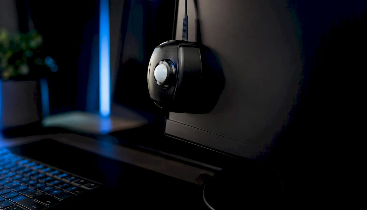
For photographic proofing, target a white point of D65 (6500K) for general editing or D50 (5000K) if you are matching to a physical proof viewed under D50 viewing conditions. A gamma of 2.2 is standard for most print workflows. Luminance between 80 and 120 cd/m² is appropriate for most studio environments. Ambient lighting matters too: a bright, color-shifted room light will skew your perception of even a perfectly calibrated display.
The recommended tools are a hardware colorimeter or spectrophotometer. X-Rite's ColorMunki and i1Display lines, and Datacolor's Spyder series, are the most widely used instruments for this purpose in the U.S. Colorimeters are faster and more affordable; spectrophotometers offer higher accuracy and are worth the investment for color-critical fine-art print work.
Soft-proof settings to verify every session: rendering intent (Relative Colorimetric with BPC for most images, Perceptual for highly saturated scenes), Simulate Paper Color, and gamut warnings. The Cambridge in Colour tutorial explains how toggling Simulate Paper Color reveals the full contrast compression a print will exhibit, which is often more dramatic than photographers expect.
Preflight checklist before sending files to the printer
Run through every item below before submitting any file to a print lab or commercial printer.
- Embedded profiles confirmed: every image file has an embedded ICC source profile; no untagged images in the document.
- PDF/X output intent set: the export preset specifies the correct target profile (GRACoL 2013 for U.S. coated offset, or the lab's specified profile).
- Image resolution: 300 ppi at final print size for photographic content; 600 ppi for fine line art or text.
- File format: PDF/X-4 for most modern workflows; PDF/X-1a if the lab requires legacy compatibility.
- Fonts: all fonts outlined or fully embedded in the PDF.
- Spot colors: converted to process CMYK if the press does not support spot channels, unless the job specifically requires spot ink.
- Proof approval: a hard proof or digital proof has been approved and signed off before the run begins.
Questions to ask your printer before submission:
- Which ICC output intent do you require, and can you supply your custom printer profile?
- Which rendering intent do you apply to photographic images versus flat graphics?
- Will you handle color conversion at the RIP, or do you require pre-converted CMYK files?
- Is a hard proof included in the quote, and what is the turnaround?
The Adobe color management documentation reinforces that when files move across multiple devices or workstations, consistent profile embedding is the single most effective way to prevent unpredictable output. For a deeper look at what separates a good print from a great one, the photography print quality guide covers calibration requirements and verification steps in detail.
When is a custom printer profile worth the cost?
Standard profiles like GRACoL 2013 are excellent starting points, but they describe average press conditions. A custom ICC profile is built from a test chart printed on your specific press, with your specific inks, on your specific paper. For limited-edition fine-art prints, brand-critical color work, or any run where color accuracy is a commercial or artistic commitment, a custom profile is worth every dollar.
Typical turnaround for custom profiling: the lab prints a test target (usually an IT8 or ECI 2002 chart), measures it with a spectrophotometer, and builds the profile. The process takes one to three business days from chart print to verified profile delivery. Some labs offer same-day profiling for premium jobs.
Cost ranges vary by provider and scope. A basic custom inkjet profile from a U.S. profiling service typically runs in the range of $50–$150 per paper/ink combination. On-press profiling for commercial offset, which involves press-side measurement and G7 or GRACoL calibration, costs more and is usually quoted per press condition. Hard proofs from a certified proofing system add $20–$80 per proof sheet depending on size and the provider's certification level.
For limited-edition print series, the investment in a custom profile and a signed-off hard proof protects the integrity of every print in the edition. The cost per unit drops sharply across a run of 25 or more prints, making custom profiling a sound production decision rather than a luxury.
Request a quote and a test/proof schedule from your print provider before committing to any edition. Ask specifically whether their proofing system is G7 or GRACoL certified, and whether they can supply a verification strip with the proof.
Common printing problems and how to fix them
- Unexpected color shift (print looks warmer or cooler than screen): the most common cause is a mismatched or missing output profile. Verify that the PDF/X output intent matches the profile the lab is using. If the lab converted the file at the RIP without knowing your source profile, the result will be unpredictable.
- Muddy or blocked-up shadows: check Black Point Compensation. BPC should be enabled in both your soft-proof settings and your conversion settings. Without it, the darkest tones in your file map to absolute black on press, compressing shadow detail.
- Loss of saturation in blues and greens: these colors are frequently outside the gamut of CMYK presses. Use gamut warnings in Photoshop to identify affected areas. Switch from Relative Colorimetric to Perceptual rendering intent if large areas of the image are affected; Perceptual compresses the whole gamut proportionally rather than clipping out-of-gamut values.
- Unexpected color cast across the whole image: suspect a profile assignment error. Open the file in Photoshop and check Edit > Assign Profile. If the embedded profile does not match the actual editing space the file was built in, reassign the correct profile before converting.
- Banding in gradients: usually a resolution or bit-depth issue rather than a profile problem. Confirm the file is 16-bit for photographic work and that the output resolution is correct for the press.
- Print looks flat compared to the soft proof: the Simulate Paper Color option in soft proofing was likely disabled, so the proof did not show the full contrast compression the paper white introduces. Re-proof with Simulate Paper Color enabled to set accurate expectations.
When banding or color drift appears on a reorder from the same lab, suspect press drift rather than a profile error. Color management (initial profiling) and color control (ongoing press verification) are separate disciplines. As Fiery's color management guidance explains, a press can drift between runs even when the original profile was accurate, which is why scheduled verification and recalibration matter for consistent long-run production.
For substrate-related surprises, paper choice has a direct effect on color gamut and perceived contrast. The photographic paper vs fine art paper guide explains how substrate differences translate into color and proofing decisions.
Pro tips from professional fine-art print workflows
Fine-art and limited-edition printing demands a higher standard of color control than most commercial jobs. These practitioner-level practices separate repeatable, gallery-quality results from one-off approximations.
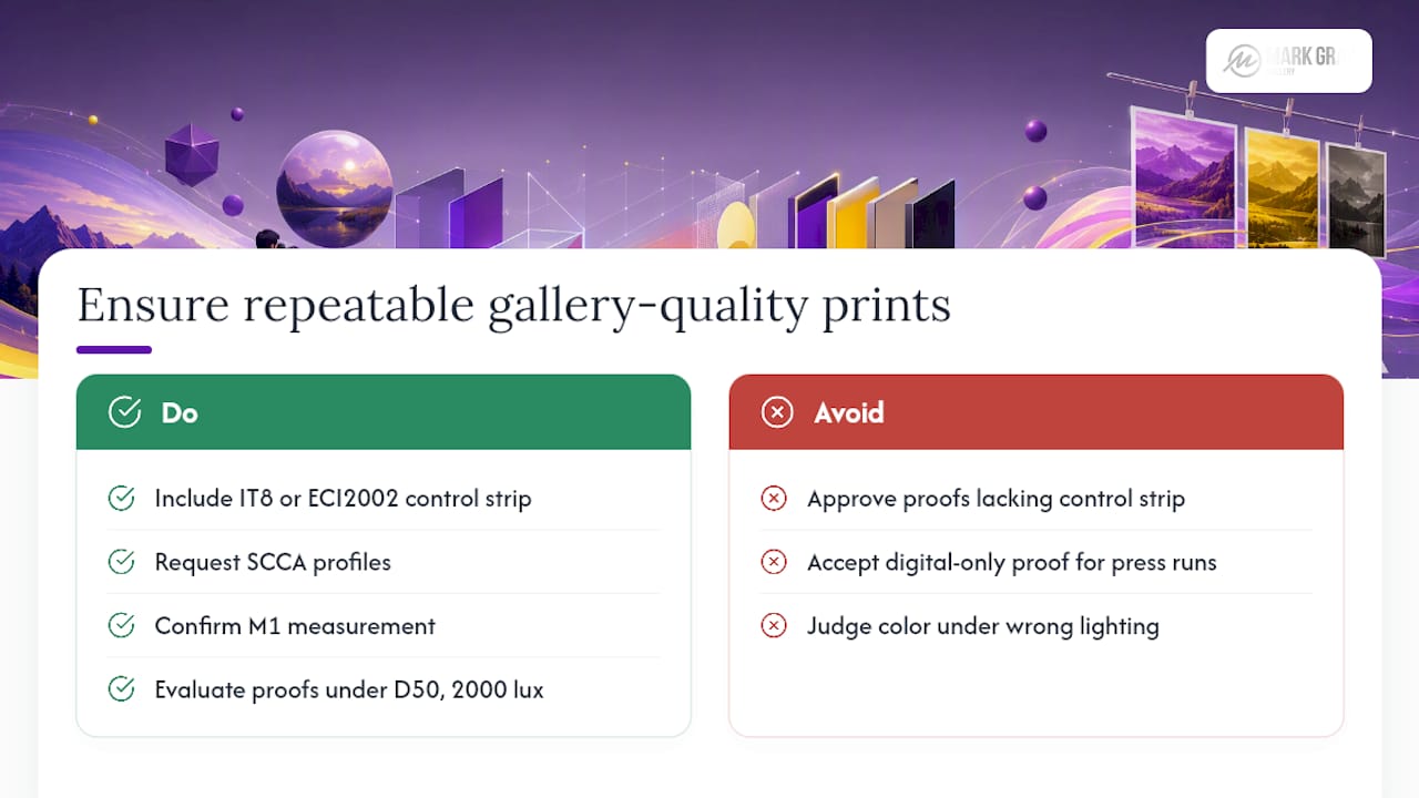
Pro Tip: Request a control wedge or verification strip on every press proof. A printed IT8 or ECI 2002 strip alongside your image lets you measure whether the proof is within tolerance before you approve it. If the strip is out of spec, the proof is not valid, regardless of how good the image looks.
Request SCCA-adjusted profiles when your paper contains optical brightening agents (OBAs). OBAs respond to UV light and shift the apparent white point of the paper under different lighting conditions. A standard profile built without accounting for OBAs will produce a soft proof that looks accurate under one light source and shifts noticeably under another. Ask your profiling service whether they measure under M1 illumination (which includes UV) when building profiles for OBA papers.
Viewing conditions for proofs and final prints matter as much as the profile itself. The ISO standard for proof evaluation is D50 illumination at 2000 lux. If you are evaluating a proof under warm incandescent light or cool fluorescent tubes, your color judgment will be wrong. A dedicated D50 or D65 viewing booth, such as those from Just Normlicht or GTI, is a worthwhile investment for any studio producing color-critical work. For displaying large-format prints, the same principle applies: the gallery lighting under which a print will be viewed should inform the proofing conditions.
For press-critical limited editions, require a press proof, not just a digital proof. A digital proof from a certified inkjet proofing system is excellent for color verification, but a press proof on the actual substrate confirms ink trapping, dot gain, and paper interaction in ways a digital proof cannot replicate. The fine art printing process guide covers end-to-end production steps, including where proofing fits in the approval chain.
An honest perspective on when color management pays off
There is a temptation, especially among photographers new to print production, to treat color management as a problem to solve once and then forget. The reality is more nuanced. Standard profiles like GRACoL 2013 are genuinely excellent for most U.S. commercial offset work. For a photographer sending files to a well-run lab that maintains G7 calibration, the standard profile plus a calibrated monitor and a single hard proof will produce outstanding results without any custom profiling at all.
Where the calculation changes is in limited-edition fine-art printing. When a print is numbered, signed, and sold as a collectible, the color in that print is part of its value. A custom profile built for the specific paper and press, a proof approved under D50 viewing conditions, and a verification strip on every run are not excessive. They are the production standard that the work deserves.
My recommendation: self-manage color for open-edition and standard commercial work using the workflow in this guide. For limited editions, numbered series, or any print where color accuracy is a commercial commitment, invest in custom profiling and a certified proof. The cost is modest relative to the value of the work, and the peace of mind is considerable.
Professional color management for your most important prints
When a print represents your finest work, standard profiles and a best-guess soft proof are not enough. Mark Gray Gallery offers professional-grade color guidance for photographers preparing limited-edition landscape prints for press, including advice on output intent selection, custom profiling recommendations, and proof approval workflows tailored to fine-art production.
The limited-edition landscape photography prints available through Mark Gray Gallery are produced with the same rigorous color standards described in this guide: calibrated output, substrate-specific profiles, and proof-approved color for every edition. If you are preparing your own work for print and want guidance on profile selection, rendering intent, or proof specifications, the gallery is a practical reference point for what color-accurate fine-art printing looks like at a professional standard. Visit Markgray to explore the collection and reach out directly for production inquiries.
Sources
Downloading profiles from verified, registry-linked sources is the single most effective way to reduce guesswork and mismatch risk. A profile sourced from an anonymous forum post carries no metadata linking it to a characterized dataset, which means you cannot verify whether it accurately represents the printing condition it claims to describe.
The ICC Profile Registry is the authoritative starting point. Every registered profile is linked to its characterized dataset and printing condition metadata, covering CRPCs, ISO references, and standard process conditions. For U.S. workflows, GRACoL 2013 and SWOP 2006 profiles are available here alongside their full characterization data.
Idealliance and PRINTING United Alliance host GRACoL and CRPC datasets, ECG (expanded color gamut) tools, and G7 calibration resources. These are the primary downloads for U.S. commercial offset and proofing workflows.
ECI (European Color Initiative) provides PSO profiles, ISO 12647-2 characterization data, and expanded-gamut profile packages for European and ISO-aligned production. U.S. photographers working with European print partners or labs that specify PSO profiles will find everything they need here.
Adobe's ICC profile package, available through Adobe's support pages, includes standard profiles for common printing conditions and is pre-installed with Photoshop and InDesign. These are the same registered profiles available from the ICC Registry, packaged for immediate use within Adobe applications.
The PDFlib PDF/X output intent documentation provides the definitive reference for which profiles map to which printing processes and regions, making it the correct resource when a print provider cannot specify their preferred output intent.
- PDFlib: PDF/X output intents (knowledge base)
- X‑Rite: soft-proofing and display calibration guidance
- Adobe: color management in Acrobat