
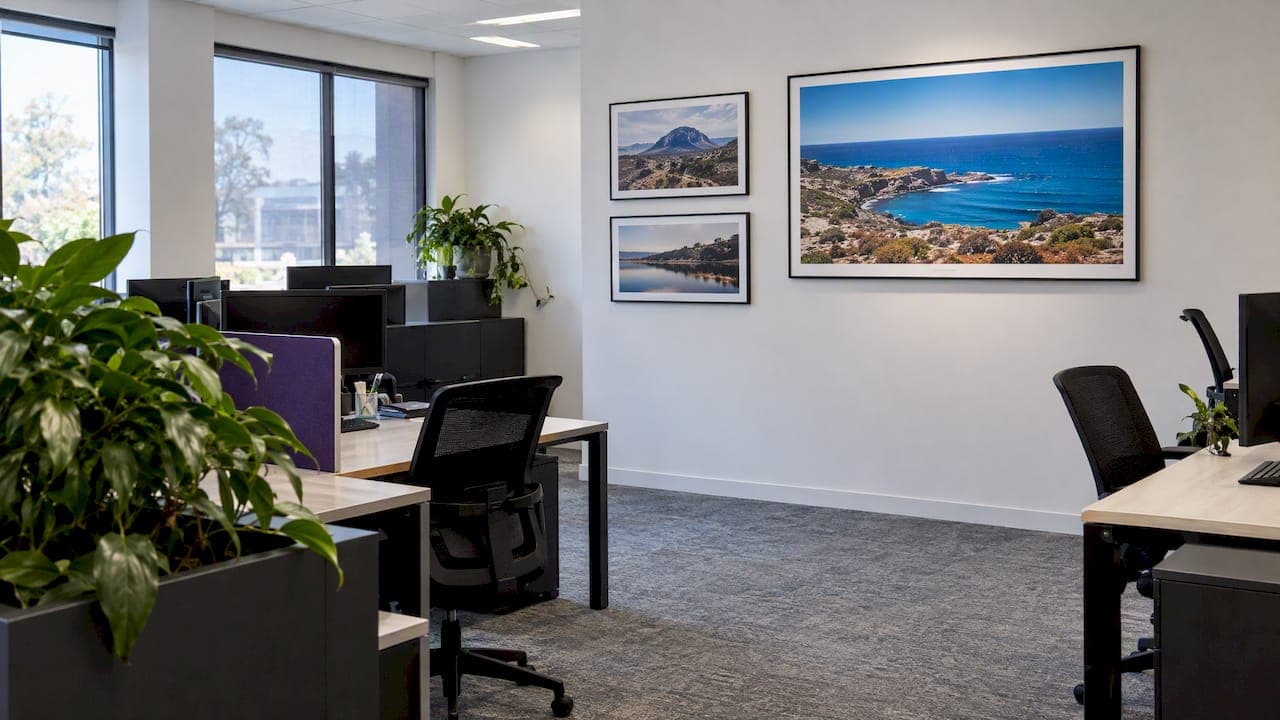
The fastest way to make an open plan office look curated and work better is to combine large scale calming images with targeted acoustic art, then follow a 70/30 accent rule so the space stays visually balanced rather than cluttered. This mix delivers three wins at once: clear visual zoning, a consistent brand signal, and measurable gains in sound absorption where meeting pods and breakout areas need it most.
TL;DR:
- Shift the visual balance to 80/20 in focus zones or 60/40 in breakout rooms, concentrating accents near meeting pods and other collaboration points.
- Reserve oversized pieces for walls viewed from at least 3 meters away, and place each artwork’s midpoint 150 to 160 centimeters above the floor.
- Commercial acoustic art typically carries NRC ratings from 0.70 to 0.90; treat ceilings first, then add wall pieces near noisy meeting areas.
- Choose fade resistant inks near windows, and use bold shapes or gradients on acoustic fabric because fine lines and small text reproduce poorly.
Table of Contents
- 1. Art Styles and Formats That Suit Open Plan Offices
- 2. Applying the 70/30 Rule to Size, Place, and Scale Your Collection
- 3. Acoustic Art Options That Cut Noise Without Looking Industrial
- 4. Sourcing and Commissioning Office-Grade Photography
- 5. What Years of Landscape Photography Have Taught Us About Office Walls
- 6. Bring These Ideas Into Your Office Through Our Gallery
- FAQ
- Sources
1. Art Styles and Formats That Suit Open Plan Offices
Open plan layouts reward art that calms the eye without competing with people, screens, and movement. Here is a curated menu to choose from, organized by what each format does best.
- Landscape photography: large, uncluttered horizons and natural color palettes give busy, collaborative zones a visual resting point, which is why we lean on it across our own gallery work.
- Large abstracts and gradients: bold, brand-aligned color fields work well on feature walls where a company wants a strong visual identity without literal imagery.
- Modular series (diptychs and triptychs): splitting one scene across two or three panels lets a collection grow with the business instead of forcing a full wall redo.
- Printed acoustic panels and ceiling tiles: dual-purpose pieces that look like art while absorbing sound, ideal for walls and ceilings near noisy clusters.
- Murals and removable wallpaper: high-impact branding for reception or hallway walls that can be swapped out without structural change.
- Framed prints, acrylic blocks, and gallery mounts: polished, client-facing finishes suited to reception desks and executive corners.
Landscape photography earns its place at the top of this list because it reads as calm from across a room and as detail up close, which suits spaces where people glance up between meetings rather than stand and study a piece. Large abstracts and gradients do similar work for teams that want color and energy tied to a brand palette rather than a literal scene.
Modular series solve a practical problem: most offices do not fit out every wall on day one. A diptych today can become a triptych next year without disturbing what is already hung, and repeating a theme across floors keeps a growing office visually coherent.
Printed acoustic panels and acoustic ceiling tiles deserve a category of their own, since they solve a design problem and a noise problem simultaneously. We cover sizing and acoustic ratings in detail in the next two sections.
A quick note on durability: offices are high-traffic, sunlit environments, so UV-resistant inks and lamination matter more than they would in a quiet study at home. Prints near windows or under strong downlights should always be specified with fade-resistant inks, and any acoustic fabric face should be rated for commercial wear.
2. Applying the 70/30 Rule to Size, Place, and Scale Your Collection
In an open plan office, that means most walls stay quiet so the remaining accent walls actually get noticed.
The ratio is not fixed. Quiet, focus-heavy zones benefit from an 80/20 split with fewer, larger statement pieces, while collaboration hubs and breakout rooms can push toward 60/40, using more frequent accents to signal energy and interaction. Design guidance also recommends placing art at interaction nodes, meeting pods, and breakout corners, so the 30% accent allocation visually marks where collaboration happens.
A few sizing heuristics make the rule easy to apply:
- Reserve large-format pieces for walls with at least 3 meters of clear viewing distance, so the composition reads properly from a desk or hallway.
- Hang the center of a piece at roughly eye level above the nearest furniture line, typically 150 to 160 centimeters from the floor to the artwork's midpoint.
- Let a single large piece or a modular series cover a meaningful fraction of a feature wall rather than scattering several small frames across it.
- Plan modular diptychs or triptychs from the start if the wall may need to expand later, since matching finishes later is harder than ordering them together now.
The 70/30 rule comes from interior design practice, where 70% of a room anchors it in a neutral, calm palette while the remaining 30% introduces contrast and focal interest, a ratio that translates directly into office art planning.
For exact measurement templates and wall-to-piece ratios, our wall art size guide walks through the math room by room.

3. Acoustic Art Options That Cut Noise Without Looking Industrial
Acoustic art refers to printed panels and ceiling tiles that double as sound absorbers, typically rated between NRC 0.70 and 0.90, meaning they absorb roughly 70% to 90% of the sound that hits them rather than reflecting it back into the room. In an open plan layout, that range is the difference between a workable breakout zone and one nobody wants to use for calls.
The priority order matters. Ceilings are usually the largest continuous reflective surface in an open office, so treating the ceiling first, before touching a single wall, is the move recommended by acoustic specialists assessing echo problems. A simple clap test in the room will tell you quickly whether reverberation is coming from above or from bare walls near meeting nodes.

A real-world example makes the order concrete: a Brisbane office fitout for Megaport used printed wall panels and ceiling tiles together, with 24mm wall panels rated NRC 0.70 covering a feature wall and Quietspace ceiling tiles rated NRC 0.85 installed into the existing suspended grid.
A few practical notes before you brief a supplier:
- Printed acoustic panels are commonly available from 600 x 600 millimeters up to 2400 x 1200 millimeters, so plan wall art around those modules rather than a single oversized sheet.
- When a design spans multiple panels, plan the joins to fall across low-detail areas like sky or water rather than through a focal point.
- Polyester acoustic faces diffuse ink slightly more than rigid print substrates, so fine line work and small text do not reproduce as cleanly as bold shapes.
Pro Tip: Specify artwork for acoustic panels as large shapes and soft gradients, and leave hairline detail and small type for rigid prints elsewhere on the wall.
4. Sourcing and Commissioning Office-Grade Photography
Deciding how to source art for a corporate space usually comes down to three paths: buying an existing print, licensing an image for a specific use like signage or a splashback, or commissioning bespoke photography sized to a particular wall. Licensing suits recurring commercial applications, buying suits a straightforward feature wall, and commissioning suits a space with an unusual dimension or a brand story to tell.
Before approaching a photographer or gallery, it helps to have answers ready on:
- Exact wall measurements and the finished artwork size, including any trim for framing or panel joins.
- File format, resolution, and color profile requirements for large-format printing.
- Framing, mounting, or acoustic-backing preferences, plus any fire-rating or warranty questions for a commercial fitout.
Turnaround varies by product: limited-edition prints and custom acoustic panels both involve print production time plus installation scheduling, so it pays to brief early rather than against a move-in deadline. Our own gallery offers limited edition prints, open edition prints, and image licensing for commercial use, alongside framing and delivery support. For a full walk-through of file specs and briefing steps, see our commissioning guide for corporate offices.
5. What Years of Landscape Photography Have Taught Us About Office Walls
Landscape photography works in open plan offices because scale does the emotional work that subject matter alone cannot. A wide, well-lit horizon calms a room the way a cluttered collage of small frames never will, and the right palette can echo a brand's colors without shouting about it. Projects we have supplied prints and licensed images for confirming what the acoustic case studies also show: the biggest visual and acoustic wins come from a handful of well-placed, well-scaled pieces rather than many small ones.
— Mark
6. Bring These Ideas Into Your Office Through Our Gallery
Turning this plan into hung artwork is straightforward through our gallery: browse limited edition and open edition prints for feature walls, request image licensing for signage or splashbacks, or ask about acrylic block finishes for reception and desk displays.
Reach out through Markgray to discuss sizing, panel layouts, or a bespoke commission for your next fitout.
FAQ
What is the 70/30 rule in art?
In offices, that 30% is typically concentrated on feature walls or near collaboration hubs, and the ratio can shift to 80/20 in quiet zones or 60/40 in high-energy breakout areas.
How do I design my work office?
Start by splitting walls into calm, neutral surfaces and a smaller set of accent walls using the 70/30 rule, then treat acoustics before finalizing art placement since ceiling treatment often solves echo problems that wall art alone cannot. Layer in large-format photography or abstracts for visual calm, and reserve printed acoustic panels for walls near meeting nodes.
What art to put in an office?
Large-scale landscape photography, bold abstracts, and modular diptych or triptych series all suit open plan offices because they read clearly from a distance and avoid visual clutter. Printed acoustic panels and ceiling tiles are worth prioritizing wherever noise is a problem, since they function as both artwork and sound treatment.
How to make your office look expensive?
A handful of large, well-framed, high-quality prints consistently reads as more considered than many small frames, especially in reception or client-facing areas. Acrylic block mounts and gallery-standard framing add a finished look, and keeping to the 70/30 rule prevents a space from feeling cluttered or over-decorated.
Do acoustic art panels actually reduce office noise?
Yes, acoustic art panels designed for commercial use typically carry NRC ratings between 0.70 and 0.90, meaning they absorb a substantial share of the sound that reaches them. Treating the ceiling first, then walls near meeting pods, generally produces the most noticeable reduction in echo.
Sources
- Acoustic ceiling tiles in a Brisbane office fitout – Acoustic Sound Products
- Acoustic Art LX33 Powder Coat - Starry | The Office Furniture
- NRC noise rating | Akustik Australia