
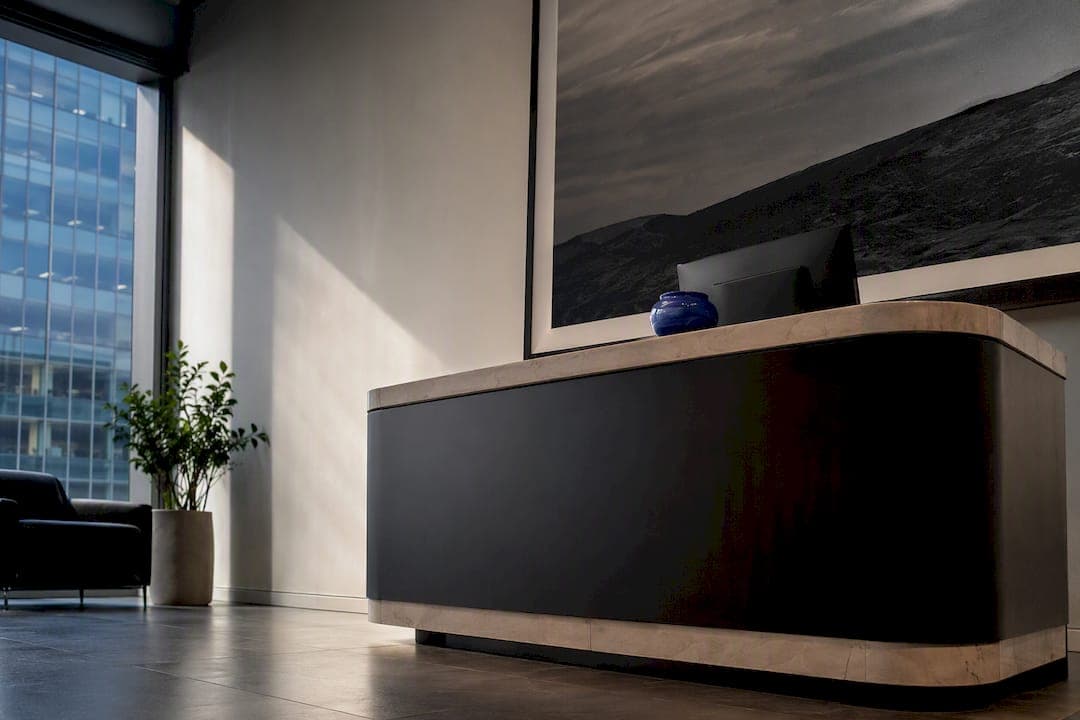
For most reception areas, one large statement piece or a coordinated gallery cluster sized to cover roughly 60 to 75% of the wall or desk width delivers the clearest first impression. That sizing rule, paired with art chosen to match your brand's tone, does more for a lobby than any furniture upgrade. A proper sizing guide removes the guesswork.
TL;DR:
- Using a large statement piece or gallery cluster that covers 60 to 75% of the wall ensures a confident and memorable impression in reception areas.
- Proper sizing, such as 36 to 45 inches for desks and 48 to 60 inches for open walls, significantly enhances visual impact and cohesiveness.
- High-traffic environments benefit from durable finishes like acrylic or metal prints, with matte canvas and acoustic panels providing added glare reduction and noise control.
- Strategic lighting at 30 degrees with high CRI bulbs and correct placement improves art appearance and minimizes glare in busy lobbies.
- Investing in appropriately sized, high-quality photography, especially limited editions, elevates brand perception and longevity of the artwork.
Table of Contents
- Reception Wall Art Ideas Worth Stealing
- Sizing and Placement Rules That Actually Work
- Materials and Finishes for High-Traffic Lobbies
- Lighting and Acoustics That Look Intentional
- Curating Art That Matches Your Brand
- What a Photographer Wants You to Know Before You Buy
- Keeping Reception Art Looking New
- What Reception Wall Art Actually Costs
- Why Curated Art Changes How a Lobby Feels
- Bring Gallery-Quality Photography Into Your Lobby
- Sources
- FAQ
Reception Wall Art Ideas Worth Stealing
Most reception walls fail for one of two reasons: the art is too small for the space, or it says nothing about the business behind it. The ten ideas below solve both problems, and each one works for a different wall shape, budget, and brand personality.
One bold statement piece behind the desk. This works best when your reception wall is a single unbroken surface with no doors, switches, or signage competing for attention. A single large landscape photograph or abstract canvas, sized to the two-thirds rule described below, reads as confident rather than empty. It's the fastest route to a memorable entrance, and it's the approach most corporate lobbies land on because it requires the least ongoing maintenance.
A gallery cluster instead of one piece. When the wall is wide but broken up by outlets, thermostats, or an awkward door swing, a cluster of three to five smaller framed prints often works better than one oversized canvas. The trick is treating the whole cluster as a single visual mass rather than a scattered collection. Keep spacing between frames consistent (2 to 3 inches is standard) and align the outer edges so the group reads as one shape, not five separate decisions.
Brand-aligned abstract art for energy-driven businesses. Tech firms, agencies, and startups often lean toward bold abstract compositions because sharp lines and saturated color read as forward-thinking. Save this for lobbies where you want visitors to feel the pace of the business the moment they walk in.
Calming landscapes for client-facing and wellness spaces. Smooth natural forms and horizon lines tend to lower the emotional temperature of a waiting area, which matters most in healthcare, legal, and financial offices where clients often arrive anxious. A wide seascape or a soft mountain vista does more to settle a waiting room than a motivational quote print ever will.
Premium photographic prints for prestige positioning. Limited-edition landscape photography, especially printed large and mounted well, signals a level of investment that generic stock art can't match. This is the category worth spending real budget on if your brand depends on projecting quality and permanence.
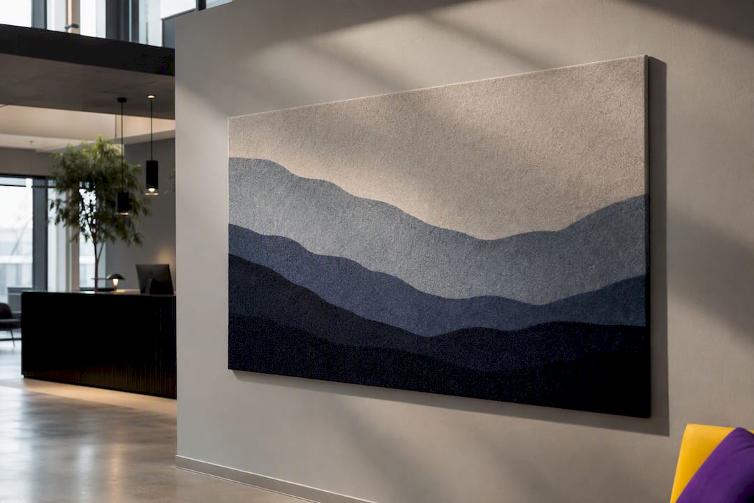
Textured and acoustic panels doing double duty. In open-plan lobbies with hard flooring and high ceilings, a printed acoustic felt panel solves a noise problem while still functioning as art. It's one of the few reception upgrades that pays for itself in both appearance and comfort.
Rotating and digital displays for repeat visitors. If the same clients or employees pass through your lobby daily, a static piece eventually becomes invisible. A digital frame cycling through a curated set of images, or a physical rotation tied to the seasons, keeps the space feeling maintained rather than forgotten.
Pro Tip: Rotate one piece per quarter instead of the whole wall. Visitors notice a fresh detail without ever feeling like the space has been re-decorated from scratch.
The through line across all ten approaches: scale and consistency beat novelty. A wall with three mismatched frame styles looks unfinished no matter how good each individual photo is.
Sizing and Placement Rules That Actually Work
Reception art almost always needs to be bigger than instinct suggests. The 60 to 75% width rule is the fastest way to check your instincts: measure the wall or desk it hangs behind, then size the art (or the full gallery cluster) to fill that proportion.
- Desk-aligned single pieces: for a typical 6 to 8 foot reception desk, aim for a canvas between 36 and 45 inches wide. Anything narrower reads as an afterthought.
- Larger open lobby walls: scale up to 48 to 60 inches wide, or use a triptych to stretch visual width without commissioning one oversized frame.
- Hanging height: center art around 52 to 55 inches from the floor when most viewers will be seated at a reception desk, and closer to 57 to 60 inches where visitors mostly stand.
- Gallery cluster math: add up the width of every frame plus 2 to 3 inches of spacing between each, then confirm that total against the 60 to 75% target.
One detail people miss on video calls: art hung at standing eye level often disappears from webcam framing entirely. Drop the centerline a few inches for any wall that sits behind a desk used for video meetings.
Materials and Finishes for High-Traffic Lobbies
Finish choice matters as much as the image itself once art is competing with lobby lighting and daily foot traffic.
- Matte canvas hides glare well and reads as textured and premium, but it picks up dust and needs occasional gentle care.
- Acrylic face-mounted prints add real visual depth and a glossy, glass-like finish. They resist glare better than framed glass and wipe clean with a microfiber cloth, which makes them a strong fit for busy lobbies.
- Framed prints under museum glass cut reflections almost entirely and protect the print, though the frame itself needs periodic dusting.
- Metal prints hold up well in humid or high-traffic entryways but can throw harsh reflections under direct light.
- Wall panels and tiles make sense structurally when the wall itself has damage, uneven texture, or needs acoustic treatment built into the display.
Pro Tip: If your lobby has large windows facing the art, skip glossy finishes entirely. Matte canvas or acrylic block finishes handle ambient daylight far better than glass-framed prints.
Lighting and Acoustics That Look Intentional
Good lighting is the difference between art that looks displayed and art that looks installed as an afterthought. The 30° rule is the standard fixture angle for gallery-style lighting: mount fixtures so light hits the art at roughly 30 degrees from vertical, which minimizes glare while still modeling texture and depth.
- Choose bulbs rated CRI 90 or higher so colors in a landscape photograph or painting render accurately rather than washed out.
- Avoid pointing direct light at glass or high-gloss finishes; diffused or angled fixtures solve most glare complaints instantly.
- The Australian government's lighting guidance is a useful baseline for balancing color accuracy against energy use in fixtures that run all day.
- Acoustic felt panels printed with a photographic image absorb sound while still functioning as the visual focal point, a genuine two-for-one in lobbies with hard floors and high ceilings.
Place lighting above and slightly forward of the art rather than directly overhead, which is the single most common mistake in DIY lobby installs.
Curating Art That Matches Your Brand
Before choosing a single frame, decide what feeling the lobby needs to produce. A calm, unhurried mood suits healthcare and legal offices; energy and momentum suit agencies and startups; understated prestige suits finance and professional services. Design thinking treats art as a form of visual language, where smooth natural forms suggest calm and bold abstract shapes suggest ambition.
- Map the audience and brand tone first, before browsing any art at all.
- Measure the wall and mark every fixture (light switches, thermostats, signage, logo placement) so the chosen piece doesn't collide with anything already bolted to the wall.
- Pick one focal wall rather than spreading art thin across the whole lobby.
- Confirm contrast and palette against your existing furniture and flooring before ordering final prints.
- Build in a refresh plan, whether that's a seasonal rotation or a partnership with a local artist for a rotating exhibit.
Pro Tip: Walk your lobby with a tape measure before you shop for art, not after. The single most common reception design mistake is falling in love with a piece that turns out to be six inches too narrow for the wall.
Keep signage and wayfinding zones visually quiet. Art competing with directional signs near an entrance creates clutter exactly where visitors need clarity most.
What a Photographer Wants You to Know Before You Buy
Limited-edition photography earns its price when a reception wall is the first thing clients see and needs to hold up under repeated scrutiny, not just a first glance. A print that's been shot on panoramic medium format film shows detail at large sizes that a phone photo or generic stock image simply can't match.
If you're licensing an image instead of buying a limited-edition print, get the terms in writing: resolution limits, display duration, and whether the image can appear in promotional photography all need to be spelled out before installation, not after.
- Acrylic face-mounting adds noticeable depth and protects pigment from fading under lobby lighting.
- Museum glass framing cuts glare almost completely while keeping the print visible from an angle.
- Cross-check your chosen size against a proper sizing guide before ordering, since photographic prints often look smaller in person than expected once framed.
Keeping Reception Art Looking New
Different finishes need different care routines, and mismatched maintenance is how good art starts looking tired within a year.
Canvas prints collect dust fastest in high-traffic lobbies. A soft, dry microfiber cloth or a vacuum brush attachment on the lowest setting handles routine cleaning; never use liquid cleaners on raw canvas, since moisture can warp the stretcher bars over time.
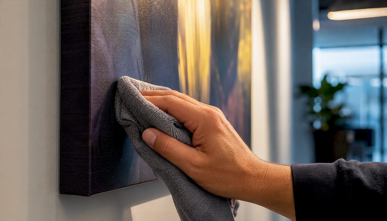
Acrylic block and face-mounted prints clean up the easiest of any finish. A microfiber cloth with a small amount of glass cleaner removes fingerprints and dust without streaking, which matters in lobbies where visitors sometimes touch displayed pieces.
Framed prints under glass need the glass wiped separately from the frame. Use glass cleaner on a cloth, never sprayed directly onto the surface, since overspray can seep behind the frame and damage the print.
Metal prints hold up well against humidity but show fingerprints more readily than other finishes. A quick wipe with a dry cloth during weekly office cleaning keeps them looking fresh.
Acoustic felt panels are the outlier: most can't be wet cleaned at all. A handheld vacuum brush or a lint roller on the lowest suction setting is usually the safest option, so check manufacturer guidance before installation if dust is a concern in your building.
Set a simple standard: dust weekly, deep clean quarterly, and inspect for fading near windows twice a year. Direct sun is the fastest way to shorten the life of any printed material, regardless of finish.
What Reception Wall Art Actually Costs
Budgets for reception art vary enormously depending on scale and finish, but a few patterns hold across most projects. A single statement piece almost always costs less per square foot than an equivalent gallery cluster, because framing and hanging hardware for five small pieces adds up faster than one large print.
Acrylic block finishes tend to sit at a premium compared to canvas because of the mounting process and material cost, but they also last longer and clean more easily, which lowers the long-term cost of ownership in a high-traffic lobby. Framed prints under museum glass sit in the middle: glass and quality framing cost more upfront than a raw canvas print, but they protect the artwork better over years of daylight exposure.
The biggest budget mistake is under-sizing to save money. A piece that's too small for the wall looks cheap regardless of how much it cost, while a properly sized piece in a mid-range finish almost always outperforms an oversized display in an expensive one.
For businesses considering commissioned or custom photography, working with a commercial interior design partner alongside your art selection can help align the whole space, not just the wall, before you finalize any purchase order.
Why Curated Art Changes How a Lobby Feels
The best reception walls I've studied share one trait: someone made a deliberate decision about what the space should say, then sized and lit the art to support that decision. One lobby I recall clearly improved dramatically after swapping three mismatched frames for a single large, well-lit landscape print. Nothing else in the room changed, yet visitors described it as feeling more established. Measure the wall, decide the mood, and only then start shopping.
— Mark
Bring Gallery-Quality Photography Into Your Lobby
If you've been comparing generic stock art, printer catalogs, or a designer's mood board, there's a more direct route: work with the source. A photographer's landscape photography collected internationally and printed with high-quality equipment offers detail suitable for large sizes reception walls actually need.
Start with the limited edition prints collection if you want a statement piece with genuine scarcity value, or browse open edition prints for a more budget-flexible option that still carries the same photographic quality. For a premium mounted finish that resists glare and adds visual depth, the acrylic block format at $295 per piece is worth measuring your wall against. Corporate teams needing rights-cleared imagery for signage, brochures, or splashbacks should look into image licensing directly, and businesses planning a bespoke installation can explore commissioning a custom piece matched to their brand. Measure your wall, pick a lead image, and reach out to start the conversation.
Sources
- Energy
- Office Art Sizing Guide: Perfect Dimensions for Every Wall – Big Ox Printing
- Choosing the Best Canvas Size for Your Office Wall – SpudPrint
- What Size Canvas Print for a Home Office Wall? | Rossetti Art
FAQ
What are the latest reception design trends?
Reception design is trending toward fewer, larger focal pieces rather than multiple small decorations, along with acoustic panels that double as art and rotating displays that keep repeat visitors engaged.
What are the trends in wall art for 2026?
Photographic landscape prints, textured acoustic panels, and premium mounting like acrylic blocks are gaining ground over generic canvas prints, largely because they signal more deliberate investment in the space.
What are some good ideas for decorating a wedding reception?
Wedding receptions typically call for softer, more romantic imagery and temporary display setups, which differs enough from permanent office lobby design that it deserves separate planning rather than the sizing and lighting rules covered here.
How do I decorate an office reception area?
Start by measuring the main wall and sizing art to cover 60 to 75% of its width, choose a finish that suits your lighting conditions, and pick imagery that matches the mood you want visitors to feel the moment they walk in.