
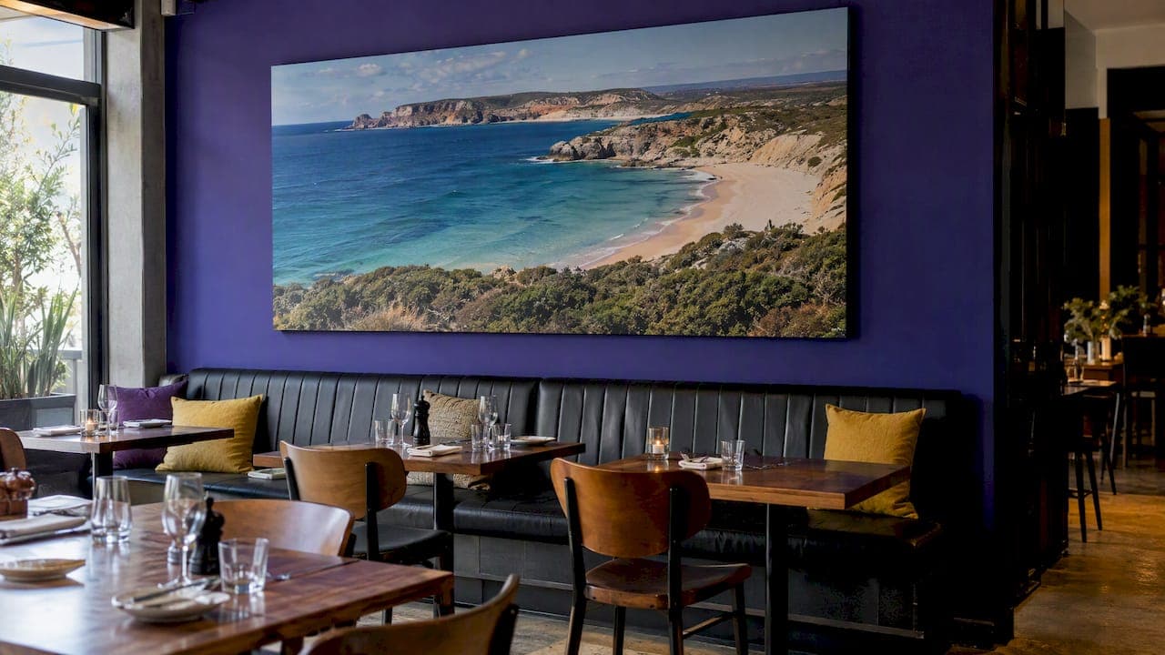
The best restaurant wall art tells guests where they are and why they should stay a little longer. For most Australian venues that means a few large, confident pieces tied to your concept and your place, hung at the right height, lit properly and placed away from the splash zone. This guide covers the ideas that work, the mistakes that cost money, and how to choose art for a café, bistro or fine dining room.
TL;DR
- Choose one story for the room (coast, bush, city, produce) and let every piece serve it. A coherent wall beats a collection of unrelated frames.
- Go big. One large landscape photograph or a triptych does more than a dozen small frames.
- Natural, outdoor imagery suits the 2026 push towards biophilic and colour-rich Australian interiors.
- Keep art out of food preparation zones, and check council fit-out rules before you finish any wall.
- Light every piece deliberately, and hang it for the seated sightline, not the standing one.
Table of Contents
- Why the walls matter more than you think
- What is changing in Australian dining rooms
- 12 restaurant wall art ideas that work
- Why landscape photography suits dining rooms
- Size, height and placement
- Lighting your art
- Food safety and fit-out rules to check first
- Perspective: what we have learned from photography on walls
- Choosing between limited edition, open edition and mounted prints
- Bring a landscape into your venue
- A simple planning process
- Common mistakes
- FAQ
- Sources
Why the walls matter more than you think
Walls are the largest surface a diner looks at for an hour or two. Research on luxury restaurant environments, published in the International Journal of Contemporary Hospitality Management, found that atmospherics such as colour, lighting and decor affect diners' positive emotions, and those emotions in turn drive loyalty, meaning diners revisit and recommend. The study looked at luxury settings, so treat it as direction rather than a promise for a corner café. The principle still holds: a wall is part of the menu.
There is a commercial argument too. A fit-out company's 2026 trend report suggests that natural elements in a space can lift dwell time by an estimated 15 to 20 per cent, which can mean more coffees, desserts and second glasses. It is an industry estimate, not a guarantee, but it matches what many owners see: people linger in rooms that feel good.
What is changing in Australian dining rooms
Two trends shape the choices this year.
Maximalism with meaning. Hospitality analysts at AGFG describe a move away from beige minimalism towards rich colour stories and narrative-driven decor, including large-scale murals and locally sourced work that tells a story of place. Deep ocean blues and ochre are named as leading colours.
Soft industrial. Concrete, steel and exposed brick are still everywhere. The same Petra Group report describes balancing those hard materials with warm, natural features such as moss panels, vertical gardens and landscape imagery that brings the outdoors in. A big photograph of a misty forest or a red-earth horizon does exactly that, with none of the watering.
Both trends point the same way: art with a sense of place, at scale, in a palette that works with your materials.

12 restaurant wall art ideas that work
1. One hero landscape on the main wall
Pick the wall guests see when they walk in or the one behind the best table. Hang a single large landscape photograph, ideally wider than the banquette beneath it. A hero piece gives the room a focal point and gives staff and regulars a way to describe it ("the table under the big ocean photo").
Panoramic formats suit long dining rooms especially well. They echo the horizontal lines of a banquette, a bar or a window run.
2. A triptych above banquette seating
Three matched panels read as one artwork but are easier to fit around switches, sconces and vents. Keep gaps between panels consistent and narrow, around the width of a hand, so the eye joins them.
3. Local scenery that names your neighbourhood
A coastal café in Byron, a wine bar in the Barossa and a laneway restaurant in Melbourne should not share the same art. Landscape photography of your own region, or of the places your produce comes from, links the plate to the wall. If you serve Tasmanian seafood, a Tasmanian coastline earns its place.
Our curated Australian prints by region is a useful starting point for matching a landscape to a location.
4. Colour pulled from the room
Take two or three colours from your upholstery, tiles or crockery and look for art that repeats them. Deep blues against terracotta, ochre against dark timber: this is the colour-led approach analysts are describing for 2026. A coherent selection tends to create a stronger impression than a mix of unrelated pieces, and it makes a small room feel intentional.
5. Moody monochrome for evening venues
If your trade is mostly dinner, black and white or very low-key landscapes suit candlelight and warm bulbs. Textured subjects such as dunes, storm skies and rock formations hold up in dim light because their interest comes from tone, not bright colour.
6. Acrylic or glass-faced pieces for bright cafés
A sunny café with big windows can bleach colours and create glare on standard glazing. Acrylic-mounted and low-reflection finishes let colour stay clean and saturated. They also wipe down easily, which matters near a coffee machine.
7. A mural for a feature wall
When you want drama and have a blank, awkward wall, a large mural or printed wallcovering is the fastest transformation. Murals work best when the image has depth, such as a path, a shoreline or a horizon, so the wall seems to open up rather than close in.
8. Mounted canvas for casual, high-volume rooms
For a busy café where you want durable, lightweight, frameless pieces, custom mounted canvas prints are a practical way to fill several walls consistently. They suit relaxed settings and tight budgets, while a limited edition photographic print suits a room where art is part of the pitch.
9. A gallery wall with a rule
Gallery walls work in restaurants only when they have a rule: all landscape, all one frame colour, or all from one region. Without a rule they look like a thrift shop. Set the layout on the floor first, keep spacing even, and leave one generous piece as the anchor.

10. Art for the private dining room
A private room is where clients are entertained and deals are discussed. It deserves its own, quieter piece, ideally a single large image that works as a conversation starter without competing with the people in the room.
11. Corridors, entries and the path to the restrooms
Guests walk these every visit, and they are usually bare. A run of matching smaller prints in a hallway makes the whole venue feel considered, and it keeps your large hero pieces for the dining room.
12. Art that doubles as a retail moment
If guests keep asking where a piece is from, tell them. A small discreet label with the title, location and photographer turns your wall into a conversation. Some venues also stock gift options so guests can take a piece of the room home.
Why landscape photography suits dining rooms
Landscape imagery is one of the safest and most flexible choices for hospitality, for a few reasons.
- It relaxes the room. Open horizons and natural light are calming, which supports a long lunch.
- It travels across concepts. A coastal image works with Italian, Japanese, modern Australian or a bar menu.
- It ages well. Trends in prints and murals change quickly, while a strong landscape stays relevant.
- It tells a place story. Provenance is a headline theme in Australian hospitality, and a regional image supports it visually.
- It scales. A good original, shot on large-format or medium format film, holds detail at big sizes, so a wall-filling print still looks sharp when guests are a metre away.
That last point matters more than owners expect. A low-resolution file blown up to two metres wide looks soft and cheap, and diners notice at close range. Always ask for the source resolution and the maximum recommended print size before you commit.
Size, height and placement
Some practical rules save embarrassment later.
- Hang for the seated eye. In a restaurant most people are sitting. Lower art slightly compared with a lounge or hallway so it sits comfortably in the seated sightline. Our partners in design describe lowering wall art a few centimetres for seated rooms, and we agree with the principle.
- Match width to furniture. Art over a banquette or sideboard should cover roughly two thirds to three quarters of the furniture's width.
- Keep it out of the splash and heat zone. Avoid walls directly behind fryers, grills and the coffee station, and anywhere guests could brush against it. Steam and grease shorten the life of any print.
- Mind the sightlines. Place important pieces where they are seen from the entry and from the bar, not hidden behind a pillar or a service station.
- Plan for movement. Busy rooms mean bumped chairs and passing trays. Keep artwork above head height at the end of aisles and use secure fixings.
Lighting your art
Great art under poor light loses most of its impact. Use adjustable picture lights or small track spots, aim them at roughly a 30 degree angle from the wall to reduce glare, and choose bulbs with high colour rendering so ochres and blues stay true. Dimmers are your friend: a lunch crowd and a candlelit dinner service need different levels. Our guide to lighting for wall art goes into the detail.
Food safety and fit-out rules to check first
Decor is not the first thing a council environmental health officer looks at, but wall finishes are. In Australia, requirements for walls in food preparation, storage and service areas come from the Food Standards Code and are interpreted by local councils. As an example, the ACT Food Business Fit-out Guide sets out wall and ceiling finish requirements for food preparation, storage and servery areas under Standard 3.2.3, and the North Sydney Council guide explains what finishes plans must show.
In practice:
- Keep decorative art in the dining area, away from preparation and washing zones.
- If you are refitting, ask your council what must appear on the plans before you choose wallcoverings or murals.
- Check requirements with your own council or a qualified food premises designer, because details vary by state and local government area.
Perspective: what we have learned from photography on walls
We photograph landscapes on panoramic medium format film, and our prints are collected in 32 countries. That has taught us a few things about how an image behaves in a public room.
First, detail is what keeps a large print interesting. People in restaurants have time to look. They study the textures in the foreground, the light on the far ridge, and they come back to the same piece on their next visit. Film capture at this format gives a print that rewards that kind of looking.
Second, choose subjects that feel true to the room. Venues get the best results when the image comes from a place the owner genuinely connects with: the coast they grew up on, the region their produce comes from, the landscape their guests travel to see. Guests sense the difference between decor and a story.
Third, buy fewer, better pieces. One limited edition print that anchors a room does more for its identity than six cheap frames. It is also a more considered purchase, which is a good fit for owners who treat the fit-out as an investment.
Finally, ask about the print. Edition size, paper, mounting and the fade resistance of the inks all affect how a piece ages under restaurant lighting. We are always glad to talk this through with an owner or designer before they buy.
— Mark
Choosing between limited edition, open edition and mounted prints
| Option | Best for | Strength | Watch out for |
|---|---|---|---|
| Limited edition photographic print | Fine dining, hotels, venues where art is part of the identity | Numbered, collectible, highest print quality | Needs considered placement and lighting |
| Open edition print | Cafés, bistros, multi-site fit-outs | Accessible, consistent across venues | Less exclusive |
| Mounted canvas | Casual, high-volume rooms | Lightweight, frameless, quick to install | Can feel less refined in upmarket rooms |
| Acrylic block | Shelves, reception counters, small accents | Compact, striking, easy to move | Small scale, so it supports rather than anchors a wall |
| Mural or wallcovering | Feature walls, large blank surfaces | Instant impact at scale | Image quality and wall finish must suit the space |
Bring a landscape into your venue
If you want one of these ideas to carry a landscape, our limited edition prints are made from award-winning panoramic medium format photographs, and our open edition prints offer Australian scenes in a more accessible format. For counters, shelves and the reception desk, acrylic blocks are $295 each, plus $24.95 postage and handling Australia-wide. If you would like a mural, signage or menu board image, our image licensing covers commercial uses. Gift certificates start from $50 if you would like a team member or a partner to choose their own piece, and you can see them on the gift certificates page.
A simple planning process
- Write your concept in one sentence. For example: "A relaxed coastal wine bar using produce from the south coast."
- Pick a palette from your fixed finishes: floor, upholstery, timber and tiles.
- Measure the walls and the furniture beneath them, and mark the seated eye line.
- Choose a hero piece first, then support it with smaller works.
- Plan lighting before hanging, including power and dimming.
- Check council rules for any wall treatment in or near food areas.
- Hang, step back and look from every seat, not only from the door.
Common mistakes
- Buying small art for a big wall, which looks timid and makes the room feel unfinished.
- Mixing too many styles. Pick one visual language.
- Ignoring glare from windows and downlights.
- Hanging too high. It is the most common mistake in dining rooms.
- Treating art as the last job, when the budget is gone. Allocate it at the start of the fit-out.
FAQ
What wall art works best in a café?
Large-format landscape photography, murals and mounted canvas all suit cafés. Choose durable, easy-to-wipe finishes near the coffee machine and counter, and use the biggest piece on the wall guests face when they queue. Keep the palette in line with your furniture and cups so the room feels cohesive.
How high should I hang art in a restaurant?
Hang it so the centre of the piece sits comfortably in the sightline of a seated guest, which is lower than in a hallway or lounge. Art above banquettes and sideboards should relate to the furniture, covering roughly two thirds to three quarters of its width. Test with paper templates before drilling.
Can I put art on restaurant walls near the kitchen?
Keep decorative art out of food preparation, storage and washing areas, and away from grease, heat and steam. Wall finishes in those zones are regulated, and your local council can tell you what applies. Use the dining area, entry and corridors for art.
How big should a hero artwork be?
Large enough to anchor the wall: often two thirds or more of the furniture width beneath it. Ask the supplier for the maximum recommended print size, because a file stretched beyond its resolution will look soft up close.
Sources
- 2026 Hospitality Trends: Décor, Crockery, Provenance & Ingredients (AGFG)
- 2026 Cafe Design Trends: Biophilic and Urban Industrial Interiors
- The effects of luxury restaurant environments on diners' emotions and loyalty
- ACT Food Business Fit-out Guide
- North Sydney Council: Food premises design, construction and fit-out guide
- Custom mounted canvas prints