
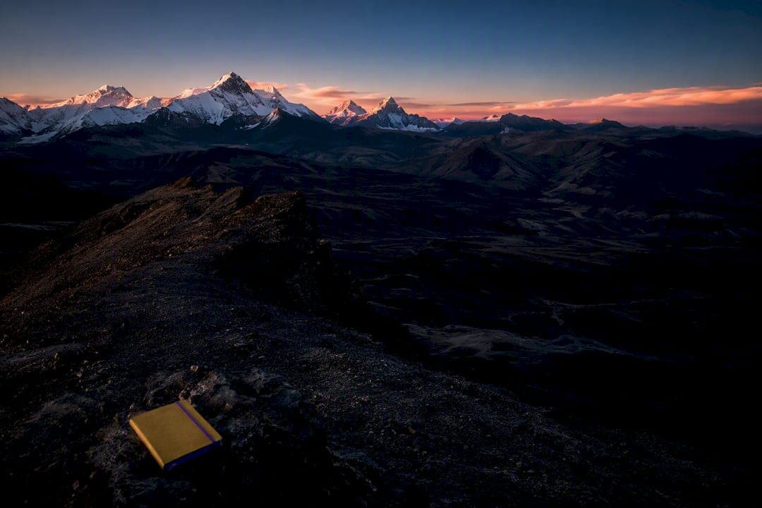
Keep color when the scene's palette carries the emotion, whether that's a sherbet sunrise or a field of autumn larch. Choose black and white when light, shape, texture, or contrast are doing the real storytelling and color would only distract from it. The reliable move for any serious landscape photographer is to shoot RAW and test both versions before committing, because the right answer usually reveals itself in post, not in the field.
TL;DR:
- Shooting RAW and testing both color and monochrome conversions later ensures the best final look based on scene specifics.
- Color is essential when the scene's emotion or subject relies on vibrant hues, such as sunrises, foliage, or saturated landscapes.
- Black and white works best for textured, high-contrast scenes like weathered rocks, foggy forests, or cloud formations, where tone and shape dominate.
- Proper technical choices, including managing luminance, dynamic range, and filters, are crucial for compelling black and white and color images.
- Developing the ability to predict a scene's effectiveness in either medium improves with practice and guided experience through fieldwork and review.
Table of Contents
- Color vs Black and White Landscapes: A Field Checklist
- How Color and Monochrome Change the Story You're Telling
- What Makes a Landscape Work Technically in Either Medium
- A Workflow for Testing Color and Black-and-White Versions
- Field Tactics That Keep Both Options Open
- Real Landscape Choices: Color, Monochrome, and Why
- Why the Real Answer Is: Learn to See Both
- Learn the Choice Hands-On With Mark Gray
- Sources
- FAQ
Color vs Black and White Landscapes: A Field Checklist
Standing at a lookout with fading light, you don't have time for philosophy. You need a fast, repeatable set of questions that tells you which direction to shoot for, and which to test later at the desktop.
Run through these prompts before you commit to a final edit, or even before you release the shutter:
- Is color the actual subject? A sunrise blazing orange, a hillside of autumn foliage, or a field of lavender loses its entire reason for existing in monochrome. Keep the color.
- Are shape, texture, or pattern the strongest elements in the frame? Sand dunes, weathered bark, and rock strata often read more powerfully once color stops competing for attention.
- Is a distracting color fighting the subject? A garish sky or a stray red jacket in an otherwise moody scene can pull the eye away from what matters. Stripping color out simplifies the read.
- Does the scene have strong tonal contrast or dramatic light? Hard shadows, silhouettes, and high-contrast weather fronts tend to gain drama in black and white rather than lose it.
- Would color harmony carry the mood on its own? Analogous blues in a misty valley, or warm golds in late afternoon, are the kind of color relationships that black and white simply cannot replicate.
Two practical tests settle most arguments quickly. First, switch your camera's preview to monochrome mode and look at the scene through that lens before you shoot, so you're pre-visualizing rather than guessing later. Second, once you're back at your computer, duplicate the RAW file into a virtual copy and convert it, then compare both versions side by side rather than judging from memory. Many working photographers treat this A/B step as standard practice rather than an afterthought, and shooting RAW to test conversions gives you the flexibility to change your mind without losing quality.
Pro Tip: When you genuinely can't decide in the field, capture the exposure as if you were shooting for black and white. That means protecting highlight detail and embracing higher contrast light. A strong monochrome file almost always converts back to a usable color image, but a flat color exposure rarely makes a convincing black and white.
How Color and Monochrome Change the Story You're Telling
Color and black and white aren't two settings on the same tool. They're two different arguments about what a landscape means, and picking one over the other changes what the viewer feels before they've consciously registered why.
Color photography leans on realism, vibrancy, and symbolic association. A red autumn maple against a blue sky doesn't need explaining. The color itself carries warmth, seasonality, even nostalgia. One useful way to think about it: color functions like a loud, crowded party where every hue is competing for attention, while monochrome photography behaves more like a quiet, intimate conversation, stripped down to what actually matters in the frame. Color earns its place when the scene's emotional payload is inseparable from its palette, a lavender field in bloom, a glacier lit up pink at dusk, a rainforest canopy saturated after rain.
Black and white does something almost opposite. It removes the loudest element in the frame and forces the eye toward what's left: luminance, texture, geometry, and negative space. A colorful scene converted to monochrome can turn into a study of structure and power, because color grabs attention first while monochrome asks the viewer to look harder at shape and form. This is why black and white landscape prints so often favor subjects like:
- Weathered cliffs and canyon walls with heavy texture
- Fog-shrouded forests where tonal separation replaces color contrast
- Architectural or geological patterns, like basalt columns or dune ridges
- Storm fronts and dramatic cloud structures where contrast carries the drama
Here's the trap most beginners fall into: converting a mediocre color shot to black and white hoping it will suddenly look artistic. It rarely works. Composition and lighting have to earn their place in either medium, and a flat, poorly framed color photo becomes a flat, poorly framed black and white photo. The conversion doesn't fix a weak foundation, it just removes the one element that was hiding it.
What Makes a Landscape Work Technically in Either Medium
Every strong black and white or color landscape rests on the same technical bedrock, even though the two mediums demand different priorities once you're behind the camera, something you can master with professional Photography SEO Services | Be Discovered & Book More Shoots helping build your photography business.
Luminance versus chrominance is the concept most photographers skip past without understanding, and it's the single biggest factor separating a flat monochrome conversion from a compelling one. Luminance is the brightness value of every pixel, independent of color, and it's what your eye reads as depth, dimension, and form once hue is removed. Tonal contrast built from luminance defines how successful a black and white conversion feels: high contrast emphasizes edges and silhouettes, while low contrast produces a softer, almost dreamlike haze. Two colors with identical brightness but different hues, say a green meadow and a gray boulder of similar tonal value, will collapse into nearly the same shade of gray once converted, which is exactly why some conversions look muddy no matter how much you push the sliders.
Dynamic range and your histogram matter more than most hobbyists realize, especially if you plan to test a black and white conversion later. Blown highlights or crushed shadows lose information permanently, and no amount of tonal mapping in post recovers detail that was never captured. Check your histogram in the field, not just your camera's rear screen, which lies more than you'd think in direct sunlight.
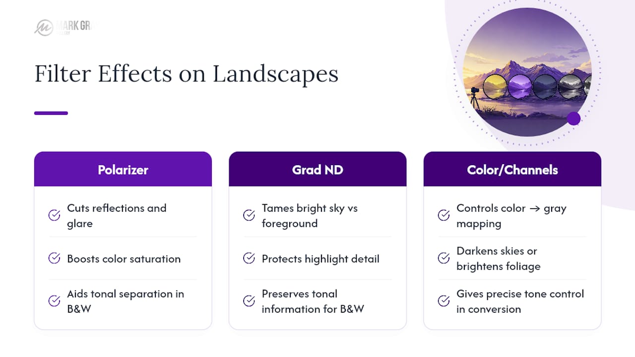
Filters still earn their place in a mirrorless, RAW-shooting world. A polarizer cuts reflections and glare off water and wet rock, which helps both color saturation and tonal separation in a later conversion. A graduated neutral density filter tames a bright sky against a darker foreground, protecting highlight detail you'll need whichever direction you go. And colored filters, whether physical or simulated through channel mixing, let you control exactly how a red barn or a blue sky maps to gray tone, darkening skies or brightening foliage with real precision.
Pro Tip: Bracket your exposures whenever the dynamic range looks tight, even if you're planning a black and white edit. A single frame optimized for the highlights, paired with one optimized for shadow detail, gives you the tonal separation a good monochrome conversion depends on.
A Workflow for Testing Color and Black-and-White Versions
The decision doesn't have to happen at the tripod. Most working photographers make the real call at the desktop, where they can compare both versions honestly instead of guessing under time pressure.
- Import the RAW file and correct the basics first. Fix exposure, white balance, and lens distortion before you make any creative decision, because a badly exposed file will mislead you in either color or monochrome.
- Duplicate it into a virtual copy. Never destroy the original color data. Editors like Lightroom Classic and Capture One both support virtual copies at no storage cost, so there's no reason to commit early.
- Convert the copy using a channel mixer or dedicated black and white tool, adjusting individual color channels rather than a flat desaturation, which almost always looks lifeless.
- Compare both versions side by side, not sequentially. Ask which one carries more emotional weight and which composition holds up better once color is removed.
- Refine the stronger version. In color, that usually means careful white balance and selective saturation. In monochrome, it means dodge and burn, local contrast adjustments, and a decision about clarity versus texture that suits the subject.
A few finishing details separate an amateur edit from one ready for print or web presentation:
- Grain and sharpening choices should differ between mediums. Color landscapes often benefit from cleaner, sharper detail, while monochrome can carry a touch of grain without looking noisy.
- Color-managed soft-proofing matters before sending any file to a printer, since monitor and paper gamuts rarely match.
- Black and white prints need particular attention to tonal mapping, because depth on paper depends entirely on tonal relationships rather than color cues, and a flat negative reads as flat no matter the subject.
Field Tactics That Keep Both Options Open
Good field technique isn't about deciding color or monochrome on location. It's about capturing a file flexible enough to succeed either way once you're back at the computer.
- Build compositions around foreground interest, leading lines, and strong shapes. These elements translate across both mediums because they're structural, not chromatic.
- Shoot at base ISO whenever light allows, and bracket exposures in high-contrast scenes like sunrises, sunsets, or backlit fog. When depth of field is critical, consider focus stacking rather than relying on a single aperture to cover the whole scene.
- Preview in monochrome on the rear screen to pre-visualize tonal separation, while your camera continues recording full RAW color data underneath. Watch the histogram, not just the screen, to avoid clipped highlights that no conversion can rescue.
- Handle mixed-light scenes carefully. A landscape lit partly by warm sunset and partly by cool shadow can look muddy in color but strikingly clean once converted, since removing hue often resolves competing color temperatures instantly.
Pro Tip: Keep your camera set to record RAW even when you're leaning toward a monochrome result. A RAW file preserves every bit of color information, which gives you complete freedom to change your mind about which composition techniques serve the scene best once you're reviewing files at full resolution.
Real Landscape Choices: Color, Monochrome, and Why
A few recurring scenarios show how the decision actually plays out once light and geography get involved, rather than staying theoretical.
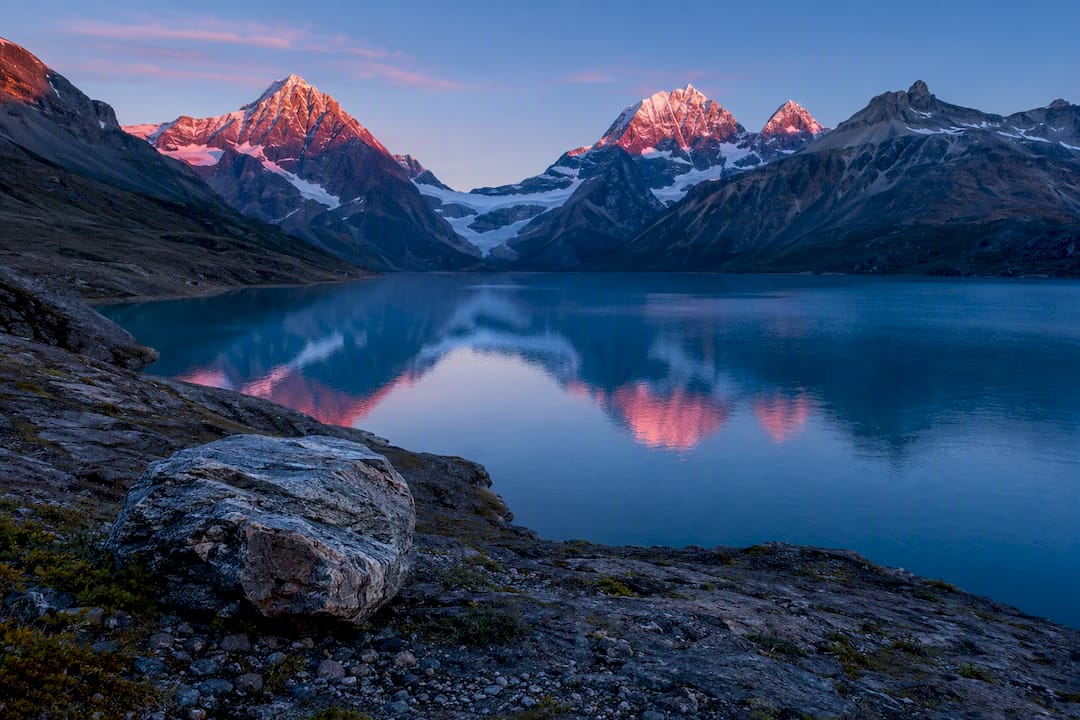
A glacial lake at first light with pink alpenglow on distant peaks stays firmly in color. The palette carries the entire mood, and converting it to black and white would strip out the one thing that makes the image worth printing.
A weathered coastline with heavy cloud cover and hard directional light tends to favor black and white. Removing color lets the texture in the rock and the drama in the sky take over, elements that would otherwise fight with a flat gray sea and an overcast sky offering little color interest anyway.
A rainforest interior with dappled, mixed lighting often gets processed both ways before a final call is made, because color and monochrome pull in genuinely different directions here.
- Tonal mapping and careful highlight recovery matter more for the black and white version, since print depth depends on preserved tonal relationships.
- Color versions typically need more restrained white balance work to avoid an artificial, oversaturated look.
- Reviewing annotated examples side by side, a practice built into structured photography workshops, sharpens the instinct for which scenes will read well in either direction well before you're standing in front of one.
Every finished limited edition print starts from this same evaluation process, whether the final call lands on color or black and white.
Why the Real Answer Is: Learn to See Both
Most photographers treat this as a technical choice, a slider decision made after the fact. It isn't. It's a perceptual skill, the ability to look at a scene and predict how it will behave once color is removed, and that skill only develops through repetition. Shoot the same subject with both outcomes in mind, review the two versions honestly, and you'll start recognizing the pattern before you even raise the camera. A structured photography course or a few sessions working alongside someone with that trained eye will shortcut months of guesswork.
— Mark
Learn the Choice Hands-On With Mark Gray
Reading about tonal contrast and luminance only gets you so far. The fastest way to build real judgment about color versus black and white is standing in the field with someone who has made that call thousands of times.
Mark Gray's 1 Day Photography Courses put you behind the camera in real Australian landscapes, working through the same checklist covered above in real time. For a deeper dive, the multi-day photography tours run in small groups across Australia and internationally, with luxury arrangements led personally by an internationally acclaimed photographer whose limited edition prints are collected in 32 countries. If you want individual attention on your own portfolio, private lessons can be built around your specific gaps, whether that's exposure technique or post-processing judgment. And once you're ready to see what a fully resolved color or monochrome landscape looks like in print, browse the limited edition prints gallery, each shot on panoramic medium format film for detail that holds up at wall size. Check available dates and book a course today.
Sources
- The art of black and white photography — Harmann
- Black and White vs. Color — Luminous Landscape
- Black and White vs Color: Which Should You Choose? • Focal Crafters
FAQ
Did Ansel Adams Ever Shoot in Color?
Yes, Ansel Adams experimented with color photography throughout his career, though he remained best known for his black and white landscape work. He often felt color film of his era couldn't achieve the tonal control and dramatic contrast he could get through black and white printing techniques like the Zone System.
What's a Better Color, Black or White?
Neither is inherently better. It depends entirely on whether the scene's emotional impact relies on color vibrancy and harmony or on tonal contrast, texture, and shape. A sunrise usually calls for color; a storm-lit cliff face often calls for black and white.
What Is the Three-Color Rule in Photography?
The three-color rule generally refers to limiting a composition to roughly three dominant colors to keep it visually cohesive rather than chaotic. It's a compositional guideline rather than a fixed law, and definitions vary somewhat between photographers and instructors.
What Are the Golden Rules of Landscape Photography?
The core rules include composing with strong foreground interest, using leading lines to guide the eye, shooting during favorable light like golden hour, and protecting highlight detail with a careful histogram check. Structured practice, like the checklist covered above or a hands-on photography course, speeds up how quickly these rules become instinctive rather than mechanical.