
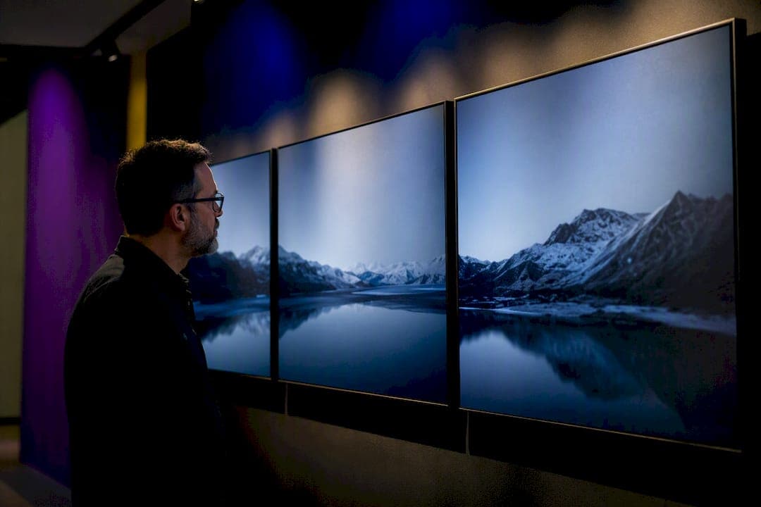
A photo triptych is either one wide image split into three panels or three related images sequenced to read as a single artwork. Choose the split-image route to expand a panorama into a gallery-scale statement, and choose the three-image route to tell a storytelling story, chart a transformation, or connect a theme across separate frames. Both paths lead to a print set designed to hang, and read, as one.
TL;DR:
- A reconstructive triptych requires a single panoramic shot with consistent exposure and aspect ratio, while narrative and transformation sets rely on three related but separate images.
- Matching color, lighting, and visual weight across panels is essential to avoid seams and imbalance, especially when panels are shot on different days or locations.
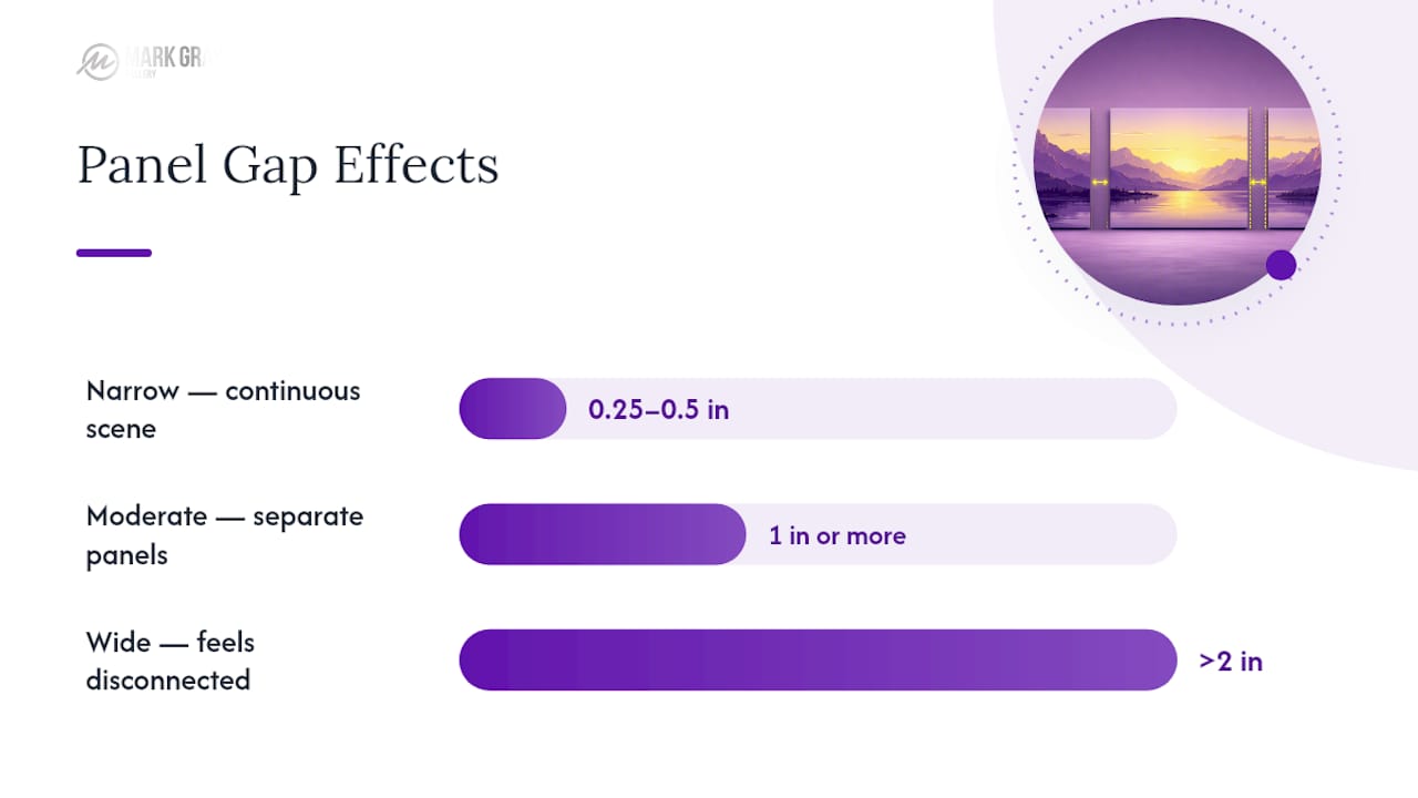
- Narrow gaps (around 0.25 to 0.5 inches) create a seamless illusion for split panoramas, whereas wider gaps (over 1 inch) emphasize the separation in narrative or transformation sets.
- Consistent file preparation, including splitting the master image using precise crop math and batch-exporting in matching color profiles, is crucial for high-quality triptychs.
- Full-size paper mockups checked from multiple viewing points ensure proper scale, gap, and alignment before ordering prints, reducing costly errors.
Table of Contents
- What a Photo Triptych Is and the Main Types You'll Encounter
- Choosing the Three Images: Motif Selection and Sequencing
- Design Principles: Proportion, Gaps, and Visual Harmony
- Preparing Files for a Triptych: Crop Math and Software Workflow
- Printing and Display: Materials, Mounting, and Hanging Measurement
- Mockup, Test, and Hang: Checking Before You Commit
- Practitioner Tips From Mark Gray on Triptych Photography
- Quick Checklist for Completing a Photo Triptych Project
- Why the Triptych Format Still Matters to Me
- Bring Your Triptych Vision to Print or Learn the Craft in Person
- Sources
What a Photo Triptych Is and the Main Types You'll Encounter
The word comes from the Greek for "three-fold," and its roots sit in hinged altar paintings from medieval Europe, where a central panel flanked two wings that opened and closed. Photography borrowed the structure without the hinges. As Merriam-Webster defines it, a triptych is a three-part work of art, and in photographic practice that means either three related images or a single image divided into three panels. Wikipedia's entry on the format notes it now shows up constantly in commercial and gallery photography, precisely because three panels create rhythm a single frame can't.
Four conceptual categories cover most photographic triptychs worth hanging:
- Narrative — three moments that read left to right like a short story, such as a wave building, breaking, and receding.
- Transformation — the same subject shown across time or condition, like a tree in three seasons.
- Reconstructive — one large scene deliberately split into three panels, prioritizing scale over separation.
- Expanded connection — three unrelated subjects tied together by a shared color palette, light quality, or mood rather than obvious content.
Pick the category before you pick the images. A reconstructive triptych demands one strong panorama; a narrative or transformation triptych demands three images that were never meant to be one file.
Choosing the Three Images: Motif Selection and Sequencing
Panels need a shared thread or the set falls apart on the wall. That thread can be color, light direction, subject matter, or camera viewpoint, but it has to be visible at a glance, not explained in a caption. WhiteWall's guide to multi-part images points to matched color grading and consistent lighting as the two fastes ways to unify frames shot on different days or in different locations.
Follow this sequence when building a set from scratch:
- Decide split or separate first. A single panorama with a strong horizontal sweep suits the split-image approach; three distinct subjects need the separate-image approach.
- Audit for shared DNA. Line up candidate images and check for a common color temperature, a repeated shape, or a consistent horizon line.
- Assign visual weight. One panel should anchor the eye (usually the center or the boldest color), with the other two supporting rather than competing.
- Test the sequence both directions. Read left to right and right to left. If the story only works one way, you have a narrative triptych; if it works both ways, you likely have an expanded-connection set.
Three mistakes wreck otherwise strong triptychs. Placing a focal point too close to a panel edge means it gets visually severed by the gap. Letting one panel dominate in color or contrast pulls attention away from the other two. And mismatched exposure or white balance between separately shot panels reads as a production error rather than a stylistic choice, even when the subject matter connects perfectly.
Pro Tip: Shoot your three panels within the same lighting window whenever possible. Even twenty minutes of shifting cloud cover can change color temperature enough that no amount of Lightroom syncing fully hides the seam.
Design Principles: Proportion, Gaps, and Visual Harmony
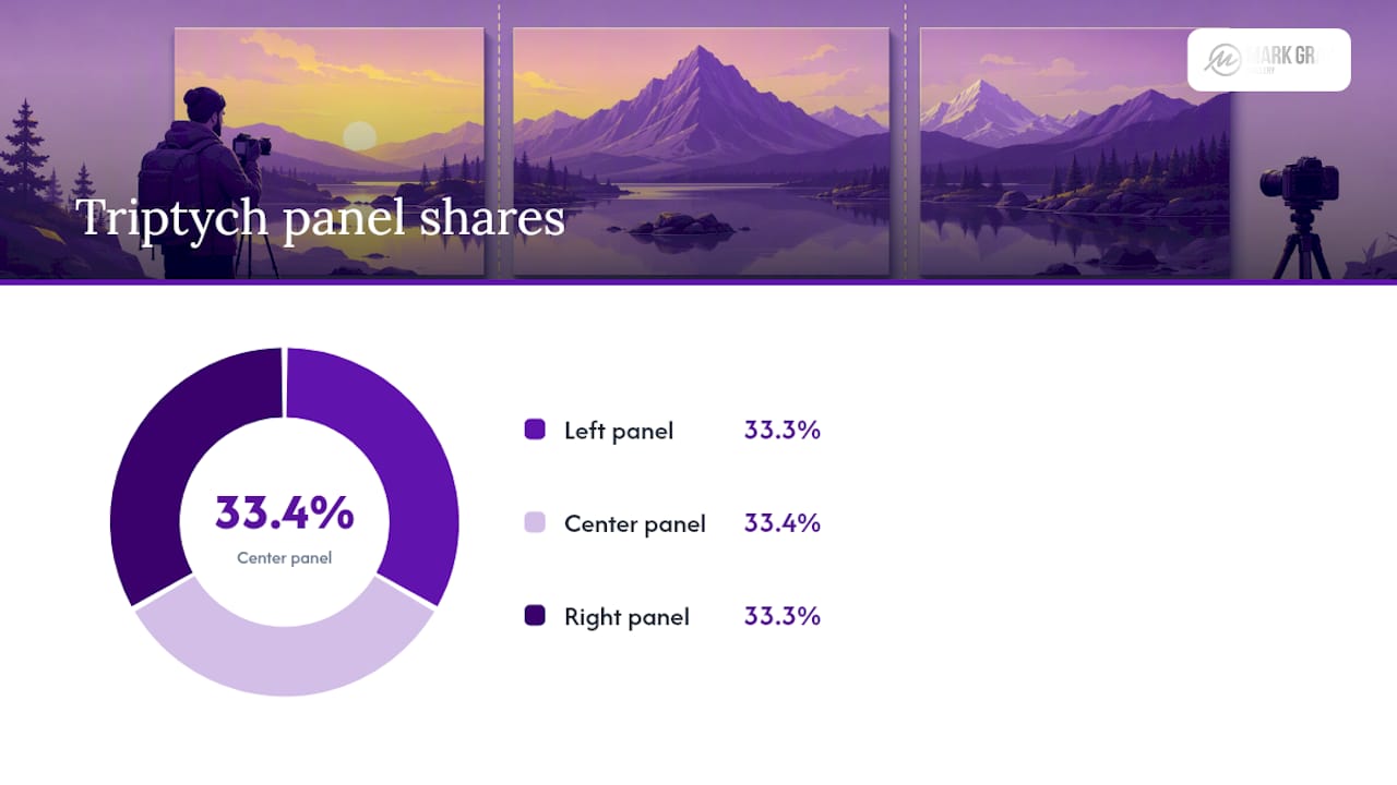
Proportion decides whether a triptych reads as unified architecture or three unrelated frames stapled together. Square panels (1:1) suit expanded-connection sets where each image needs to stand alone. Elongated verticals or a wide 3:1 horizontal split suits reconstructive triptychs built from a single panoramic capture. Keep all three panels identical in size and aspect ratio unless you're deliberately building an asymmetric composition, in which case the size variation itself needs to feel intentional, not accidental.
The gap between panels is the most underrated design decision in the entire process:
- A narrow gap (around 0.25 to 0.5 inches) preserves the illusion of one continuous scene, ideal for split panoramas.
- A wider gap (1 inch or more) emphasizes three separate components, better suited to narrative or transformation sets where you want each panel to breathe.
- Gaps wider than roughly 2 inches start to feel like three unrelated pieces rather than a triptych at all.
Bolot Studio's planning guide recommends testing several gap widths physically before committing, since photos on a screen never predict how a gap feels at full scale on a wall.
Color and exposure consistency across panels matters as much as spacing. Even a slight shift in white balance between panels creates a visible seam that no framing choice can fix. Decide early whether you want strict symmetry, where the center panel is the clear focal point and the outer two mirror each other in weight, or asymmetry, where visual interest deliberately shifts toward one side. Symmetry reads as calm and formal; asymmetry reads as more dynamic and editorial. Neither is wrong, but mixing the two without intent looks like an unfinished decision.
Preparing Files for a Triptych: Crop Math and Software Workflow
Start with your highest-resolution master file and never overwrite it. Duplicate it before you touch a single crop, because triptych panels almost always need re-cropping after the first mockup review.
For a straightforward horizontal split, the math is simple: divide the master image's pixel width by three to get each panel's base width, keeping the full height. A 9,000 pixel wide panorama, for example, splits into three 3,000 pixel wide panels. Vertical splits work the same way using height instead of width, and alternate ratios (say, a wider center panel flanked by two narrower wings) just mean adjusting those three widths deliberately rather than dividing evenly.
Close-Up Digital's step-by-step triptych workflow, built around a real camera club example, walks through setting canvas dimensions in Photoshop before cropping, so all three panels share one reference frame instead of drifting out of alignment.
A practical Lightroom and Photoshop workflow looks like this:
- Set canvas size first in Photoshop, using your target print dimensions times three (minus gap allowances if the lab needs exact panel sizes).
- Crop each panel from the master file using guides snapped to your calculated pixel divisions, not eyeballed placement.
- Batch-export from Lightroom using a consistent preset so color grading stays identical across all three files.
- Check layer alignment in Photoshop against a shared horizon or edge line before finalizing.
- Name files by sequence, such as triptych_project_panel1, panel2, panel3, so your print lab never mixes up the order.
Export at the resolution your print lab specifies, typically 300 ppi for fine-art paper. Use Adobe RGB if your lab supports it for wider color range, or sRGB if it doesn't, and confirm which before exporting rather than after. Apply output sharpening as the very last step, matched to your chosen paper's texture.
Pro Tip: Export a low-res proof set first and view it at actual size on a tablet propped against the wall where the triptych will hang. Screen previews at fit-to-window zoom hide alignment errors that become obvious at true scale.
Printing and Display: Materials, Mounting, and Hanging Measurement
Material choice changes how your triptych's colors and contrast actually read once it's on the wall. Fine-art paper under glass gives the deepest blacks and a traditional gallery feel. Acrylic face-mounting adds gloss and depth that makes colors pop, particularly for landscape and seascape subjects. Dibond aluminum composite gives a flat, contemporary finish with no glare, well suited to minimalist interiors.
Mounting choice affects perceived continuity as much as the gap width does:
- Floating frames on each panel emphasize separation, reinforcing a narrative or transformation read.
- Shared backing with no individual frames reads as more continuous, better for reconstructive splits.
- Face-mounted acrylic without frames gives the cleanest, most seamless look for panoramic splits.
Calculate your full footprint before ordering: panel width times three, plus gap width times two. A set of three 20 inch panels with 1 inch gaps needs 62 inches of wall space, not 60. Start eye-level placement with the vertical center of the triptych at roughly 57 to 60 inches from the floor, then adjust for ceiling height and typical viewing distance in that specific room. Always order all three panels from the same production batch and proof them side by side before hanging. Print runs on different days can shift color slightly even with identical files.
Mockup, Test, and Hang: Checking Before You Commit
Cut full-size paper templates matching each panel's exact dimensions and tape them to the wall before you order a single print. This is the single most reliable way to judge gap width and overall scale, since screen mockups consistently misrepresent how a triptych feels at full size.
- Test from every point people will actually view it from: a doorway, a seating position, a stair landing.
- Adjust gap width based on the closest realistic viewing distance, not the ideal one.
- Use a center line or a shared top edge across all three templates to keep alignment consistent while testing.
- Mark final mounting points directly on the templates before removing them, so hanging hardware goes exactly where you tested.
Practitioner Tips From Mark Gray on Triptych Photography
Splitting a panorama versus shooting three separate panels comes down to one question: does the scene already contain three visual beats, or are you imposing three beats on one continuous view? Mark Gray's workshop sessions on landscape composition consistently return to this distinction when students bring in wide coastal or desert scenes.
A single sweeping panorama almost always wants to stay one image with a wide aspect ratio. The moment you split it into three panels just because "triptychs are trending," you lose the very thing that made the scene work. Split only when the composition genuinely has three readable movements.
Workshop groups often shortcut sequencing by laying prints on a table and physically sliding them into different orders before deciding, which catches sequencing problems no amount of screen editing reveals. For readers weighing print editions, framing options, or licensing a triptych set for commercial use, Com's print and edition guidance covers how those decisions affect long-term value.
Quick Checklist for Completing a Photo Triptych Project
- Decide split-image or three-separate-images approach.
- Select and sequence images sharing a visual thread.
- Run your crop math and lock in aspect ratios.
- Prepare and duplicate your master files.
- Export panels with matched color and sharpening.
- Order all three panels in one matched-finish print batch.
- Test full-size paper templates on the wall.
- Hang using your tested gap and eye-level measurement.
Why the Triptych Format Still Matters to Me
Three panels create tension a single frame never can. That tension between unity and variation is the whole appeal of the format. I reach for a triptych when a scene has three genuine visual movements, not because a client asked for "something bigger for the wall." Collectors and galleries respond to that honesty. A well-built triptych sells as one considered piece rather than three prints that happened to end up next to each other.
— Mark
Bring Your Triptych Vision to Print or Learn the Craft in Person
If you'd rather work from proven landscape imagery than start from scratch, Com's limited-edition prints are already shot, edited, and available in triptych-ready formats, with framing advice included so you're not guessing at finishes or mounting.
Beyond the print catalog, Mark runs one-day photography courses and multi-day landscape workshops where triptych composition gets taught in the field, not just explained on a screen. Photographers wanting hands-on practice with sequencing, split-panorama decisions, and file prep can join a session built around exactly these skills. For anyone weighing panoramic framing choices for a reconstructive split, Com's panoramic framing guide is worth a look before you order. Visit the Mark Gray Gallery to browse available prints and current workshop dates.
Sources
- Merriam-Webster: triptych
- Triptych — Wikipedia
- How to Create A Triptych (Updated) - Close-Up Digital
- Triptych wall art: How to plan a three-panel photo set — Bolot Studio
- The art of the triptych: creating perfect multi-part images — WhiteWall