
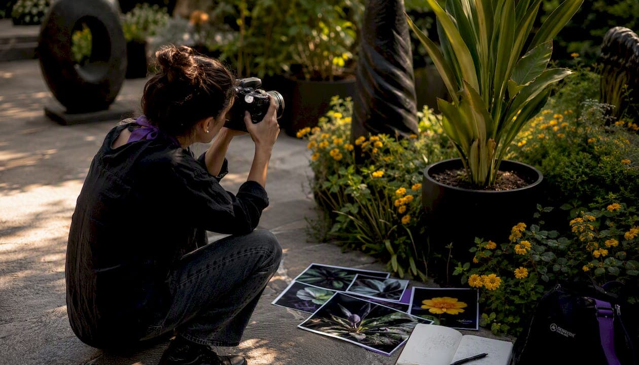
A vertical photo, technically called portrait orientation, is any image where the height exceeds the width. That single distinction shapes how viewers read a frame, how platforms display it, and how much commercial value it carries. Choose vertical when your subject is taller than it is wide, when vertical lines dominate the scene, or when the final output is a mobile screen, social Story, or portrait print.
Quick reference for the most common situations:
- Portraits and single subjects: vertical framing isolates the subject and conveys personality more directly than a wide frame, as Adobe's portrait photography guidance confirms.
- Architecture and tall landscapes: vertical lines, building facades, and narrow canyon walls all read stronger in portrait orientation.
- Mobile-first social content: Instagram feed posts favor 4:5, while Stories, Reels, and TikTok use 9:16.
- Stock and commercial licensing: vertical compositions align with mobile UI layouts and increase a photo's licensing appeal.
Table of Contents
- What does "vertical photo" actually mean?
- How does vertical differ from horizontal, and why does it matter?
- When should you choose vertical over horizontal?
- How do you shoot better vertical photos in the field?
- What aspect ratios and pixel sizes do vertical photos need?
- How do you edit and crop vertical images effectively?
- Where can you find high-quality vertical photos?
- What makes a compelling vertical composition? Examples and prompts
- Mark Gray's expert perspective on vertical photography
- Key Takeaways
- Why vertical is the orientation I reach for first
- Gallery-quality vertical prints and workshops from Mark Gray Gallery
- Useful sources and further reading
What does "vertical photo" actually mean?
A vertical photo is defined by one measurable fact: height is greater than width. The industry term for this is portrait orientation, borrowed from traditional portraiture where painters positioned canvases tall to fit a standing figure. The contrasting term is landscape orientation, where width exceeds height.
You will hear several labels used interchangeably: portrait photo, vertical image, tall photo format, and portrait-orientation shot. In professional photography and stock licensing contexts, "portrait orientation" is the standard term. "Vertical photo" is the plain-language equivalent that has become dominant in social media and mobile design conversations.
One distinction worth making: a vertical image can result from intentional in-camera composition or from cropping a horizontal frame after the fact. These are not the same thing. Composing vertically in-camera means you frame the subject with the final orientation in mind, preserving resolution and keeping the composition intact. Cropping a horizontal image to vertical is a workaround that sacrifices pixels and often produces awkward framing. Professionals treat vertical as a deliberate choice made before the shutter fires.
How does vertical differ from horizontal, and why does it matter?
Orientation is not a neutral technical setting. It is a compositional decision that changes what a viewer feels when they look at an image.
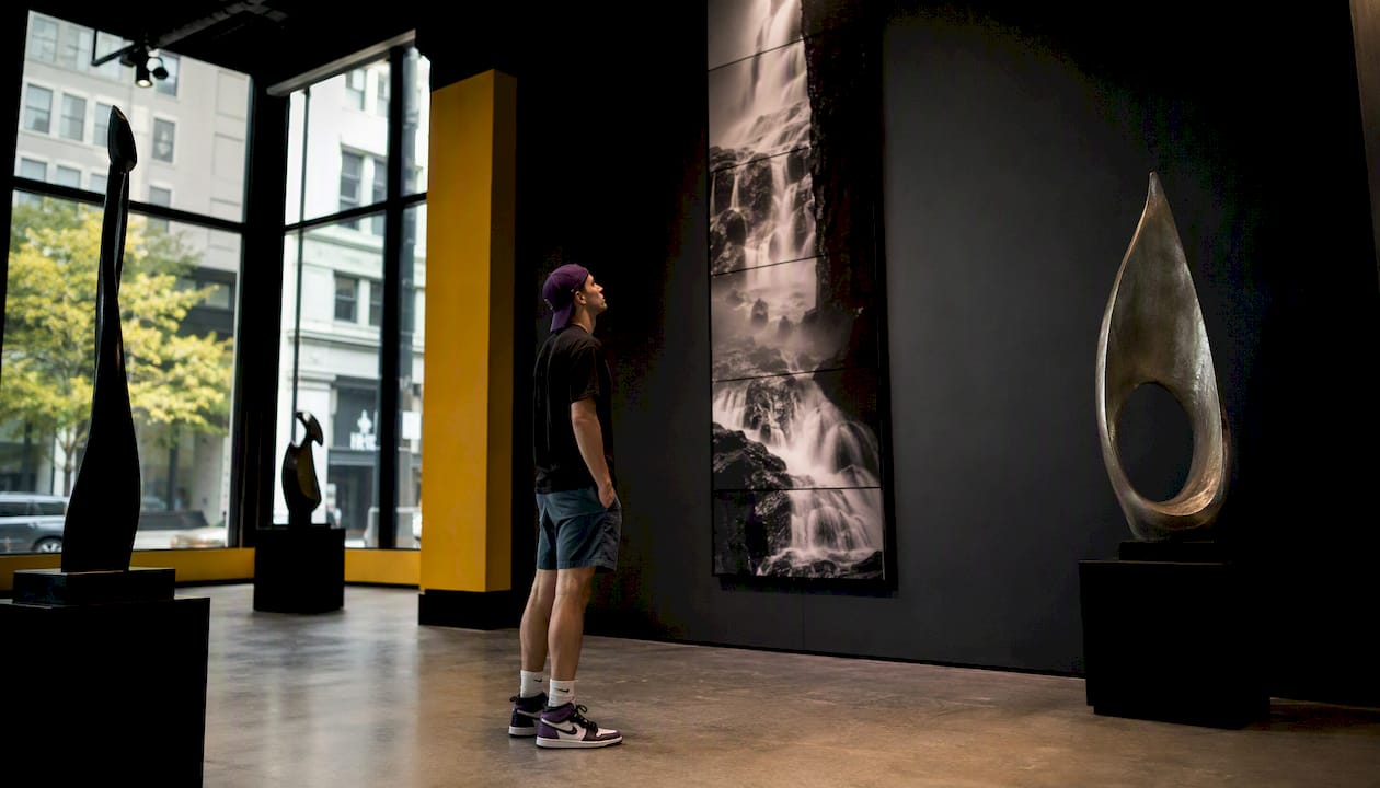
Fstoppers' orientation analysis puts it plainly: vertical framing emphasizes height, strength, and subject intensity, while horizontal framing emphasizes width, space, and a sense of calm or vastness. Shoot the same waterfall both ways and you get two genuinely different photographs. The vertical version pulls the eye upward along the cascade; the horizontal version spreads the scene and invites the viewer to rest in it.
"Choosing vertical is an active compositional choice that changes emotional impact, often adding a sense of strength or dominance — many photographers default to horizontal simply because of how cameras are gripped." — The Photography Toolkit
Eye movement follows the frame shape. In a vertical image, the gaze travels up and down, which suits subjects with strong vertical lines: a person standing, a tree, a building, a cliff face. In a horizontal image, the gaze sweeps left to right, which suits wide vistas, group scenes, and cinematic storytelling.
Layout implications are equally practical. Mobile screens are vertical by default, so portrait-orientation images fill the screen without black bars or awkward letterboxing. Web designers often prefer vertical hero images because they leave horizontal space for text alongside the photo. Print formats like 5×7 and 8×10 are vertical by convention, matching how people naturally hold and view portrait prints.
When should you choose vertical over horizontal?
The decision comes down to subject shape, dominant lines, and final output. Here are the primary situations where portrait orientation is the stronger choice:
- Single-subject portraits: vertical framing fills the frame with the person, eliminates peripheral distraction, and lets personality come through without competing background elements.
- Tall architecture: building facades, towers, and narrow alleyways have strong vertical geometry that horizontal framing cuts off or diminishes.
- Mobile-first social formats: Stories, Reels, and TikTok are built for 9:16; Instagram feed posts perform best at 4:5. Shooting horizontal for these platforms means losing significant frame area.
- Vertical panoramas: a single tall scene, like a redwood grove or a canyon slot, reads far more dramatically in portrait orientation than any horizontal crop could achieve.
- Product and editorial layouts: vertical product shots fit catalog grids and e-commerce templates; editorial portraits give designers headline space above or below the subject.
- Stock licensing for mobile: vertical architectural shots increase commercial usability because they align with mobile UI layouts, making them more attractive to buyers licensing images for apps, websites, and digital signage.
A fast decision rule: if the subject's height clearly exceeds its width, or if vertical lines dominate the scene, choose portrait orientation. If the final output is a mobile screen or vertical print, choose portrait orientation. Everything else, evaluate both.
How do you shoot better vertical photos in the field?
Shooting vertically well requires more than rotating the camera. These techniques make a real difference:
- Camera handling: rotate the body so the shutter button is at the top, not the bottom. For heavy DSLRs or mirrorless bodies with large lenses, a vertical battery grip adds a second shutter button and makes extended vertical shooting far more comfortable.
- Parallel vertical lines: keep strong vertical elements, like building edges, trees, and door frames, parallel to the frame edges. Tilted verticals read as mistakes, not style.
- Leading lines upward: use paths, staircases, rivers, or rows of columns to draw the eye from the bottom of the frame toward the subject or sky. This technique is especially effective in tall landscape compositions.
- Foreground balance: the bottom third of a vertical frame is prominent and often underused. Place a meaningful foreground element there rather than leaving dead space.
- Focal length for portraits: an 85mm lens (full-frame equivalent) is the classic choice for portrait work. It compresses facial proportions flatteringly and maintains subject isolation without requiring you to stand uncomfortably close.
- Step back for architecture: shooting too close to a tall building exaggerates keystone distortion, where vertical lines appear to converge at the top. Stepping back and using a longer focal length compresses the height naturally and keeps lines straighter.
- Shoot both orientations: for any important subject, capture a horizontal and a vertical version. Clients, editors, and stock buyers often need both, and the decision about which works better is sometimes clearer in post than in the field.
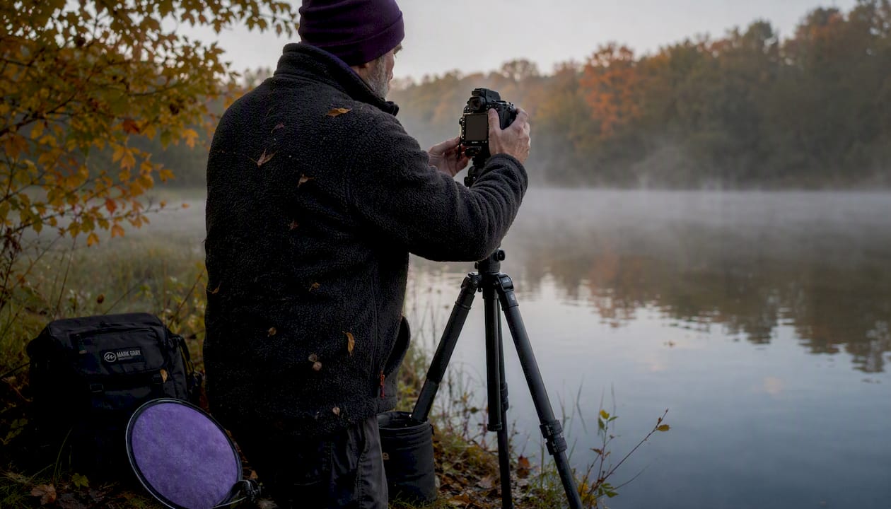
Pro Tip: Compose vertically in-camera rather than planning to crop later. A horizontal frame cropped to 4:5 loses roughly 25% of its pixels. Framing for the final orientation from the start preserves full resolution and keeps your composition intentional. The landscape composition checklist at Mark Gray Gallery covers this workflow in detail.
What aspect ratios and pixel sizes do vertical photos need?
| Format | Aspect Ratio | Recommended Pixel Size | Typical Use |
|---|---|---|---|
| Instagram feed (portrait) | 4:5 | 1080 × 1350 px | Feed posts, portrait crops |
| Instagram / TikTok Stories | 9:16 | 1080 × 1920 px | Stories, Reels, TikTok |
| Classic sensor portrait | 2:3 | — | Full-frame capture, web display |
| Standard print (5×7) | 5:7 | — | Home prints, greeting cards |
| Standard print (8×10) | 4:5 | — | Framed prints, gallery display |
| Mobile wallpaper | 9:16 | — | Smartphone backgrounds |
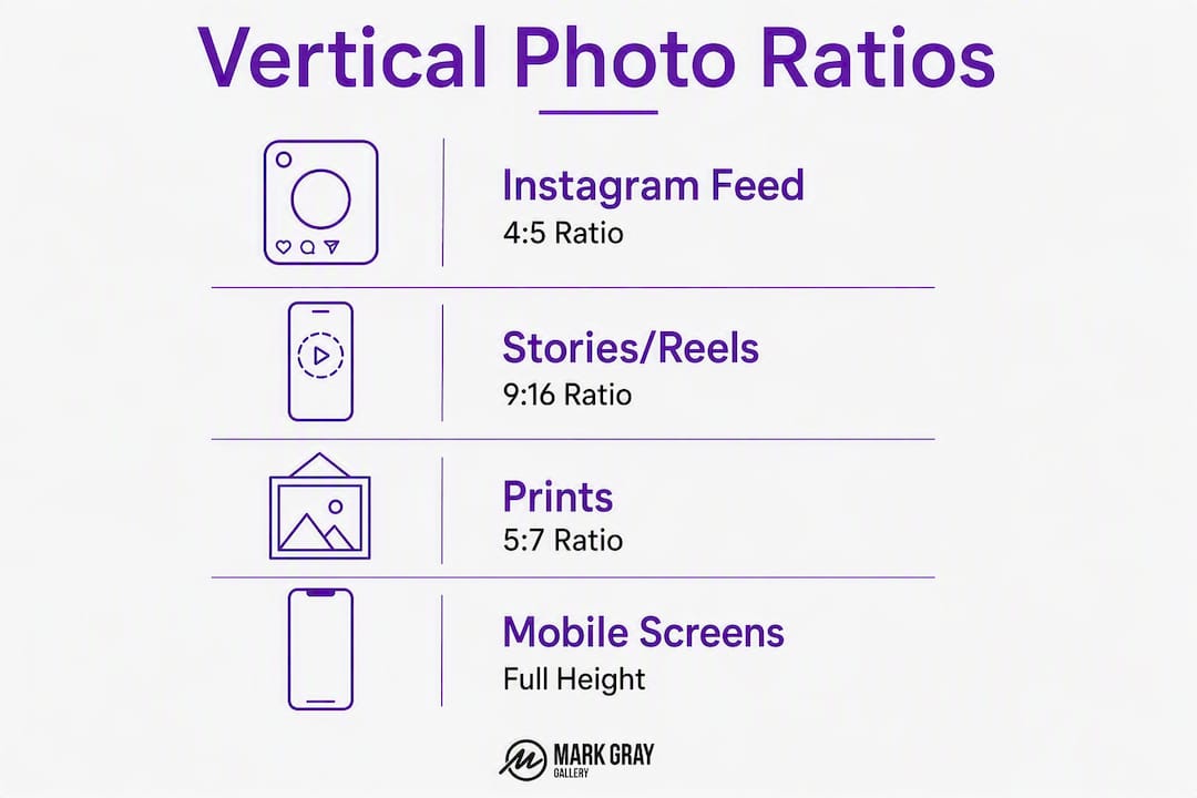
The 4:5 ratio deserves particular attention. Fstoppers notes that many professionals compose with a 4:5 crop in mind even when shooting on a 2:3 sensor, because the slightly wider vertical frame feels more balanced than the taller, narrower 2:3. For Instagram feed posts, 4:5 also maximizes screen real estate without triggering the platform's automatic crop.
Choose 9:16 when the output is a Story, Reel, or TikTok. Choose 4:5 when the output is an Instagram feed post or a standard print. Use the native 2:3 sensor ratio when you need maximum resolution for large-format printing or when you want to give a client or editor full cropping flexibility.
How do you edit and crop vertical images effectively?
Good post-processing for vertical images follows a clear sequence:
- Straighten vertical lines first. Before any other adjustment, use the crop tool's angle correction or a dedicated straightening tool to align dominant vertical elements with the frame edge. A slightly tilted building or tree undermines the entire composition.
- Correct keystone distortion for architecture. When vertical lines converge toward the top of the frame, use perspective-correction tools (Lightroom's Transform panel, Photoshop's Perspective Crop, or DxO ViewPoint) to restore parallel verticals. Avoid over-correcting, which makes buildings look unnaturally wide at the base.
- Apply graduated exposure adjustments. Vertical frames often have a bright sky at the top and a darker foreground at the bottom. A graduated filter or luminosity mask lets you balance these zones without flattening the overall exposure.
- Crop with resolution in mind. If you are cropping a 2:3 frame to 4:5 for Instagram, calculate whether the resulting file meets the platform's 1080 × 1350 px minimum. Cropping aggressively on a low-resolution original produces soft, pixelated output.
- Apply selective sharpening. Vertical crops expose more sky and foreground than a tightly framed horizontal. Use a brush or mask to sharpen the subject and mid-ground while leaving smooth areas like sky and water untouched.
- Check noise in extended areas. Sky and plain foreground surfaces show noise more visibly than textured areas. Apply noise reduction selectively to these zones rather than globally, which can soften fine detail in the subject.
Pro Tip: Use Lightroom's Guided Upright or Photoshop's Adaptive Wide Angle filter to fix leaning buildings while preserving natural proportions. Avoid the Auto Upright setting on heavily distorted shots; it often over-corrects and introduces unnatural stretching at the frame edges.
Where can you find high-quality vertical photos?
Stock sites, free image libraries, and AI tools all offer vertical images, but knowing how to filter and search efficiently saves significant time.
- Stock sites with orientation filters: — Adobe Stock, Getty Images, and Shutterstock all include an "orientation: vertical" or "portrait" filter in their search interface. Apply it first, then add descriptive keywords like "portrait natural light," "vertical architecture," or "9:16 landscape."
- Free image libraries: — Unsplash and Pexels both support orientation filtering. Search "portrait orientation" or add "vertical" to any keyword string. Quality varies, so check resolution before downloading.
- Licensing reminder: always check the license before using any image commercially. Free libraries often restrict commercial use, and stock licenses vary by tier. The licensed photography vs. free images guide at Mark Gray Gallery explains the practical differences clearly.
What makes a compelling vertical composition? Examples and prompts
The fastest way to develop an eye for vertical framing is to practice with specific subjects and search for strong examples online. A few prompts worth trying:
In the field: photograph a tall tree with a leading path running toward it from the foreground. The path anchors the bottom third, the trunk fills the middle, and the canopy reaches the top. Then shoot the same scene horizontally and compare how the emotional weight shifts.
For portraits: place your subject slightly off-center in a vertical frame, with one vertical architectural element (a doorway, a wall edge, a window frame) running parallel to the frame edge behind them. The parallel line reinforces the vertical geometry without competing with the face.
For architecture: stand at street level and shoot a full building facade from corner to corner. Leave sky at the top for copy space, and use the building's base as the bottom anchor.
Search prompts for inspiration: "vertical architecture courtyard," "portrait 4:5 natural light," "9:16 landscape waterfall," "environmental portrait vertical," and "tall forest leading path" all surface strong reference images across Google Images, Pinterest, and stock platforms.
Mini-assignments: shoot the same subject in both orientations back-to-back; build a five-image vertical series for a mobile Story; create a vertical portfolio thumbnail set at 4:5 for a consistent grid.
Mark Gray's expert perspective on vertical photography
Vertical framing is one of the most underused tools in landscape photography, and it is especially powerful for commercial and stock work. A few principles that shape the approach at Mark Gray Gallery:
Compose in-camera, always. Cropping a horizontal frame to vertical is a last resort, not a workflow. When you frame vertically from the start, you see the foreground, the leading lines, and the sky balance as they actually are, not as approximations of what a crop might produce.
Leave a 4:5 margin. Even when shooting on a full-frame sensor at 2:3, framing with a 4:5 crop in mind means the final image works for Instagram feed posts, standard prints, and most editorial layouts without sacrificing the composition's integrity.
Vertical architecture has real commercial value. Vertical architectural compositions align with mobile-first layouts and are consistently more attractive to commercial licensees than horizontal equivalents. When shooting a location, capture a vertical hero shot, a vertical detail, and a vertical environmental shot as a minimum set.
Pro Tip: When shooting tall subjects like buildings or cliffs, step back further than feels necessary. Distance reduces keystone distortion and gives you more compositional control in post. A slightly longer focal length, around 70mm to 100mm on a full-frame body, compresses the height naturally and keeps vertical lines cleaner.
Key Takeaways
Vertical photos are a deliberate compositional choice: shoot portrait orientation in-camera, use 4:5 for portraits and prints, and use 9:16 for Stories and short-form video.
| Point | Details |
|---|---|
| Definition and decision rule | A vertical photo is taller than it is wide; choose it when the subject or dominant lines are vertical, or the output is mobile or portrait print. |
| Top aspect ratios | Use 4:5 (1080 × 1350 px) for Instagram feed and prints; use 9:16 (1080 × 1920 px) for Stories, Reels, and TikTok. |
| Shoot in-camera, not in post | Composing vertically in the field preserves full resolution and keeps the composition intentional rather than a cropped approximation. |
| Commercial value | Vertical architectural and portrait shots align with mobile UI layouts and carry stronger licensing appeal for stock and commercial buyers. |
| Com's offering | Mark Gray Gallery offers gallery-quality vertical-format landscape prints, photography workshops covering composition, and commercial image licensing. |
Why vertical is the orientation I reach for first
The conventional wisdom in landscape photography is that wide horizontal frames capture the grandeur of a scene. That is true for some subjects. But the assumption that horizontal is the default and vertical is the exception has cost many photographers their best shots.
Some of the most striking landscape prints in the Mark Gray Gallery collection are vertical. A narrow slot canyon, a single Icelandic waterfall framed against basalt columns, a lone tree on a Norwegian hillside: these subjects demand a vertical frame. A horizontal crop of the same scenes would spread the drama thin and lose the sense of height that makes them arresting.
The workflow habit that matters most is simple: before raising the camera, ask whether the subject is taller or wider. If the answer is taller, or even equal, try vertical first. Shoot horizontal as the backup. Most photographers do the opposite, and they spend time in post trying to rescue a horizontal frame that was never right for the subject.
For anyone serious about developing this instinct, the photography workshops at Mark Gray Gallery cover vertical composition as a dedicated field exercise, not a footnote.
Gallery-quality vertical prints and workshops from Mark Gray Gallery
Mark Gray Gallery offers a direct path from learning to owning for anyone serious about vertical-format photography. The collection includes limited and open edition landscape prints captured across Australia, New Zealand, Norway, Iceland, French Polynesia, Spain, and the United Kingdom, many in portrait orientation and printed to gallery standards.
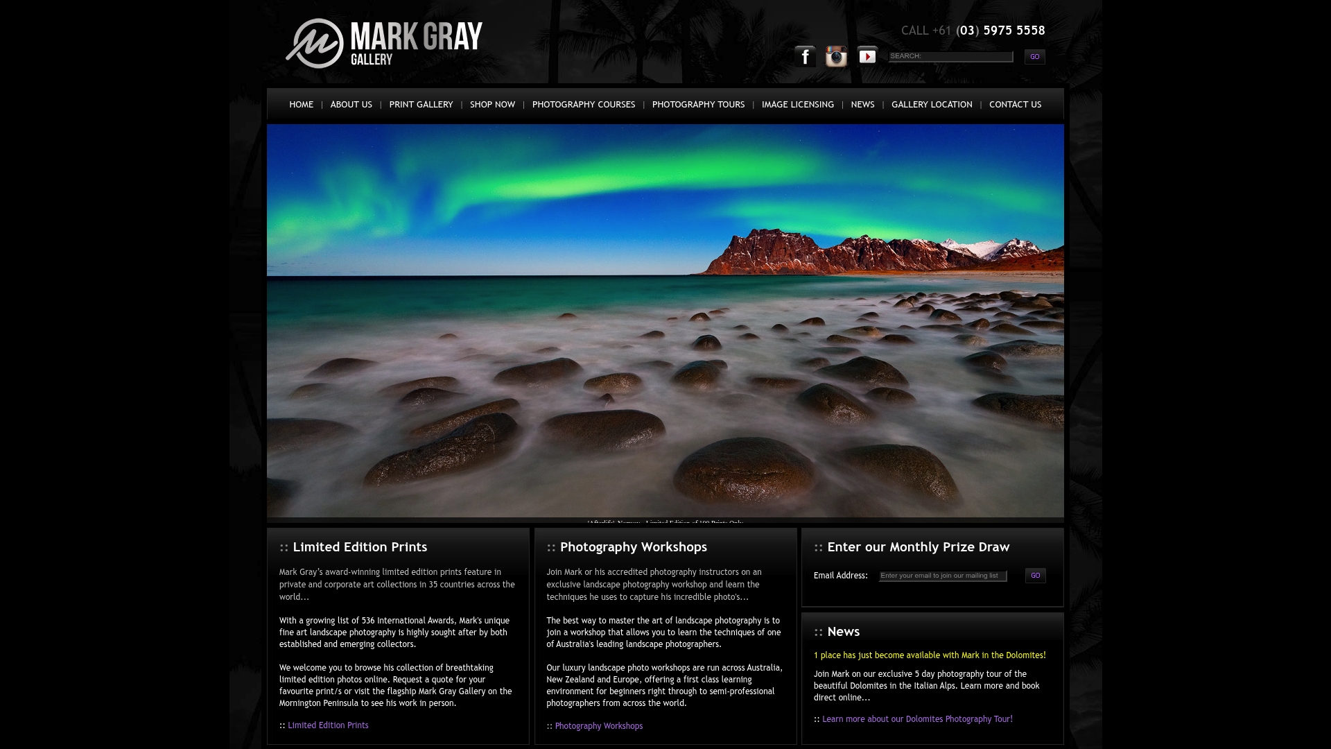
For photographers who want to develop their own vertical composition skills, Mark Gray's one-day photography courses across Australia and multi-day workshop tours worldwide cover in-camera framing, aspect ratio planning, and field workflow in depth. Commercial clients can license Mark's landscape images for use in websites, signage, splashbacks, brochures, and more, with vertical-format options available across the full collection.
Visit markgray.com.au to browse the print collection, check workshop dates, or inquire about commercial licensing.
Useful sources and further reading
- Fstoppers: Why Vertical Is Sometimes Better Than Horizontal — composition rationale and 4:5 framing guidance
- Adobe: Portrait Photography — subject connection and vertical framing for portraits
- The Photography Toolkit: Vertical or Horizontal? — practical orientation decision framework
- Mark Gray Gallery: Licensed Photography vs. Free Images — licensing considerations for commercial vertical image use
- Mark Gray Gallery: Displaying Large Format Photography Prints — framing and display guidance for large vertical prints
This article provides general photography and formatting guidance. Licensing terms, platform specifications, and print requirements change over time; confirm current details with the relevant platform or a qualified professional before commercial use.