
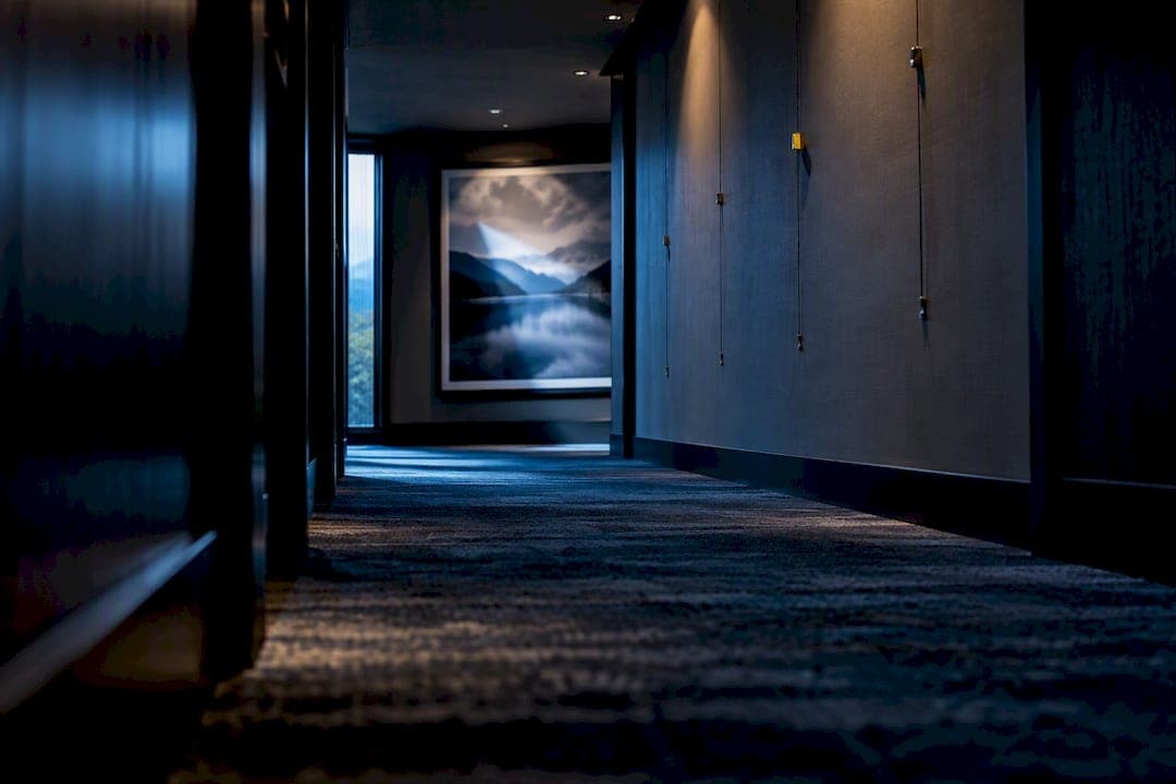
Choose a curated, place-based photographic series produced to museum-quality standards, then specify it for safety, lighting, and long-term maintenance before a single piece goes on a wall. The strongest hotel art programs pair archival substrates and pigment inks with anti-reflective glazing or Optium Museum Acrylic where traffic or safety demands it, and they plan installation around evacuation signage from the start. Request a scale mockup or licensing quote before committing to a full rollout.
TL;DR:
- Durability of printed artwork is essential to maintain guest experience, requiring high-quality substrates, pigment inks, and protective glazing suited to traffic and safety needs.
- Selecting the right style and technical specifications ensures art aligns with the space’s purpose, environmental conditions, and safety regulations, minimizing installation errors.
- Black and white photography generally ages better under varied lighting and is suitable for corridors and high-traffic areas, while landscape images create a calm, destination-focused atmosphere.
- Proper inclusion of evacuation diagrams and safety clearance zones during planning prevents compliance issues and avoids costly rework after installation.
- Working with an integrated supplier for printing, licensing, and installation guidance enhances consistency, reduces coordination friction, and ensures quality throughout the hotel art program.
Table of Contents
- Why art matters in hotels: evidence and commercial value
- How to choose photographic wall art for hotels
- Art styles and subjects that work best for hotel environments
- Recommended photography choices by hotel space
- Print production, materials, glazing and framing: exact specification language
- Installation, lighting, safety and maintenance checklist
- Why work with an experienced photographer and licensor
- A procurement perspective on ambition versus operations
- How Mark Gray's services support a hotel art program
- Authoritative research and industry guidance
- Sources
- FAQ
Why art matters in hotels: evidence and commercial value
Photography on hotel walls is not decoration for its own sake. A 2026 mixed-methods study of luxury hotel guests found that visual art engages people through attention holding, cognitive enquiry, and emotive immersion, and that this engagement correlates with a better overall guest experience. The research combined qualitative interviews with a broader guest survey, and the pattern held across both methods: guests who noticed and engaged with the art rated their stay more favorably.
The finding matters for procurement because it reframes art as a measurable input, not a finishing touch, backed by a mixed-methods hospitality study covering interviews and a guest survey.
Neuroaesthetics research summarized by hospitality design firm WATG points to a mechanism behind that effect: viewing art activates reward centers in the brain and helps shift people into more reflective, restful states, which is precisely the emotional register hotels want to create in a lobby or a suite. The same guidance recommends anchoring artwork to a property's sense of place rather than filling walls with generic stock imagery, because a coherent visual story does more to build brand identity than a scattering of unrelated images.
There is a commercial thread here too. Art that rewards a second look extends dwell time in lobbies and F&B spaces, gives guests something to photograph and share, and turns hallway walks into a slower, more considered experience rather than a blank corridor to get through. None of that holds if the print fades, the frame corrodes, or the glazing scratches within a couple of years, so durability is not a separate conversation from guest experience. It is the same conversation, extended across the life of the installation.
How to choose photographic wall art for hotels
Choosing art for a hotel is a procurement exercise with a creative front end, and treating it that way from the outset avoids the two most common failures: art that looks wrong once installed, and art that cannot survive the environment it is placed in.
- Define the guest-experience objective first. Decide what feeling each zone should produce and how that ties to the brand's own sense of place, whether that is the destination itself, the region's landscape, or a broader design narrative.
- Audit every space before selecting images. Measure sightlines, ceiling heights, natural and artificial light sources, and the exact location of evacuation diagrams, since these constraints will eliminate options before style even enters the conversation.
- Choose a style and a format approach. Decide between a single statement piece for a feature wall and a coherent series for corridors or repeated guest room layouts, and settle on subject matter appropriate for a broad, international audience.
- Write a technical specification. Substrate, ink lightfastness rating, glazing type, backing, hanging hardware, and packing requirements all belong in the same document so vendors quote against identical terms.
- Decide how the work will be sourced. Commissioned photography, limited-edition prints, open-edition prints, and licensed stock each carry different costs, exclusivity, and lead times, and the right mix often varies by zone.
- Approve mockups at scale before ordering. A rendering at true size against the actual wall catches proportion and color problems that a thumbnail never reveals.
- Schedule installation with housekeeping and events. Coordinating install windows around occupancy and event calendars keeps disruption to guests near zero.
Pro Tip: Photograph each wall with a tape measure in frame before briefing any photographer or gallery. It removes almost all the back-and-forth over scale later.
The sourcing decision in step five deserves more attention than it usually gets. Commissioning original photography gives a property exclusivity and a story to tell staff and guests alike, but it takes longer and costs more per image. Limited-edition prints sit in the middle: they carry provenance and scarcity value without the lead time of a bespoke shoot. Open-edition prints are the fastest and most budget-friendly route for repeated corridor or guest room imagery, where exclusivity matters less than consistency. Licensed stock photography fills gaps quickly, particularly for splashbacks, signage, or spaces where a fully custom piece is not justified.

Whichever route a property takes, the audit in step two is where most projects go wrong when skipped. A design team falls in love with a panoramic piece, only to discover during installation that it clashes with a fire exit sign or covers part of the mandatory evacuation diagram. Building the safety map before the mood board saves a reorder later.
Art styles and subjects that work best for hotel environments
Different photographic styles produce different emotional and practical outcomes, and matching style to zone is as important as matching quality to budget.
- Landscape and place-based photography creates calm and a sense of provenance, functioning almost like a window onto a destination, which makes it a strong choice for lobbies and suites where a longer look is welcome.
- Black and white photography reads as quiet and timeless, sits comfortably against almost any color scheme, and is less prone to looking dated as decor trends shift around it.
- Minimalist and abstract photography asks little of a passing glance, which suits corridors and transition spaces where guests are moving rather than pausing.
- Architectural and place-story photography reinforces a property's local narrative in public zones, giving guests a visual cue about where they are rather than a generic hotel interior that could be anywhere.
- Practical red lines matter as much as style: avoid overtly political, sexual, or culturally insensitive imagery, and default to accessible, inclusive subject matter that reads well across a genuinely international guest base.
Style choice also has a durability dimension. Color-saturated landscape work is more visibly affected by UV fading and color-shift than black and white photography, which tends to age more gracefully under imperfect lighting. That is one more reason black and white works well in spaces where lighting control is harder to guarantee, such as corridors with mixed daylight and artificial sources.
Recommended photography choices by hotel space
Scale, framing, and subject need to be matched to the specific function of each zone rather than chosen once and repeated everywhere.
- Lobby: Immersive, large-format pieces or a coherent series create arrival impact, and anti-reflective glazing paired with controlled backlighting keeps the image legible under lobby-level ambient light.
- Guest rooms: One focal image sized to the furniture and typical sightlines from the bed or seating area works better than several competing pieces, and non-reflective glazing with secure, discreet mounting hardware suits the lower light levels typical of these rooms.
- Corridors: A consistent-sized series creates rhythm and doubles as a wayfinding cue, and the surfaces need protective glazing that can withstand incidental contact from luggage carts and housekeeping trolleys.
- F&B and bars: Flexible, mood-driven imagery suits these spaces, and frames that allow seasonal rotation keep the visual story fresh without a full reinstall each time.
- Meeting rooms: Neutral photography that supports concentration rather than competing for attention suits corporate audiences best, and modular framing systems make reconfiguration between events straightforward.
A lobby installation is worth more design attention than any other single zone, since it sets the tone for the whole stay and is where guests spend the most unstructured looking time. For guidance on translating that into specific choices by wall type and viewing distance, see this reception wall art guide.
Print production, materials, glazing and framing: exact specification language
RFQs and statements of work go smoother when the specification uses the same terms a print house or gallery uses internally, rather than approximate design language.
Museum-quality prints require 100% cotton rag, acid-free, OBA-free substrates paired with pigment-based archival inks, and this combination is rated for multi-century display life under standard conditions rather than the handful of years typical of consumer-grade prints. The distinction between photographic paper and true fine art paper is worth understanding before specifying, since the two terms are often used loosely in the trade; this comparison of photographic and fine art paper lays out the practical differences.
Glazing choice depends on the zone and the risk profile of the installation.
| Glazing type | Optical clarity | Best suited to | Key trade-off |
|---|---|---|---|
| Museum Glass / Water White | Excellent, near-invisible | Controlled guest suites, low-traffic art walls | Heavier, more fragile than acrylic |
| Optium Museum Acrylic | Excellent, anti-reflective | High-traffic lobbies, corridors, oversized or traveling pieces | Higher unit cost, but far lower breakage risk |
Optium Museum Acrylic combines conservation-grade UV protection with anti-reflective performance and shatter resistance, and its lighter weight makes it easier to hang oversized pieces safely. That combination is why many hospitality specifiers default to acrylic in public, high-traffic, or safety-sensitive areas, reserving true museum glass for controlled spaces such as guest suites where breakage risk is lower and glass's slightly superior optical clarity is worth the extra weight and fragility.
Mounting decisions follow from the glazing choice. Framed presentations suit traditional lobby and corridor placements, while frameless acrylic face-mounts give a cleaner, more contemporary look that many contemporary hotel brands favor for feature walls. Whichever system is chosen, hanging hardware needs to be rated for the wall substrate, not just the piece's weight, and hotel walls vary enormously between plasterboard, masonry, and feature paneling.

Pro Tip: Ask any print supplier for the ink lightfastness rating in writing, not just a verbal assurance. It is the single number that predicts how the piece will look in five years under lobby lighting.
Packaging and delivery matter more in hospitality than in a typical gallery sale, since pieces often travel further and pass through more hands before installation. Crating, transit insurance, and white-glove installation should all appear as line items in a quote, not assumptions.
Installation, lighting, safety and maintenance checklist
Getting a piece specified correctly means nothing if the installation itself creates a safety or maintenance problem.
- Evacuation diagram clearance: Diagrams required under AS 3745 must remain visible and unobstructed, and they are typically mounted between roughly one and a half to a little over two meters from the floor, a band that art placement must map around rather than compete with.
- Lighting angle: A roughly 30 degree lighting angle reduces glare and surface hotspots on glazed pieces, and it is a simple rule installers can apply without special equipment.
- Color rendering: Where color fidelity matters, such as landscape photography with subtle tonal gradation, lighting rated at CRI 90 or higher preserves the intended palette far better than standard commercial fixtures.
- Fire and material compliance: Decorative wall panels and mounted art in public corridors should be checked against local fire-rating requirements for wall linings, with a Group 1 rating serving as a practical default in many hotel public zones.
- Maintenance routine: Approved cleaning agents, a defined cleaning frequency, and basic staff training prevent the most common cause of premature damage, which is well-meaning housekeeping staff using the wrong glass cleaner on acrylic glazing.
The safety clearance zone around evacuation diagrams is a fixed operational constraint, not a design suggestion, drawn from AS 3745 guidance for hotels. Mapping every diagram location before finalizing any art layout removes the single most common compliance headache in hotel art projects.
Practical guidance on hanging technique, including hardware selection and wall-type considerations, is covered in this guide to hanging landscape photography prints, and it is worth reviewing before the first piece goes up rather than after something falls.
Why work with an experienced photographer and licensor
A single supplier who can provide the print, the licensing, and the installation guidance removes a lot of coordination friction from a hotel art program. Limited-edition and open-edition landscape photography prints suited to hospitality installations are available, alongside image licensing for splashbacks, signage, brochures, and websites, covering commercial use cases that pure decor suppliers rarely handle. Educational resources on hanging technique and lighting, referenced throughout this guide, reflect the kind of aftercare and specification knowledge hotels benefit from when the same source that produced the print can also advise on how it should be displayed. For examples of the production standard involved, this collection of gallery-quality landscape prints shows the level of finish worth specifying.
A procurement perspective on ambition versus operations
Design ambition and operational reality pull in different directions more often than anyone admits during the pitch stage. Public zones need durable finishes that survive luggage carts and daily cleaning, while guest suites can carry more delicate presentations because the environment is controlled and the audience is smaller. Coordinate every installation with housekeeping and the events calendar, never around the designer's own schedule. And build cleaning, reframing, insurance, and the occasional reprint into the budget from day one, because a program costed only for the initial install always runs over within two years.
— Mark
How Mark Gray's services support a hotel art program
Once the specification is set, the fastest path to execution is working with a supplier who can produce the print, license the image for commercial use, and support the install in one relationship rather than three separate vendors. Mark Gray's landscape photography is available as limited-edition and open-edition prints suited to lobby, corridor, and guest room installations, alongside image licensing for splashbacks, signage, and brochures where a hotel needs commercial usage rights rather than a physical print. One-day photography workshops are also offered that can help hotel teams build in-house photographic literacy, useful for properties that shoot their own promotional imagery between larger art commissions.
Before committing to a full rollout, it is worth requesting:
- A scale mockup against your actual wall dimensions
- Physical sample swatches of substrate and glazing options
- Fire-safety and mounting guidance specific to your property type
- A licensing quote for any image intended for signage or splashback use
Start by browsing limited edition prints or open edition prints to see the range available, and reach out through Markgray for a hospitality-focused quote.
Authoritative research and industry guidance
The specifications in this guide draw on primary research and manufacturer documentation worth keeping on file for compliance and vendor conversations.
- Mixed-methods hospitality art study
- WATG guest experience and neuroaesthetics guidance
- Museum-quality print standards
- Optium Museum Acrylic specifications
- AS 3745 evacuation diagram placement guidance
Sources
- “I Like This Art, So I Like This Hotel”—A mixed methods investigation
- How art defines the guest experience — WATG
- What makes museum-quality art prints different from standard prints
- Optium Museum Acrylic® | Tru Vue
- Evacuation diagrams for hotels and accommodation — EvacPath
FAQ
What are some creative ideas for a hotel room photoshoot?
Strong hotel room photoshoots pair the room's own view or regional landscape with the property's design palette, often shooting a single destination across a limited-edition series so every room in a wing shares a visual thread. Black and white treatments work well when a hotel wants imagery that will not clash with future decor refreshes.
What is the 2/3 rule for wall art?
The 2/3 rule is a common design guideline suggesting that a piece of wall art should occupy roughly two thirds of the width of the furniture it hangs above, such as a headboard or console table. Definitions vary slightly by designer, but the underlying goal is visual balance rather than a piece that looks too small or overwhelms the furniture beneath it.
What are the trends in wall art for 2026?
Hospitality design guidance continues to favor site-specific, place-based photography over generic stock imagery, since it strengthens a property's sense of place and gives guests a stronger connection to the brand. Minimalist and black and white treatments remain popular for their flexibility across changing decor schemes.
How do I get artwork into hotels?
Photographers and galleries typically place work in hotels through direct licensing agreements, limited-edition print sales, or commissioned shoots tied to a specific property's brand and location. Mark Gray offers image licensing for commercial hospitality use alongside limited-edition and open-edition prints, which covers both routes for hotels sourcing photography directly.
Do hotels need to worry about fire ratings for wall art?
Yes, decorative wall panels and mounted art in public corridors and many hotel zones fall under fire-rating requirements for wall linings, with Group 1 serving as a common default classification. Checking the rating before installation avoids a compliance issue that is expensive to fix retroactively.