
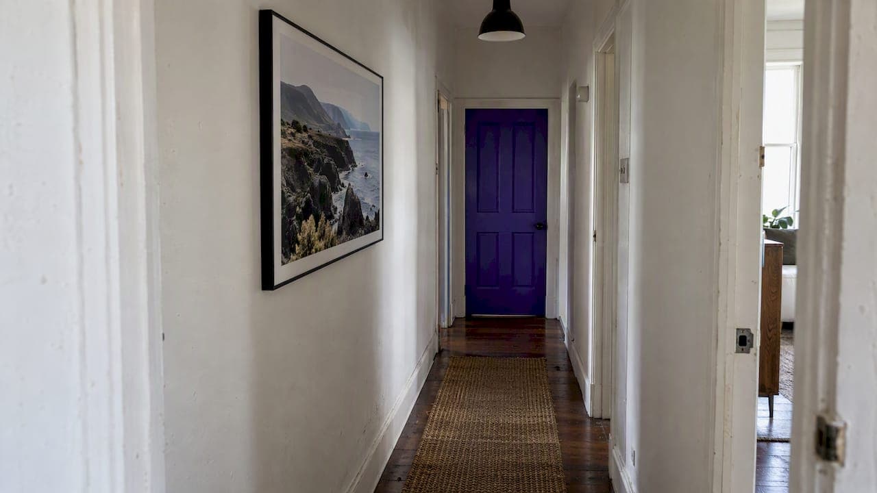
The best hallway wall art does three things: it draws the eye along the corridor, it stays in proportion to a narrow space, and it sets the tone for the rest of the home. A single long panoramic print, a horizontal row of matching frames or a tight gallery of one subject all achieve this. Large, busy arrangements usually do not. Below you will find the layouts that work, how to size and hang them, which colors open a hall up, and how to choose the image itself.
A hallway is the one space everyone walks through and few people stop in. That changes how art should be chosen. You see it in motion, from a sharp angle and often from only a metre or two away, so calm composition and fine detail matter more than loud subject matter.
TL;DR
- Lead the eye along the corridor: a horizontal row or a long panoramic print works better than one tall piece on a narrow wall.
- Keep depth shallow. Slim frames, picture ledges and flush-mounted prints leave walking room.
- Hang the center of a piece or group near eye level, and keep gaps between frames consistent.
- Choose open, light, calm landscapes with a clear horizon to make a narrow space feel longer.
- Light the wall deliberately, and treat the end wall of the hall as your main focal point.
Table of Contents
- Start with the hallway you actually have
- Layout ideas that suit a narrow wall
- Entryway wall art ideas
- Size, spacing and hanging height
- Colors and image styles that open up a narrow hall
- Choosing landscape photography for a hallway
- Lighting the hallway wall
- Our perspective: let one image do the walking
- Smaller ideas that add to a hallway
- Choosing a print as a gift or for a new home
- Bring a Mark Gray print into your hallway
- FAQ
- Sources
Start with the hallway you actually have
Before choosing a single image, look at three things: how far you can stand from the wall, where the light comes from, and where the eye lands when you enter.
Distance. In a narrow hall you may only get a metre between you and the wall. Anything very large will be seen in fragments, and anything with a deep frame will catch shoulders and bags. Plan for slim profiles and images that read well close up and at an angle.
Light. A hallway often has no window. That means artificial light does most of the work, and glare from a bare downlight can wash out a glossy surface. Our guide to wall art lighting for Australian collectors covers angles and color rendering in detail.
Focal point. Most hallways have an obvious destination: the end wall, a door, a staircase. The strongest scheme usually puts one confident piece there and supports it with quieter work along the sides.
Layout ideas that suit a narrow wall
The horizontal gallery line
A single row of frames at a consistent height pulls the eye down the corridor. One interiors specialist recommends a horizontal gallery arrangement in a hallway to lead the eye along the space, and says the pieces can sit in a strict line or be arranged more freely. In practice the strict line suits modern homes and a single photographer's body of work. The freer arrangement suits mixed collections.
Keep the frames the same height or align them on a shared center line. Three to five pieces is usually enough for a standard hallway. More than that and the wall begins to feel crowded.
The picture ledge
A ledge lets you lean art rather than hang it, which makes swapping pieces easy and avoids many holes in the wall. A home furnishing retailer shows how artwork on a picture ledge can turn a narrow hallway into a gallery-like space, particularly when you add lighting, glass and a few objects. Keep the ledge shallow in a narrow hall and place it above shoulder height, so bags and sleeves do not knock things off.

One long panoramic print
This is our favorite solution for a long wall. A panoramic format follows the proportions of the hallway itself, so the print feels as though it belongs to the space rather than being squeezed into it. A wide landscape with a clear horizon also gives the eye somewhere to travel. If you have a wall of two metres or more without a door or switch, a single panoramic piece will often look better than a cluster of small frames.
The paired or triptych set
Two or three images from the same location, hung with narrow, even gaps, read as one work. This is a good approach when you cannot fit a very wide print but want presence. Choose frames of identical size and keep the images related by color and light, such as dawn along one coastline.
Stairwell and landing walls
If your hall includes stairs, follow the rise of the staircase with the center points of the frames, or hold a straight horizontal line and let the stairs climb beneath it. Either works. What fails is a half-way approach, where the frames neither follow the stairs nor hold a line.
Entryway wall art ideas
An entryway is a hallway with a job to do. Guests judge the house by it, and you pass through it with keys, shoes and bags. That suggests a few rules.
- Make one clear statement. A single large or panoramic piece facing the door gives a confident first impression.
- Respect the furniture. If there is a console or bench, keep the bottom of the art close enough to relate to it, so the two read as one group.
- Protect the art. Entry walls get knocks. Choose a solid frame, or an acrylic or glass finish that wipes clean, and avoid hanging delicate pieces beside the door handle.
- Mind the sunlight. A front door with glass panels can throw strong light on the opposite wall. Keep photographic prints away from direct sun.
- Keep the story simple. Use one subject, such as coast, desert or alpine light, rather than a mix.
Our article on landscape photography display options for your home compares finishes in more depth.
Size, spacing and hanging height
These are working guidelines used by many galleries and framers rather than fixed rules, so adjust them to your wall.
| Decision | Starting point | Why it works in a hallway |
|---|---|---|
| Height | Center of a piece or group near eye level | Seen at walking pace, art should not sit too high |
| Gap between frames | Consistent, often 5 to 8 cm | Even gaps make a row read as one composition |
| Wall coverage | Roughly two-thirds of the available wall for a feature piece | Leaves breathing space on a narrow wall |
| Frame depth | Slim profile | Protects shoulder room |
| Group height | Keep to one band | Stops a long wall looking cluttered |
For a single wall, many designers use a rule of thumb that artwork should fill about two-thirds of the width of the wall space or furniture beneath it. In a corridor, treat that as a ceiling rather than a target. A slightly smaller piece with more space around it generally looks calmer.
Our wall art size guide for home and office walks through the maths, and how to hang landscape photography prints correctly explains fixings, levelling and spacing. Before you drill, cut paper templates, tape them to the wall and walk the hallway a few times. You will know within a minute whether the scale is right.
A worked example
Take a hallway 1.1 m wide and 4 m long, with a door on one side near the entrance. Leave the door side bare. On the long blank wall, hang three matching horizontal frames of equal size with 6 cm gaps, aligned on a shared center line. Place a larger single print on the end wall. The row leads the eye to the end, and the end piece rewards the walk. Total depth added to the hall is a few centimetres.
Colors and image styles that open up a narrow hall
Most hallways are enclosed, so the question is how to make them feel longer and lighter. Several choices help:
- Light, airy tones. Pale skies, soft water, sand and mist reflect light and keep the hall from feeling closed in.
- A clear horizon. A strong horizontal line in the image echoes the length of the corridor.
- Depth in the picture. Images with a foreground, middle distance and far distance add perceived space. Think of a path through dunes, a jetty into the sea or a valley falling away.
- Restraint with dark, heavy color. Deep, saturated images can work, but on a narrow wall they are best used for a single end-wall feature rather than along both sides.
- A coordinated palette. Pick one or two colors from the image and repeat them in a rug, a vase or a lamp so the hallway feels designed.
Abstract and minimal work also suits narrow spaces, but landscape photography has a particular advantage: it carries a sense of place and distance into a space that has no window.
Choosing landscape photography for a hallway
A hallway print is viewed at close range and in passing, so the quality of the print matters more than it would on a distant living room wall. Look for:
- Fine detail. Grain, texture and edges that hold up when you pass within a metre.
- Calm composition. One clear subject with room around it.
- Format. Panoramic and wide horizontal ratios for long walls, and a set of matching crops for short ones.
- Edition and provenance. A numbered limited edition signals scarcity and gives the piece standing, which suits an entryway that guests see first.
Mark's prints are made from panoramic medium format film, which is why the detail holds up at close range. They are award-winning and collected in 32 countries. You can browse limited edition landscape prints and open edition prints from Australia to see which formats and locations suit your wall.
When the wall is the whole point
Some entry halls are long, plain and begging for a bold treatment. If you want an image to run across a whole feature wall rather than hang as a framed piece, specialist wall mural printing is one route. It suits large uninterrupted walls, though for a collectible photograph we generally prefer a framed or mounted print that can move with you.
Lighting the hallway wall
Good lighting is what makes a hallway look like a gallery. Aim for even, warm light that grazes the wall from a sensible angle, rather than a single downlight directly above the print. Directional track or picture lights set at an angle reduce glare, and a high color rendering index shows the true tones of a photograph. If your hall has no natural light, this is the single upgrade with the largest effect. Our full guide to 30 degree placement and CRI 90+ lighting gives the details.
Our perspective: let one image do the walking
We have printed and hung landscape photography in homes, offices and reception areas for years, and the most common mistake in hallways is trying to do too much. People fill the wall with small frames because the space feels awkward, and the result is clutter in a place where calm would help.
Our advice is to choose a single location or mood and commit to it. A row of three related images from one coastline, or a single panoramic print of a misty valley, gives the hall a sense of direction. When we shoot on panoramic medium format film, we are looking for exactly that: a wide frame, a clear horizon and enough detail to reward a closer look. In a corridor, where you pass the work every day, that detail is what keeps a print interesting year after year.
We also encourage people to think of the print as part of the house, not a decoration added later. Measure, mock up with paper, light it properly and hang it at a height that suits the people who live there. The same logic applies in commercial spaces, as we explain in our guides to reception wall art ideas and displaying large format photography prints.
— Mark
Smaller ideas that add to a hallway
Not every hallway can take a large print. These smaller options add character without taking up depth.
- A compact gift piece on a console. Our acrylic blocks are $295 each and sit on a shelf or console without needing a nail. Postage and handling is $24.95 within Australia and $74.95 internationally.
- A second subject at the other end. If the hallway has two ends, mirror the main print with a smaller one to balance the space.
- A mirror between two prints. A mirror reflects light and doubles perceived width. Keep it between artworks rather than facing them directly.
- Seasonal swaps on a ledge. Rotating prints through the year keeps a hall fresh without more holes in the wall.
Choosing a print as a gift or for a new home
If you are buying for someone else, or you are not yet sure of the wall, a gift certificate starting from $50 lets the recipient choose the image and size that fits their hallway. For a corporate entrance or office corridor, see our guide to commissioning landscape photography for corporate offices.
Bring a Mark Gray print into your hallway
Every print in our gallery is made with an eye to long-term display: fine detail, careful composition and a finish that suits close viewing. Browse the limited edition prints, and if you would like to see where the images come from, take a look at our photography tours and workshops. For details on current print sizes and pricing, check the product pages on markgray.com.au.
FAQ
What are some ideas for decorating a hallway with wall art?
The most dependable options are a horizontal row of matching frames, a picture ledge with leaning prints, one long panoramic print and a paired set from the same location. Choose one approach and keep the frames slim so the hallway stays easy to walk through. Light the wall properly and the result will look intentional.
What is the 2/3 rule for wall art?
It is a guideline that a piece of art, or a group, should fill about two-thirds of the width of the wall space or furniture beneath it. It is a starting point for balance rather than a law. In a narrow hallway, aim a little under it so the wall has room to breathe.
What colors look good in a narrow hallway?
Light, soft colors such as pale blues, warm whites, sand and grey-greens make a narrow hallway feel more open. A single deeper tone works well on an end wall as a focal point. Pick one or two colors from your artwork and repeat them in a rug or accessory.
How high should I hang art in a hallway?
Center a single piece, or the whole group, near eye level and keep it in one horizontal band along the wall. In a hall you see art while walking, so avoid hanging it too high. Our guide to hanging landscape prints correctly covers the steps.
Can I use landscape photography in an entryway?
Yes, and it suits entryways well because it brings a sense of place and space into an enclosed area. Choose a calm image with a clear horizon, and keep it out of direct sunlight from the front door. A numbered limited edition adds a sense of occasion to a first impression.
Sources
- Weekend Project: 10 Gallery Wall Layout Ideas, TLC Interiors
- Inspiring ideas to help transform your narrow hallway, IKEA Australia