
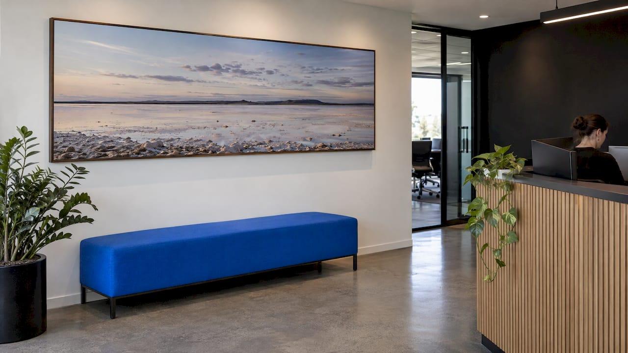
The best office landscape wall art is a few large, high-quality photographic prints, chosen for the room they hang in. A calm, open scene suits a meeting room, a bold statement image suits reception, and the whole set should share one palette and one framing style. The pieces should also be printed to last, because office art stays on the wall for years. At Mark Gray Gallery we publish limited edition and open edition landscape prints from Australia and around the world, and the guidance below is how we would brief any business hanging them.
TL;DR
- Choose one large piece over several small ones in reception and boardrooms. Use matched groups only in corridors and shared spaces.
- Match the scene to the room: open horizons for focus and calm, richer coastal or forest color for welcoming spaces.
- Keep to one palette, one frame finish and consistent spacing, so the art reads as a collection rather than decoration.
- Check print quality, UV protection and image-use rights before you buy, since office walls get light and long hours.
- Limited edition prints, open edition prints and licensed images each suit a different budget and brief.
Table of Contents
- Why landscape photography works on an office wall
- Match the landscape to the room
- Moods and what each kind of landscape does
- Statement piece, coordinated set or gallery wall
- Size, position and lighting
- Print quality, materials and UV protection
- Image rights when the art is for a business
- Limited edition, open edition or licensed image
- Start with the prints themselves
- FAQ
- Sources
Why landscape photography works on an office wall
Landscape photography is clear. A visitor understands a beach at dawn or a mountain ridge in a second, and that makes it a safe, confident choice for rooms where people are waiting, thinking or meeting clients. It does not demand a conversation about taste the way abstract work can.
There is also research behind the instinct. A ScienceDirect study of biophilic office design tested a simulated office that combined live plants, projected greenery and artwork displaying nature scenes, and measured effects on stress, mood and perceived productivity. The authors describe the results as promising evidence for adding natural features to offices. A print is the simplest, most permanent way to bring one of those features into a room with no view.
That last point matters for interior rooms. A windowless meeting room or a deep floor plate has no horizon. A wide landscape with a real sense of distance gives the eye somewhere to rest, and it makes a small room feel less enclosed.
Match the landscape to the room
Every space in an office has a different job. Start with what people do there, then choose the scene.
Reception and entrance
Reception is where a business introduces itself. Here you want one commanding image rather than a cluster. A panoramic format works well behind a desk or above a seating area, because it spreads across the wall and suits the horizontal lines of furniture and architecture.
Choose a scene with a clear focal point and strong light: a headland at sunrise, a rainforest canopy, a long beach with a single line of surf. Visitors should read it from across the room. Our guide to reception wall art ideas goes through layouts for this space in more detail.
Meeting rooms and boardrooms
Meeting rooms need art that supports concentration rather than competing with a conversation. Open, quiet compositions with soft tonal range, such as misty water, wide desert plains or still lakes, suit them well. Avoid very busy images with a lot of fine detail across the whole frame, because they draw the eye during long discussions.
Position matters as much as subject. If the room has a presentation screen, keep glossy or reflective surfaces away from the wall opposite the display, where they can bounce light back into the room. Side walls are usually the better home for a large piece.
Executive and individual offices
A single mid-size piece behind or beside the desk gives an office a considered look. This is also where limited edition work makes sense: a numbered print has a story and a finite supply, and it suits a room where one person spends most of the day with it.
Corridors, stairwells and shared spaces
Long walls call for sets. Three or four matched images with identical frames and even spacing create rhythm along a corridor. A series from a single region, such as a run of Australian coastlines or a sequence of Norwegian fjords, ties the group together. If you are planning a larger open-plan floor, our piece on the 70/30 approach to open-plan office art shows how to balance bold and calm images across one large space.

Moods and what each kind of landscape does
Different landscapes create different effects. These are practical guidelines rather than rules.
| Landscape type | Typical mood | Works best in |
|---|---|---|
| Coastal and seascape | Calm, open, refreshing | Reception, meeting rooms, wellness or break areas |
| Mountains and alpine | Ambition, resilience, scale | Boardrooms, executive offices |
| Forest and rainforest | Growth, grounded, restorative | Collaborative spaces, open-plan floors |
| Desert and outback | Space, clarity, quiet | Focus rooms, leadership floors |
| Lakes and reflections | Stillness, balance | Meeting rooms, client lounges |
| Aerial and abstract landscape | Modern, pattern-led | Lobbies, contemporary fit-outs |
Australian imagery has a particular advantage in an Australian office. Local scenes feel familiar to staff and recognizable to clients, and a regional office can anchor itself with the landscape visitors actually know. International scenes work too, especially where a business has overseas connections or wants a sense of reach. Our scenic Australia prints by region page is a good place to see how different parts of the country look in print.
Statement piece, coordinated set or gallery wall
There are three layouts that work in an office, and each suits a different wall.

A statement piece. One large image, hung centered with generous space around it. It makes the strongest impression and is the easiest to get right. Err toward larger: a single substantial piece usually looks better than several small ones competing for attention.
A coordinated set. Two to four images of the same size, hung in a line or a grid with equal gaps. Use them where the wall is long and low, such as above a credenza or along a corridor. Keep the subjects related, for example one region, one time of day or one color family.
A gallery wall. Mixed sizes in a cluster. It can look relaxed and personal in a breakout area, but it needs planning: lay the arrangement out on the floor first, keep frame finishes matched and hold the spacing even. In formal areas, we would choose the statement piece or the set instead.
For desks and shelves, smaller touches can echo the main artwork. A personalized photo frame with your logo is one way to carry the branding of the business into a team space.
Size, position and lighting
Size is the most common mistake in offices. A print that looks generous in a living room can look small in a conference room with high ceilings. As a working rule, art above furniture should span roughly two-thirds of its width, and a large wall should be filled with one or two substantial pieces rather than many small ones.
A practical sequence:
- Measure the wall and the furniture beneath it. Decide how much of the width the art should occupy.
- Hang at eye level. The center of the image should sit at about standing eye height, which is around 145 to 155 cm from the floor in most rooms.
- Check the sightline. Stand where people will normally sit or wait, and confirm the image is visible and not blocked by screens, plants or doors.
- Mind the glare. Avoid placing glossy surfaces opposite windows or displays, and use accent lighting aimed at the wall rather than the glass.
- Keep consistency in groups. Same frame, same spacing, same hanging height.
Print quality, materials and UV protection
Office art is a long-term fixture. It will hang for years in rooms with daylight and artificial light, so the print itself and the way it is displayed matter more than in a home.
Three things to check:
- The paper or surface. Fine art paper and photographic paper look different and age differently. Our guide to photographic paper versus fine art paper explains the choice for each kind of room.
- UV protection. Light is what fades an image over time. Rooms with large windows need glazing or finishes that filter UV; see our guide to UV protection for prints.
- The original capture. A large print only stays sharp if the original file or film holds detail at that size. Our prints are made from panoramic medium format film and digital cameras for exceptional detail, which is exactly what a 2-metre-wide wall needs.
Acrylic blocks are a different format altogether: a free-standing piece suited to a desk, a reception counter or a boardroom shelf. The Mark Gray acrylic block is $295 each, with Australia-wide postage and handling of $24.95.
Image rights when the art is for a business
Buying a print and licensing an image are two different transactions. A print gives you a physical object to hang. A licence gives you the right to reproduce an image: on a website, a brochure, signage, a splashback or a printed wall graphic. If your plan involves reproducing the image in any form, you need a licence for that use.
The principle applies across Australian collecting institutions too. The Australian War Memorial, for example, notes that commercial or public display of images may require a user fee that varies by use. Settle the use before you commit to the image, particularly for wall-sized reproductions or anything customers will see in marketing.
Mark's landscape photos can be licensed for stock use in splashbacks, signage, websites, brochures and flyers. If you are weighing a print against a commissioned shoot of your own site, our article on commissioning landscape photography for corporate offices covers the brief, and the broader benefits of office art is useful for the business case.
Limited edition, open edition or licensed image
The right format depends on the wall and the budget.
- Limited edition prints are numbered and finite. They suit reception, boardrooms and executive offices, where the piece is meant to be a feature and a long-term asset.
- Open edition prints suit corridors, meeting rooms and multi-site fit-outs where you need several pieces in a consistent style.
- Licensed images suit reproductions at architectural scale, such as splashbacks, feature walls and signage, or digital and printed marketing.
- Gift certificates give a team, a client or a retiring colleague the choice of their own piece.
What we have learned from putting landscapes on walls
We photograph landscapes for a living, and what we care about most is how a photograph behaves once it leaves our hands. An image taken in the first light of a Tasmanian morning or on a Norwegian shoreline has to work in a lobby with fluorescent light and a client waiting for ten minutes.
That is why we start from the wall, not the picture. How wide is it, who sits facing it, and how much daylight does it get? Our prints are collected in 35 countries and made from panoramic medium format film and digital cameras, so they hold their detail at the large scale that offices need.
Our advice is simple: choose fewer, larger pieces, keep the story consistent, and choose an image you will still want to see in ten years.
Mark
Start with the prints themselves
If you are ready to choose, begin with the limited edition prints for a feature wall, or the open edition Australian prints for a coordinated set. Mark Gray's award-winning landscape photography is available from Australia, New Zealand, Norway, Iceland, French Polynesia, Spain and the United Kingdom.
If the image is meant for reproduction rather than hanging, see our image licensing page. A gift certificate is also available for teams and clients who would rather choose their own piece.
FAQ
What size landscape print should I hang in an office reception?
Go larger than feels natural. A single large piece should fill a substantial share of the wall above a desk or seating, usually around two-thirds of the furniture width below it. Small prints look lost in rooms with high ceilings or long sightlines.
Which landscape suits a meeting room?
Quiet, open scenes such as still water, mist, wide horizons or desert plains. They give the eye a rest without competing with the discussion. Hang them on a side wall if the room has a presentation screen.
Should an office use one big print or a gallery wall?
Use one big print, or a matched set, in formal areas such as reception, boardrooms and executive offices. Reserve a mixed gallery wall for breakout spaces, and keep the frames and spacing consistent so it looks planned.
Do I need a licence to put a photograph on an office wall?
Not if you buy a print and hang it. You do need one if the image will be reproduced, for example as a printed wall graphic, splashback, sign or in marketing materials. Mark's images can be licensed for those uses.
How do I keep office prints from fading?
Avoid direct sun, choose UV-protective glazing where windows are large, and start with a print made to last. Our guide to UV protection for prints explains each option.
Sources
- Biophilic office design: Exploring the impact of a multisensory approach on human well-being (ScienceDirect)
- Images, film and sound (Australian War Memorial)