
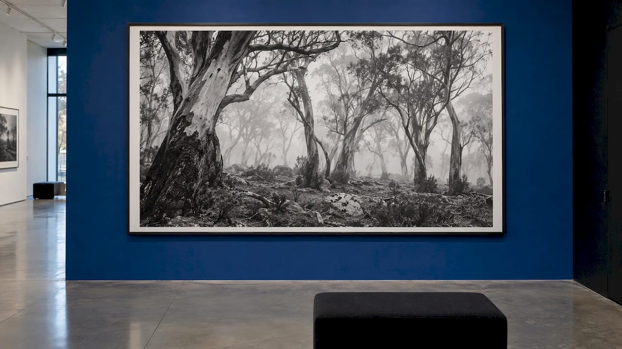
Monochrome landscape art is any landscape image built from a single colour. Black and white is the best-known version, but blue-toned, sepia or warm-orange images belong to the same family. What makes one worth hanging is not the missing colour. It is tonal range, the direction of light and a composition strong enough to hold the frame alone. This guide shows you how to recognise those qualities, how to size and display a piece, and why a print made from a detailed medium format or digital capture, such as those in the Mark Gray Gallery limited edition prints collection, gives them room to show.
TL;DR
- Monochrome means one colour. Every black and white landscape is monochrome, but a landscape made wholly of blues or browns is monochrome too.
- Strong monochrome work depends on a full tonal range from deep black to clean white, with directional light that shapes depth and texture.
- Large formats suit landscapes, because open sky, water and terrain stay calm at scale. Frame colour should answer the mood of the image.
- Monochrome is a versatile choice for homes and offices because it sits comfortably with almost any palette.
- Detail is what carries a monochrome print across a big wall, so the capture quality matters as much as the subject.
Table of Contents
- What monochrome landscape art actually includes
- Why remove colour from a landscape at all?
- What makes a monochrome landscape compelling
- Subjects that suit monochrome
- Choosing black and white landscape wall art for a room
- Size, framing and display
- Limited edition or open edition?
- Using monochrome landscapes in offices and commercial spaces
- Making your own monochrome landscapes
- Perspective
- Bring a landscape home
- FAQ
- Sources
What monochrome landscape art actually includes
The Tate defines monochrome as one colour. In art, a monochrome work uses only one colour, and for centuries artists made monochrome pictures with shades of brown or black ink. Painters used grey oil paint in a technique called grisaille, from the French word for grey.
Photography inherited the idea. The National Portrait Gallery's glossary notes that in art and film photography the word traditionally means black and white. It also covers works made from tones of a single colour, such as blue, and sepia, where a work is built from many tones of one hue.
In practice you will meet three kinds of monochrome landscape art:
- Black and white: neutral greys between black and white. The classic choice for mountains, coastlines and storm skies.
- Toned monochrome: one hue, such as warm sepia or a cool blue, across the tonal range.
- Single-hue colour work: a scene that is naturally one colour family, such as a misty blue dawn or an ochre desert.
The distinction matters when you search. People typing "black and white landscape wall art" usually want the first type. People typing "monochrome landscape art" often include paintings, prints and photographs in one pool, which is why search results mix painted canvases, stock images and mood boards.
Why remove colour from a landscape at all?
Tate says artists reach for monochrome for two broad reasons. One is to communicate stillness by exploring a single colour. The other is to reduce the work to its simplest form, so attention falls on colour, form, texture or the way it was made.
Photographers say much the same. Tasmanian photographer Nick Green, whose book DARK SEAS gathers 152 black and white photographs of the Tasman Peninsula, told Australian Photography that black and white strips the landscape back to its essentials. He says it removes the distraction of colour, creates a sense of timelessness and leaves more room for emotion, because viewers respond to atmosphere rather than admiring colours.
That is the practical appeal for a buyer. A colour landscape often gets its first impression from a sunset or a green hillside. A monochrome landscape has to win on structure, so a good one keeps rewarding you after months on the wall.
What makes a monochrome landscape compelling
Four qualities separate a striking monochrome print from a desaturated colour photograph.
Tonal range
Good monochrome work spans from true black to white with a generous run of greys between. Digital Photography School points to the Ansel Adams Zone System as a useful guide to the range of tones available, and describes contrast as the difference in scale between those tones. When you look at a print, check whether the darkest areas hold detail rather than clogging, and whether the brightest areas still show texture in cloud or surf.
Light with direction
Without shadows, a photograph loses its translation of three dimensions into two. Photographer Ming Thein argues that directional light gives texture and spatial cues, and separates subject from background. He adds that a gentle gradient of tone from top to bottom feels tranquil, while jarring gradients feel aggressive. Gradients in a sky or across a lake are therefore worth studying, because they set the mood of the whole piece.
Colour photographers chase golden hour. Monochrome can be different. Fstoppers reports photographer Patino's view that strong black and white often happens outside the typical golden hour. Late-morning or midday light can create layers of varying brightness that keep an image vibrant without colour, and spreading tones across shadows, midtones and highlights adds depth.
Tonal separation over colour contrast
In colour, a red rock against green scrub separates itself. In monochrome, those two may turn the same grey and merge. The photographer has to find a scene where light and dark do the separating. Click and Learn Photography lists the consequences: leading lines, patterns and textures become the main compositional tools, clouds act as compositional elements rather than filler, and shadows often define the mood of the frame.
When judging a piece, ask what leads your eye through it, whether the sky is doing real work, and whether the shadows feel intentional.
Detail that survives scale
With colour gone, texture is what remains: bark, ripples, rock strata, wind-combed dunes. A print made from a high-resolution capture lets you step close and still find information. This is where the equipment behind the image matters, and it is why we make our prints with panoramic medium format film and digital cameras.
Subjects that suit monochrome
Australian artists show how wide the territory is. Tony Lloyd's Nocturnalux exhibition at MARS Gallery in Melbourne in 2025 presented richly monochromatic paintings of Gippsland and Bunurong hinterland, with tangled tree shadows and winding centre lines lit by headlights, plus the granite formations of Cape Woolamai and Wilsons Promontory. In Victoria, Benjamin Healley's SCAPES series was described as a monochromatic odyssey juxtaposing industrial and natural landscapes, where the absence of colour leaves a vision carried only by light and shadow.
Subjects that tend to reward monochrome treatment:
- Coastlines and long exposures: smooth water against hard rock, where tone does the work.
- Mountains and wild coast: layered ridgelines, as in Tasmania, that gain depth from atmospheric haze.
- Storm and cloud skies: drama that colour can distract from.
- Deserts and plains: pattern, line and the long horizon. Our guide to Australian Outback landscapes explains what shapes those scenes.
- Horizontal compositions: calm bands of land, water and sky, covered in our collector's guide to horizontal lines.
Not every scene makes the switch. If the subject is defined by colour, such as autumn foliage or a reef, it stays in colour. Our colour versus black and white checklist walks through that decision from the photographer's side, and it helps a buyer see why a scene was chosen.
Choosing black and white landscape wall art for a room
Monochrome is often the safe choice when the room's palette is mixed or likely to change. The Institute of Home Staging in Australia advises that monochrome artwork suits contemporary and traditional spaces and never clashes with furnishings. That makes it useful for living rooms, offices, reception areas and rental properties.
A few practical checks before you commit:
- Match mood to purpose. Soft gradients and wide horizons suit bedrooms and lounges. Strong contrast and dramatic skies suit entrances and boardrooms.
- Think about the wall, not only the room. Landscapes with calm skies and open water can take a lot of wall without feeling heavy.
- Consider the light. A monochrome print reads differently under bright daylight than under warm downlights. View it where it will hang.
- Think about the set. Two or three related images from one region hold together better than unrelated pieces.
If you are still working out the rest of the wall, our guide to landscape photography display options for your home covers the choices in more detail.
Size, framing and display
Landscape images tend to be simple compositions with expanses of sky, terrain or water. An Australian framer notes that this makes them less imposing at large scale, so landscapes deserve large and extra large frames. The same advice covers frame colour: a black frame can overpower a light seascape, while a dark, soulful landscape can be lifted by a black frame or set off by a crisp white one.
A workable rule: pick the frame by the darkest and lightest tones in the image. A high-key, misty scene wants a light or slim frame. A heavy, moody scene can take black. Between those, keep the frame quiet so the tones in the print do the talking.
For smaller spaces and desks, a different format works. Our acrylic blocks are priced at $295 each, with postage and handling of $24.95 Australia-wide or $74.95 international, on the acrylic blocks page. They suit a shelf, a side table or an office desk.
Price varies a great deal across the market. Mass-produced framed canvases are sold at a fixed price by size, while limited edition photographic prints are priced by edition, size and finish. For current pricing on our prints, visit the print collection pages directly.

Limited edition or open edition?
For collectors, this choice matters more than the frame.
- Limited edition prints are made in a restricted run, which suits collectors and investors who want scarcity and a body of work that holds meaning over time.
- Open edition prints suit buyers who want a photograph they love at a more accessible commitment. Browse open edition prints of Australian scenes.
Our images are award-winning and collected in 35 countries, and the prints cover Australia, New Zealand, Norway, Iceland, French Polynesia, Spain and the United Kingdom. If you are weighing what a gallery-grade piece looks like, eight examples of gallery quality landscape prints shows what to look for. For region-by-region ideas, see our curated Australian picks.
Using monochrome landscapes in offices and commercial spaces
A monochrome landscape reads as calm and professional. It works in reception areas, meeting rooms and hotel corridors where colour could clash with branding. For corporate buyers there are two routes: a framed print for the wall, or a licensed image for use in printed and digital material. We license Mark's landscape photographs for splashbacks, signage, websites, brochures and flyers. Enquire through image licensing with the use you have in mind.
Making your own monochrome landscapes
Many people who admire this style want to shoot it. Two options: join a one day photography course in Australia, or book private lessons. For a longer trip, our photography tours are small-group, with luxury arrangements, and led by Mark Gray and his team of professional instructors. If you want somewhere to start looking, the Tasmania wilderness guide covers a landscape that photographers such as Nick Green have returned to for years.
Perspective
After many years behind the camera, what stays with us is that great landscape images are decided by light long before colour comes into it. When we look at a scene, we ask where the shadows fall, how the sky is layered and whether the horizon holds the frame. Those questions apply to every print we make, whether you hang it in a home or a boardroom.
That is why detail matters so much to us. We work with panoramic medium format film and digital cameras so a print can be viewed from across the room and from a step away. A wall piece should earn its place every day, not just on the first.
If you are choosing a piece, choose the one you keep returning to. Then give it room, good light and a frame that respects its tones.
Mark
Bring a landscape home
If you are ready to choose, start with the Mark Gray Gallery, where limited edition and open edition landscape prints from seven regions are collected in one place. Our prints are award-winning and held by collectors in 35 countries.
For a gift, gift certificates start from $50 and let the recipient choose their own piece.
FAQ
Is monochrome the same as black and white?
Not quite. Monochrome means one colour, and black and white is its best-known form. A landscape made entirely of blues or warm oranges is also monochromatic, so every black and white photograph is monochrome but the reverse does not hold.
Does black and white landscape art suit any room?
It is one of the most adaptable choices, because it does not compete with existing colours and suits both modern and traditional interiors. Choose the mood of the image to match the room: calm horizons for living spaces, high-contrast skies for entrances and offices.
What size should a landscape print be?
Landscapes generally work well large, because open sky, terrain and water keep the composition calm at scale. Measure the wall, then choose the largest size that leaves comfortable space around the piece. A print with fine detail holds up best at large sizes.
Can I license a landscape photograph for commercial use?
Yes. Mark's landscape photos can be licensed for splashbacks, signage, websites, brochures, flyers and more. Use the image licensing page to enquire.
Sources
- Monochrome | Tate
- Monochrome | National Portrait Gallery
- Dark Seas: Ten years of returning to Tasmania's wild edge | Australian Photography
- 9 Tips for Learning How to See in Monochrome | Digital Photography School
- Making mood and strong images in monochrome | Ming Thein
- Why Great Black and White Photos Need More than Contrast | Fstoppers
- 7 Tips for Black and White Landscape Photography | Click and Learn Photography
- Nocturnalux | Meer
- Exhibition: Scapes, Benjamin Healley | View Camera Australia
- How to Choose the Perfect Artwork for a Property | Institute of Home Staging
- Choosing the Right Frame Size and Colour | Format Framing